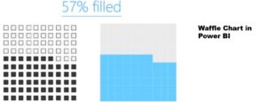
Waffle Charts can come handy for a better visualization. In this post, we will see how we can create a Waffle Chart in Power BI. I have used some creative DAX and Data Modeling to create this cutie pie, although it has little analytical value but you can certainly apply the DAX pattern to solve other problems. Doesn’t hurt to waste time with DAX and Power BI 😎 Waffle Chart in Power BI – Video More on Power BI Visuals COVID India Dashboard with Projections Display TOP-N Items and Others Dynamic Line Chart in Power BI Recruitment Tracker Dashboard Template L&D Dashboard Template
2 Comments
