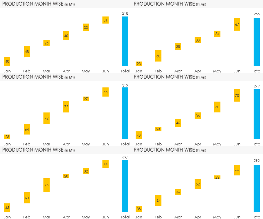
Waterfall Chart (because it looks like a waterfall) is an awesome way to display how things add up to form the total. Let’s dive into this
Here is some Random Data
![]()
We have units produced (in millions) over 6 months period
The Waterfall Chart Logic
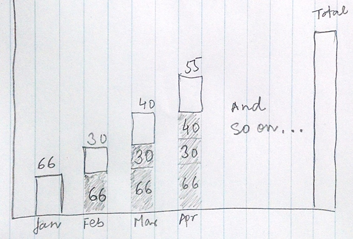
The waterfall chart is a combination of 2 data points combined in a single chart. Let me explain. Take a look at this picture..

- The first bar for Jan valued 66 stands on the ground (x axis) because it is the starting point
- The second bar for Feb valued 30 stands on 66 (hidden, dummy value for Jan) because 30 has incremented over 66 (last month’s value) and this way we keep plotting values till the Total
Preparing dummy for the Chart
Now we need to prepare dummy data which keeps on totaling the last year values. Here is how to do it

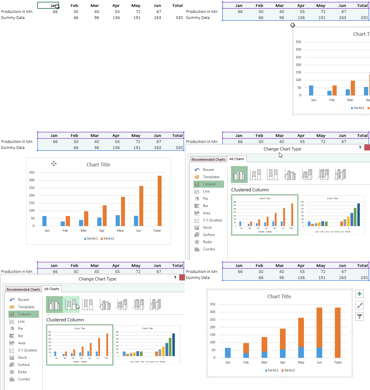
Dummy Data Formula =C6+C5 Add the previous empty cell (C6) and the value for Jan (C5) and drag it across Feb to Total. This will give a cumulative total
Preparing the Chart
- Select the data and the dummy data and press Alt + F1 to make a Column Chart
- Change the chart type to stacked column chart

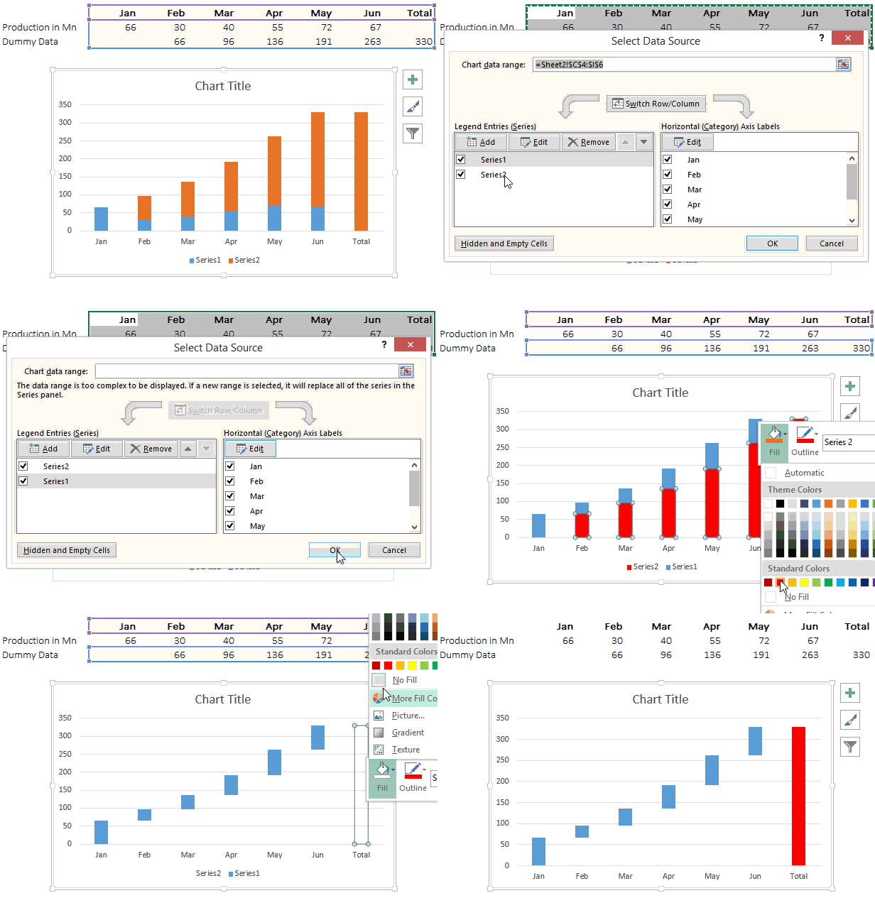
- Now reverse the Chart series order to make the dummy series go below the actual data series. Here is how you can do it
- Right click on the chart and go to ‘Select Data’
- You’ll see Series 1 (actual data) and Series 2 (Dummy Data)
- Reverse the order by the down arrow button so it should appear (in reverse order) Series 2 and Series 1
- Hide the dummy series (do a no fill), leaving aside the total bar (fill it with any color)

The Waterfall Chart is ready! Download the completed Waterfall Chart from Down Below
Learn More Interactive Charts
- How to add a total bubble at the end of the line
- Highlight the max and min values in the chart
- Interactive Stock Ticker Chart