Animations are a key part in presentations & I use them often, but I abide by one rule for using animations
” Use animations to communicate your message effectively rather than just for artistic purpose “
Of the many animation styles that I use to display data, here are 5 classic ones and definitely with a purpose
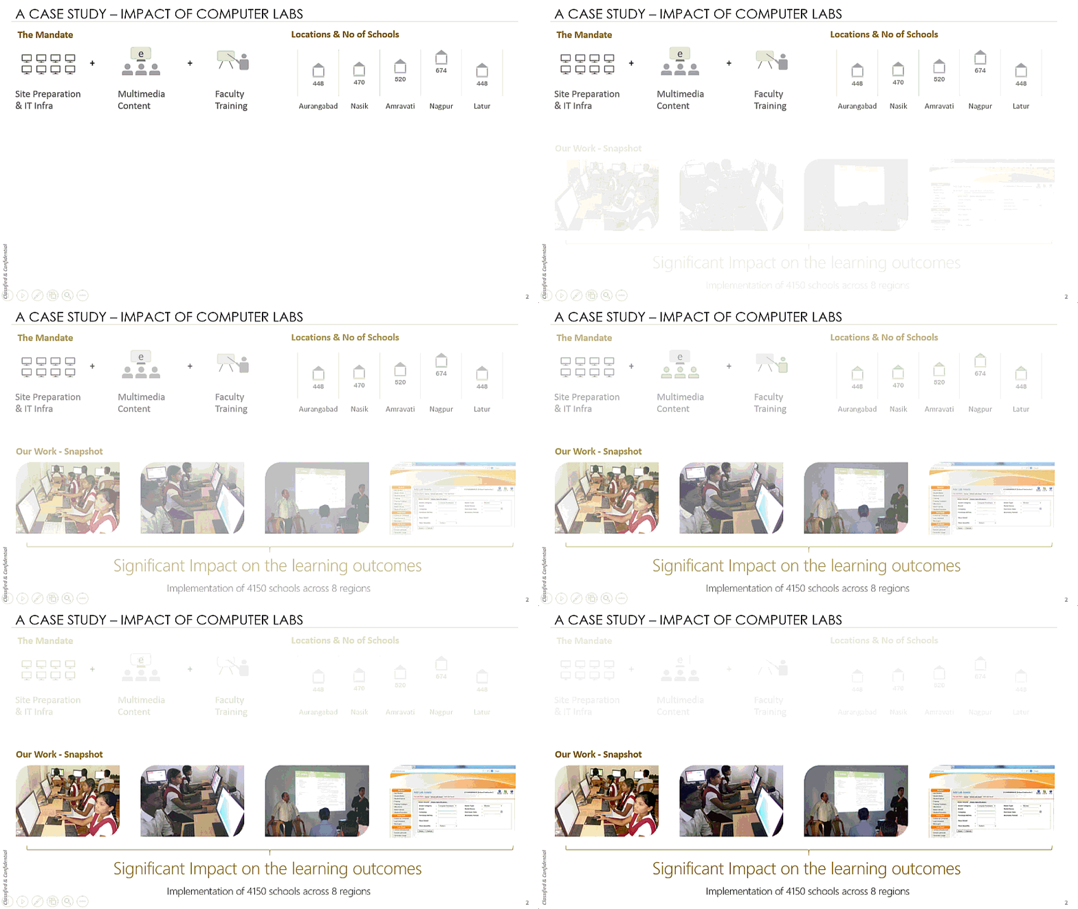
1. Fades for Shifting Focus

How can it be used – In the above slide I am fading away the part of the slide to shift the focus of the viewer to the next part of the presentation. You can use this to explain complicated concepts step by step, a process or simply moving ahead with the next part of the presentation
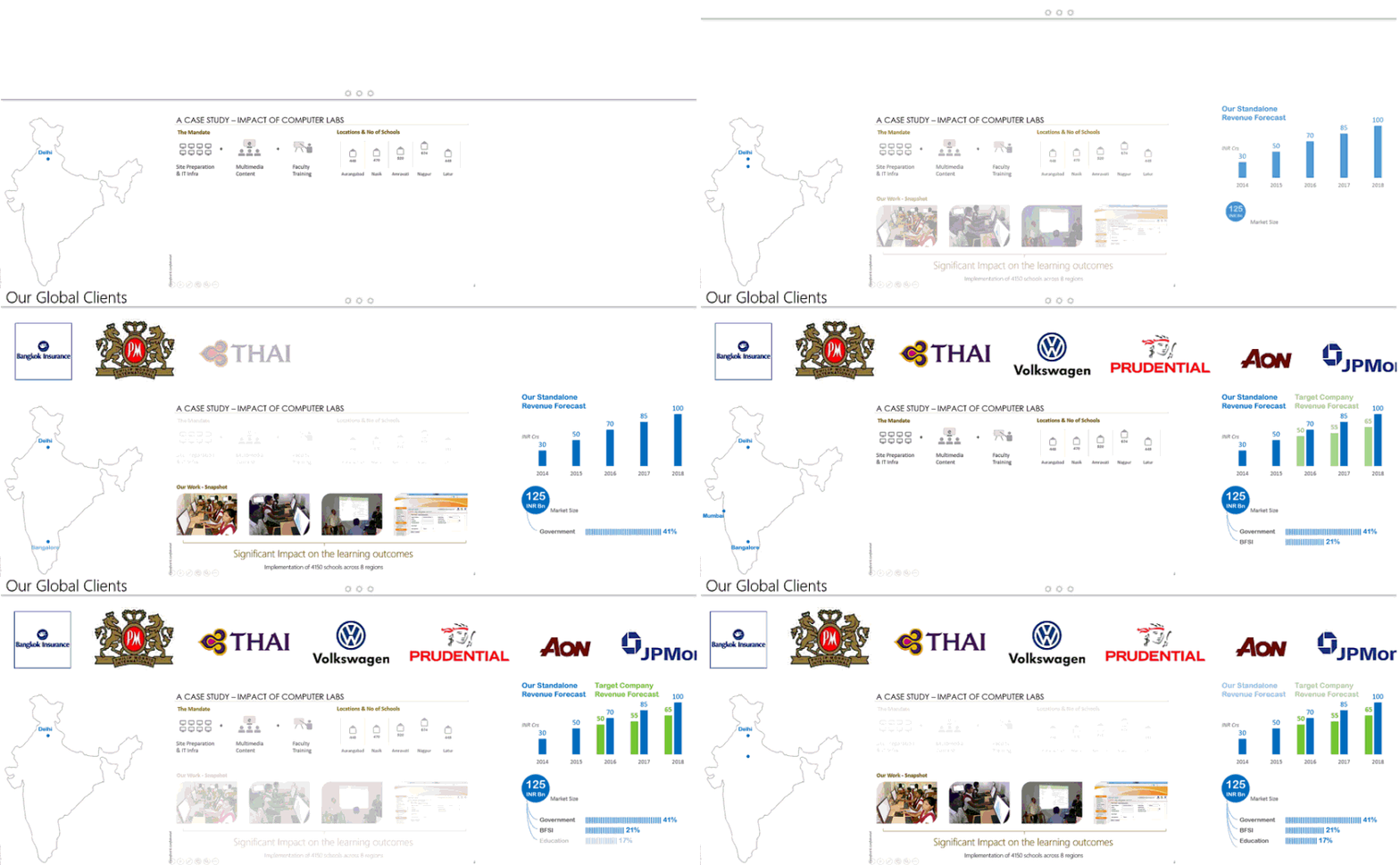
2. Tray Look

How it can be used – Mom’s old saying “It always looks nice to serve in the tray” but additionally list of clients (in the case above) is one such thing that someone would like to take glimpse at. You can free up the space for displaying more critical data once the viewer has done looking at the tray. Use this to show product pictures, catalogs etc..
3. Sub Part Branches

How it can be used – Think of this as a part of fish bone chart. You can use this to display how one part is spread into many sub parts (I have done it for market share information). Use this technique to show multiple product categories, sales split region wise and possibly any place where you want to show sub branches
4. Pointing Multiple Locations on Map

How it can be used – Plotting cities on a Map is better than writing the names of the cities on a blank. It gives the viewer the location understanding. Use this show offices across region/continent/world, phasing of regional presence and more..
5. Merging Charts

How it can be used – I custom made this animation, especially to show the post merger revenue. Typically this can be used for anything being added for example sales production effect after new plant setup, new employee strength etc..
A word about animations
There is possibly limitless things you can do with animations in PowerPoint but if you solely use animations to “fly a text / picture from a corner just because it looks cool” then your animation style is not good. “Use animations to make your message more clear, easy to digest by the viewer” and I promise you your presentations will stand out!!
Want more on Presentations and Animations ?
- 10 Rookie mistakes to avoid in Presentations
- How to make your Presentations Interactive
- How to add action buttons on your slide
