Skip to content
GoodlyGoodly
  • About
  • Blog
  • Consulting
  • Start Learning!

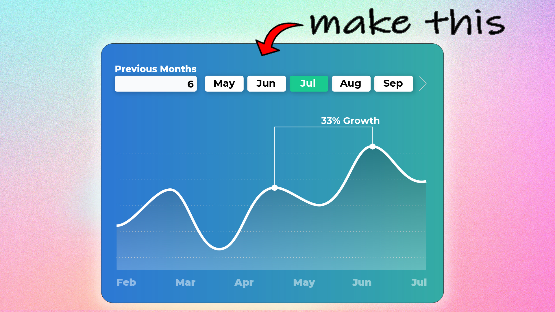
How to make beautiful Line Chart in Power BI

Published June 10, 2023 at 1920 × 1080 in Make Your Data Shine with a Custom Line Chart in Power BI

Insightful & eye Cathy line chart

Both comments and trackbacks are currently closed.
Start learning here!

I teach Excel and Power BI to people around the world. If you are planning to upgrade your skills to the next level, you'll find my courses incredibly useful.

Check out my Courses!

Terms & Conditions

Cancellation & Refund

Privacy Policy

Shipping & Exchange

Contact Us

Consulting

We offer high end Excel and Power BI consulting services.

Book a call with us.

If watching videos helps you learn better, head over to my YouTube Channel

Latest Video


Copyright © 2013 - 2025  Goodly
  • About
  • Blog
  • Consulting
  • Start Learning!
  •