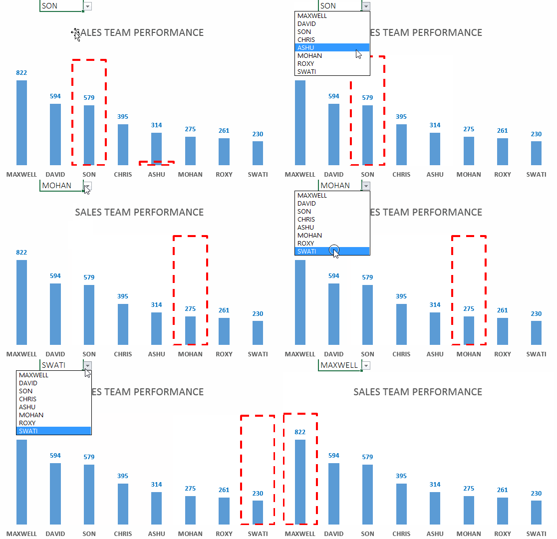
Highlight specific data series in your chart --> Set it up in your dashboard --> Impress your boss --> Get promoted faster 😀
Download the Start File
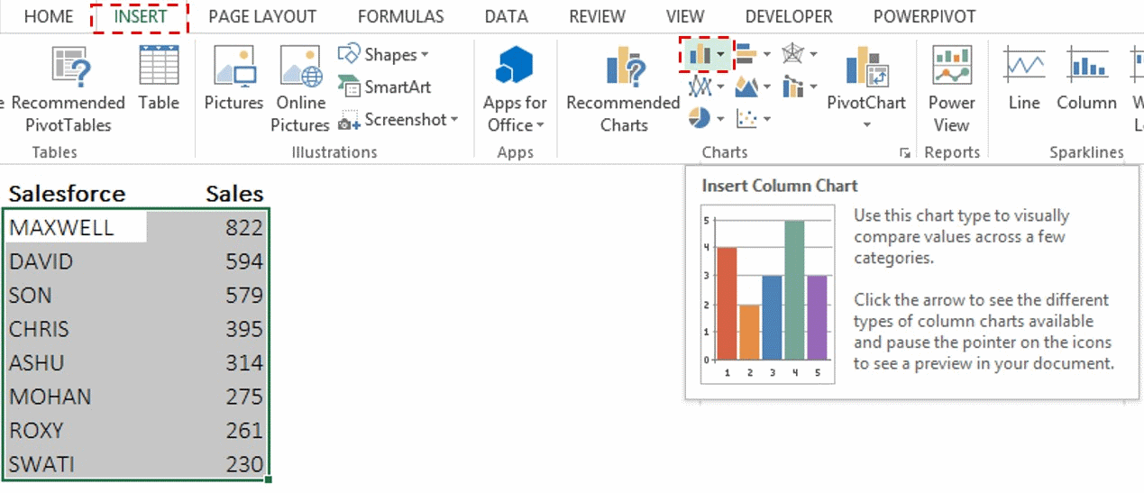
1. Select the data (assume salesmen and sales figures) and draw a clustered column chart. Skip to point 2 if you know how to make a clustered chart
- Select the data
- Choose clustered column chart in the Insert Tab
- Format the Chart – Add the data labels, hide the axis, give a suitable title
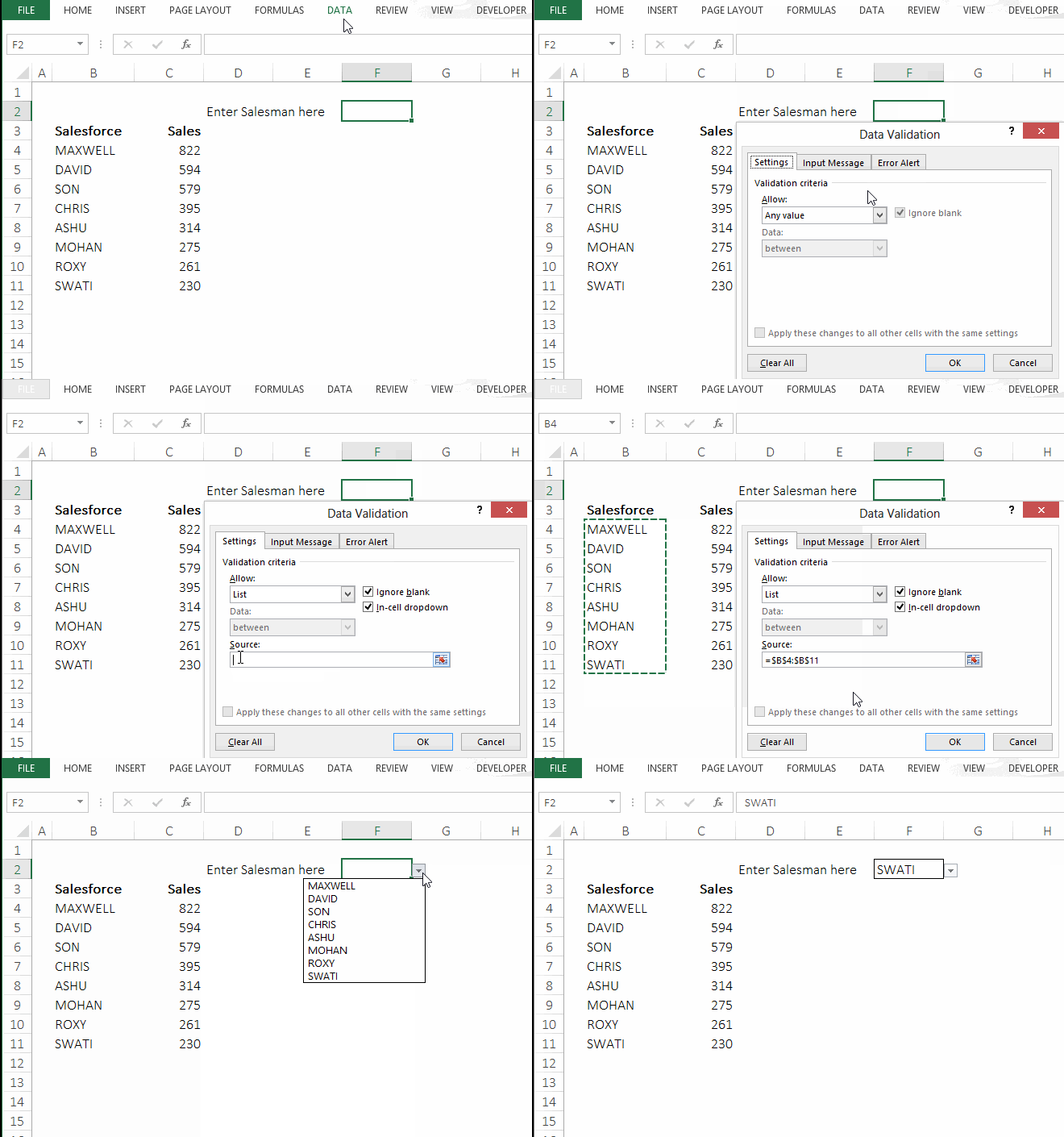
2. Create the drop down for choosing the salesmen. The option is available under the Data Tab --> Data Validation --> Choose the List Option --> Select the source of the list
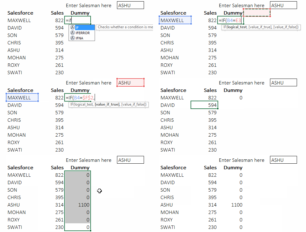
3. Make a dummy series for defining the height of the highlighting box. Use the following formula in the cell next to sales value =IF(B4=$F$2,1100,0)
4. Add the Dummy Series in the chart and in the Format Data series dialogue box (opens with Ctrl+1 on selecting the data series) put the new series on the secondary axis and set Gap Width option to 0%
![]()
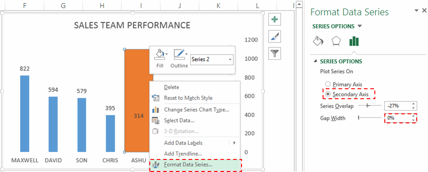
5. Also hide the secondary axis – Select the axis, Right click --> Format Axis --> Labels --> Label position --> None. Set the outline of the dummy series as red dashed thick outline (follow the graphic below) and make the fill as no fill.
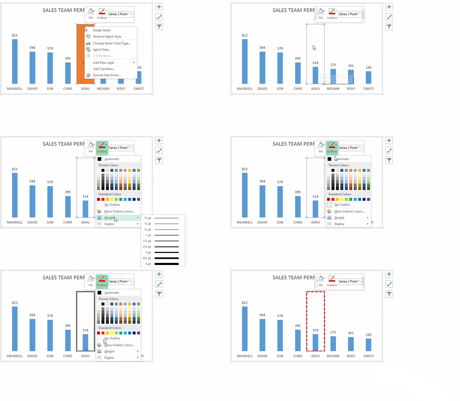
If you are an Excel 2007 or before user, you will find the above options in Format Tab (appears when you select the chart)
6. Now simply change the drop down to see the effect 🙂 Download Solved File from Down Below
That’s it for now .. take care!! Please share your secrets of highlighting any particular data series in the chart
Also Learn
How to highlight max and minimum data points in your chart
