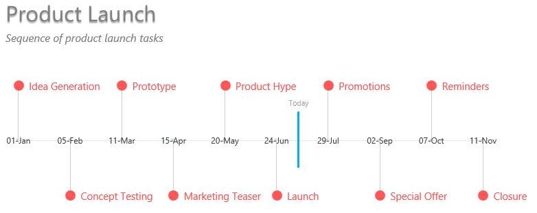
Every once in a while I make a timeline in PowerPoint to show how the tasks are scheduled over time. I thought it would be nice to have a template in Excel where I just add events and dates and the chart is created by itself.
So today it is time for a short tutorial on a timeline chart
Typically you’ll have this data
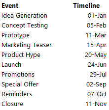
When you think of a timeline you’ll typically deal with similar to the above data where you have the events and corresponding dates
We need 4 things to make a chart like this..
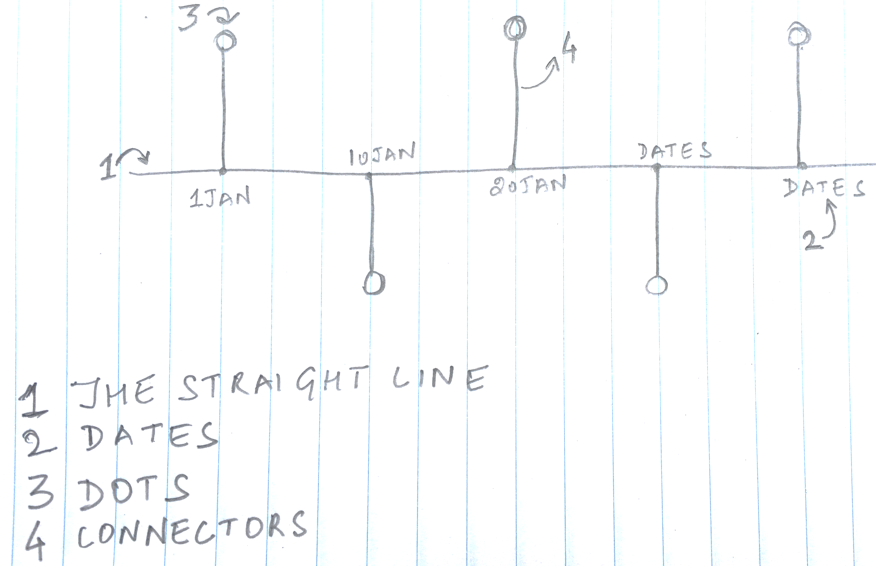
Note that we already have the dates (and the events) with us in our data the rest will be prepared as a dummy
Creating a Dummy for Straight Line and Dots
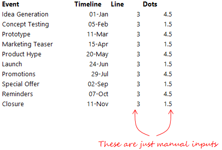
Note that in the column next to our data
- I have written 3 for a straight line (constant value since it is a straight line)
- Assuming the 3 as a middle point I want alternative dots above and below the line so I have mentioned 4.5 and 1.5 (as repetitive values) for dots
These values are less likely to change even thought they are manual inputs
Connectors Dummy
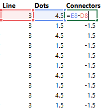
Next to make the connectors I take the difference between Dots and Line. These connectors will connects the dots to the straight line
Step 1) Create a Scatter Plot with Dates and Dots
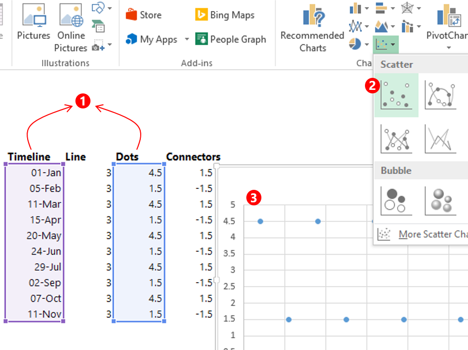
- Select the dates and dots data
- And make a Scatter Chart
- Scatter Chart is inserted in the sheet
Step 2) Add Dates and Line Data to the Chart
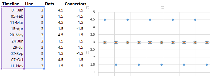
- All you have got to do is to copy the data (for timeline and line) using CTRL C
- Select the Chart and Press Ctrl V
- Change the Chart Type for this to Scatter with Straight Lines
Step 3) Add Connector Data as Error Bars
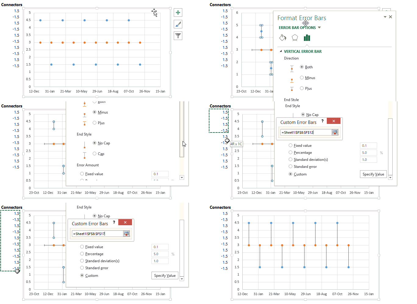
- Select the dots data in the chart and add error bars
- Format the error bars (select and press Ctrl 1) and set the direction to Minus
- End style as No Cap
- Specify a Custom negative and positive values as Connector Data from the spreadsheet
Also remove the horizontal error bars if any since we are only interested in straight line connectors (vertical error bars)
Step 4) Add Data Labels
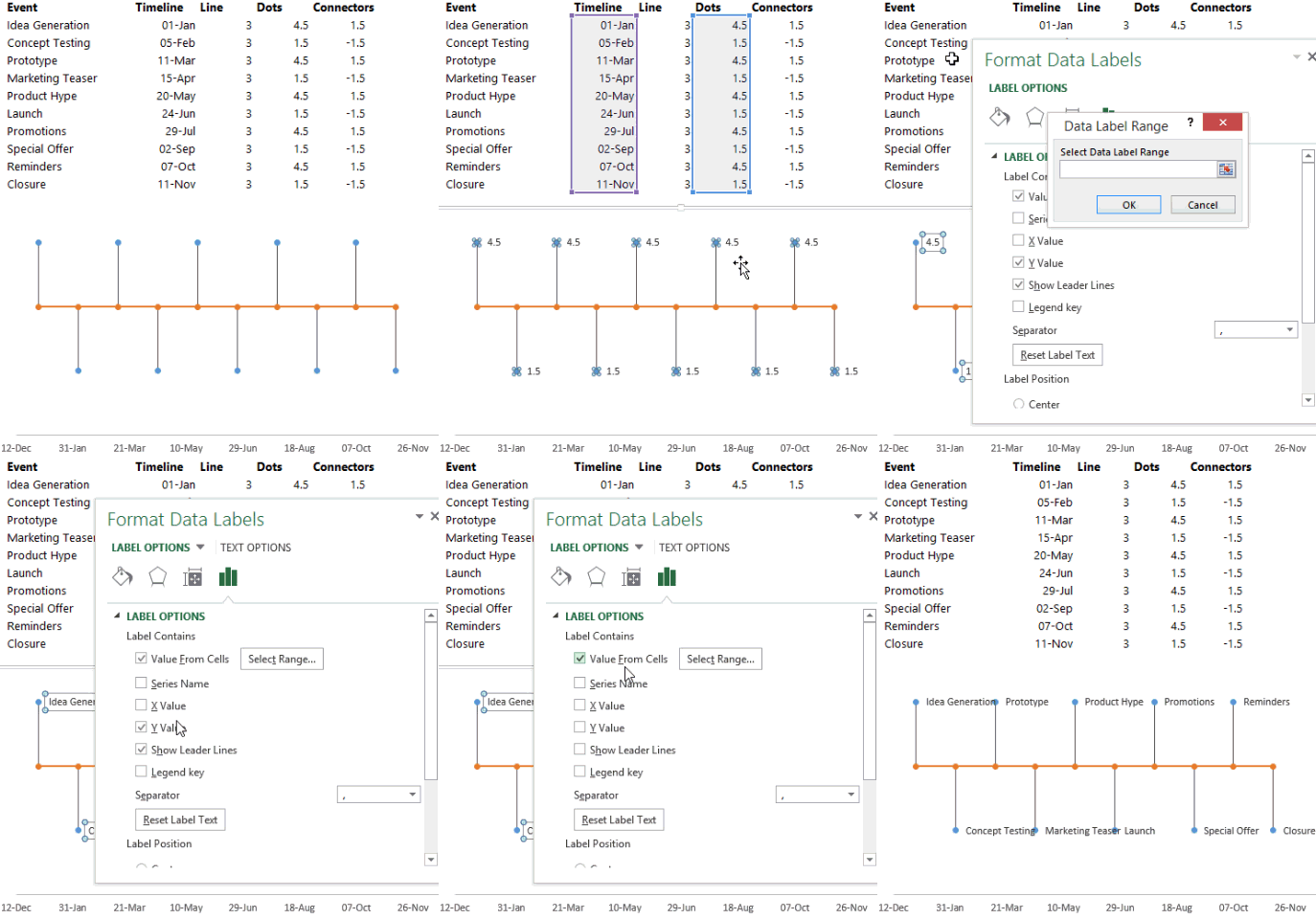
- Select the dots and add data labels
- Format the data labels (using Ctrl 1) and set values from cells as the Events data
Similarly add data labels for the straight line and customize them to the timeline dates
Step 5) Format the Chart
Although the chart has started to look like a timeline but it is far from looking formatted. Here are a few formatting aspects that you must do
- Write headlines
- Remove the horizontal axis, gridlines and any other clutter which isn’t needed
- Fade off the outline color of connectors (error bars)
- Make the chart appropriately sized
Other Interesting Chart Types
- Add a total at the end of the Line Chart
- Bubble Chart Matrix with Scrollbars
- Convert a Raw Data into a Visualization
- Shift Between Companies – Interesting Vizualization
- DOT Chart in Excel
- Funnel Chart in Excel
