Last week I participated in Chandoo’s Visualization Challenge, where we were given some raw data and had to make a meaningful visualization (Dashboard) out of it. In this post I am going to share everything about how I went along in creating this dashboard.
Compare Companies View
Overall Market View
As of this moment (10 July 2016 18:27 Indian Time), I am sitting in a flight to Bangalore and the results of the challenge are not out yet. Let’s hope for the best but I am fine even if I do not win because I gave my best shot and there will be so much to learn from other folks participating

A side view as I type this post
Keeping the side view aside and taking a look at the data
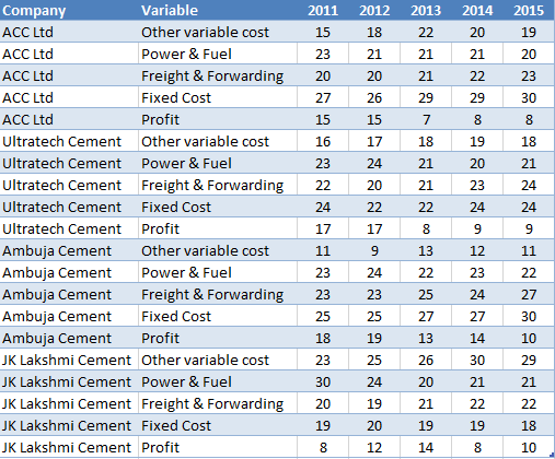
Nothing too complicated here
- A set of 4 companies and 5 types of cost elements for each
- The data is spread over 5 years
How did I plan the Dashboard?
When I took a look at the data a few things worked in my favor..
- Since I come from the investment banking background, I am pretty confident of understanding financial statements and the data looked somewhat like that
- I also know the key things that matter to the senior management in this type of a data
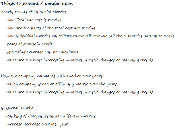
Although Chandoo did provide some metrics that we can focus on, I kept his points and added a few of mine. The first thing was to find out the most important questions which can be asked from this data..
Here is a list of questions that I gathered
So the next step was pretty logical, which was to find out the answers to those questions. A bit of number crunching and a drawing a mock visualization helped me put my thoughts together
Creating a mock of the dashboard on paper.. (and this is how it looked like)
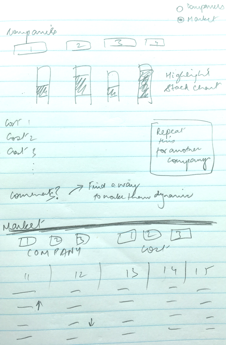
I guess doing a mock of the dashboard is extremely important
- It helps me put my mind on paper
- It is easy to scrap and recreate. And because a mock (with a pen and paper) takes far little effort than doing it on Excel you can reiterate many times before you settle with something that you like and fits your analysis
Finally this visualization came out
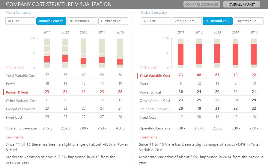
Screen 1 Compare Companies
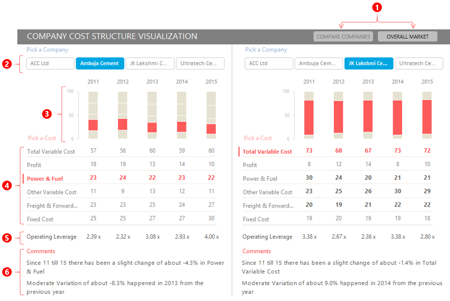
- Tabs to switch between views
- Slicer buttons to select any company
- Stacked Chart with relevant part highlighted
- Cost variables can be picked up (they are linked to the chart)
- Operating Leverage Calculated
- Dynamic Comments – They change as per the company and cost variable selected
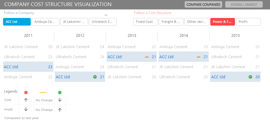
Screen 2 Overall Market
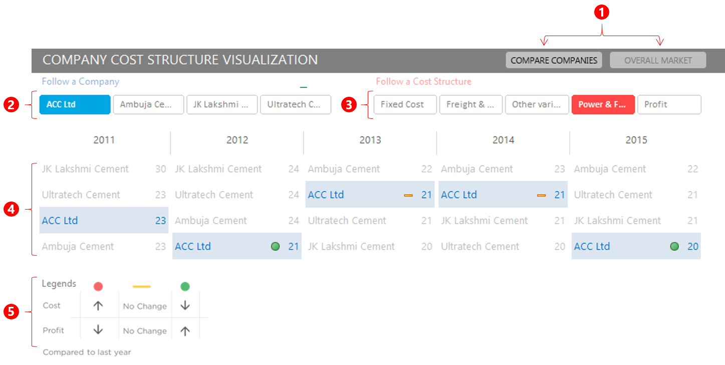
- Tabs to switch between views
- Slicer buttons to select any Company
- Slicer buttons to select any cost
- Companies (results) are displayed here – Notice that
- The selected company gets highlighted
- You can also see the ranking of the company in any particular cost structure by its position
- The dots display rise or fall in the numbers over last year
- The legends are made as a picture
The back-end workings..
To crunch the numbers and carry out all automation and analysis I used the following tricks and formulas
- Highlight any part of the stacked chart – for the stacked Chart on Screen 1
- A combination of OFFSET, INDEX, MATCH and COLUMNS functions to make lookup formulas
- For generating comments I used – IFERROR, INDEX, ROWS, MATCH, MAX, ABS, ROUND, SUBSTITUTE and VLOOKUP
- Pivot Tables were used for setting up Screen 2
- Formula driven conditional formatting was driving the icons that showed the change over last year and the company selected
How much time did I spend in creating this Dashboard
- Dashboard Pre-Work : Planning, Rough work and Mock Dashboard (1.5 Hour)
- Number Crunching and Analysis – (2 Hours)
- Formatting and Creating the look and feel – (2.5 hours)
I gave 3 sittings over 3 days to finish this task 😀
Let me know your views..
If you think that
- I could have improved on any aspect of the dashboard or
- If you have particularly liked any part of this dashboard and would like to implement in your work
let me know by leaving a comment and I would create short tutorials on different aspects of this dashboard