Ok we aren’t going for a war but I want you to be killer at charting so I call the tools as arsenal… let’s begin
I travel a lot and train people on PowerPoint and Excel in companies and often I have found people either forgetting or not knowing the chart tools available to them, so I am dedicating this 3 part post to all of you who need more arsenal. Along the way I’ll keep pointing out the Excel 2007 v/s 2013 version differences
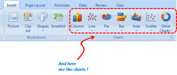
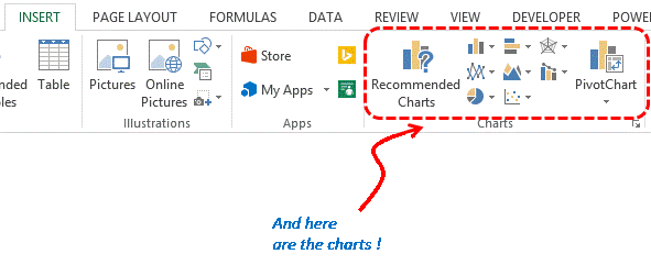
1. So, Where are these charts ?
In the Insert Tab
Excel 2007
![]()
Excel 2013
2. How many Chart Types ?
Excel 2007
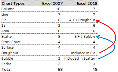
Probably limitless, essentially because excel gives you the option of mixing the charts, for instance you can have a column chart and a line chart together in a single chart. But if you still want to zero down on a specific number of the available charts in excel .. the number is 58. Lets check them out .
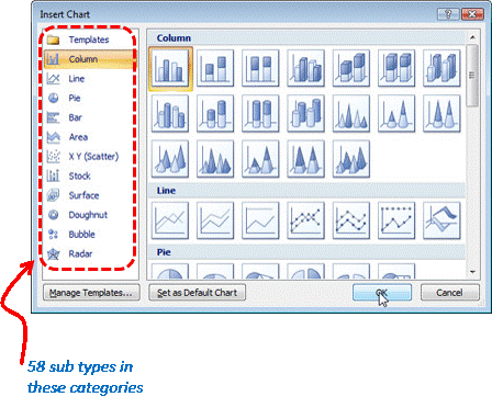
More details on chart types can be read here
Excel 2013
- If you note the difference between 2007 and 2013 the number of sub categories have reduced (for good!). There were a lot of meaning less sub categories like pointed column charts which looked like rocket launchers .. who would use them in business presentations and dashboards? I would say that in 2013 Microsoft got wiser!
- Another difference is the combo option in the categories where you can combine 2 different charts. We’ll check that out later
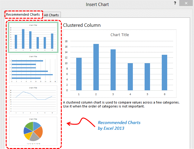
- The 3rd good thing is that if you don’t know what chart type to select for your data, excel 2013 gives you some options (with commentary) in Recommended charts
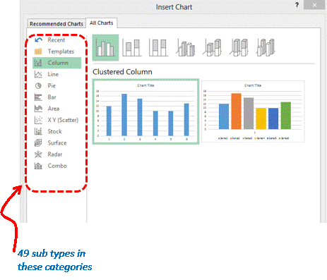
Chart Recommendation by Excel 2013
A snapshot (number of charts in each category)
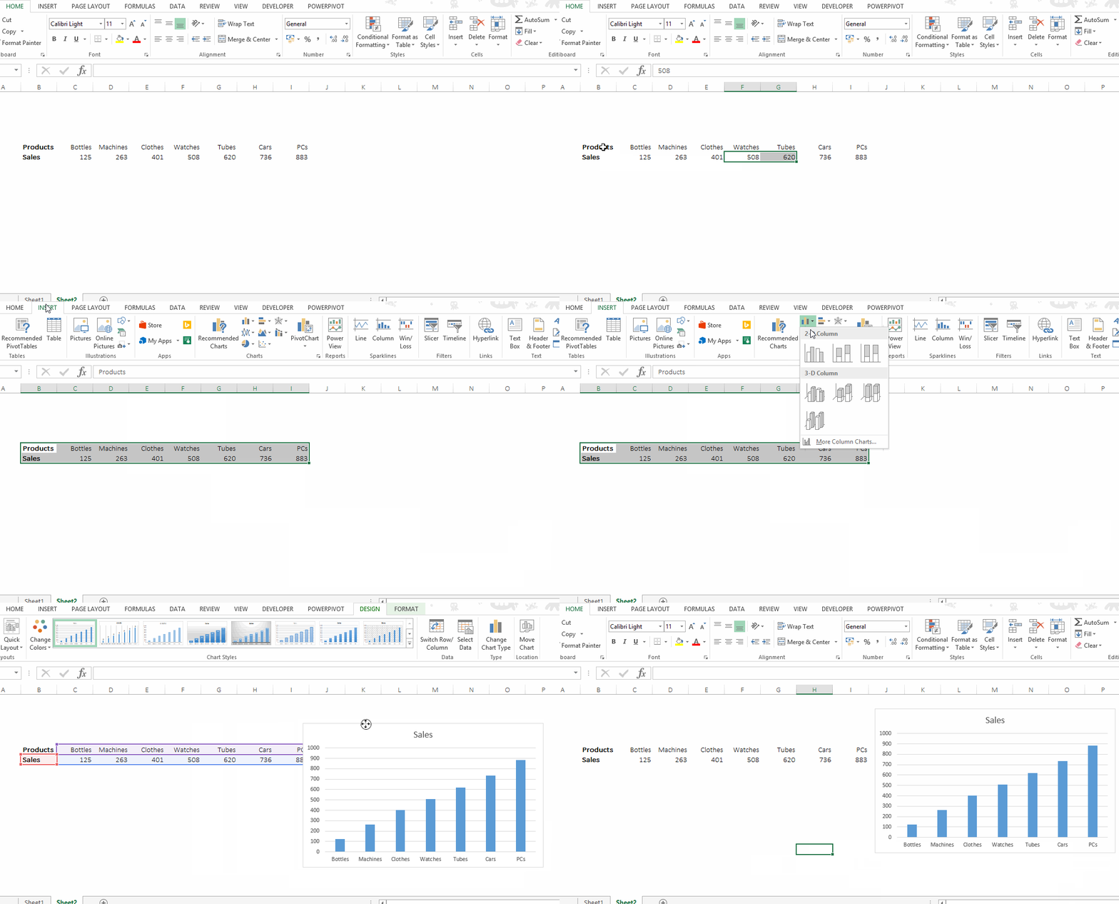
3. How do I create a chart ?
You can simply select your data and Insert the relevant chart type in your data. Take a look ![]()
![]()
Coming up Next
- Adding data to your charts
- Adding chart elements
Stay tuned ..