The final part of the arsenal building post delves in the formatting elements of the charts. Lets work on a case to get this started
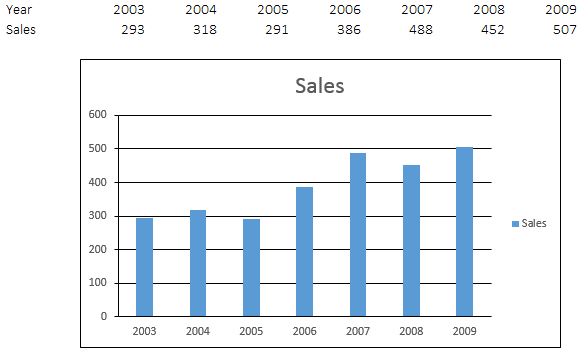
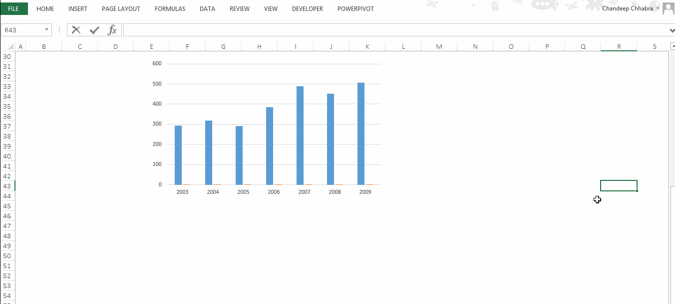
So we have some data here and its standard column chart
Formatting the Chart Elements
1. Borders and Outlines and Colors
Think of borders and outlines as a tool to isolate or group some objects together. Just don’t use them unnecessarily. For the above examle I will take off the all the borders and outlines. Here is how you do it
- Select the chart element, let’s say chart area (i.e. the border outside the chart)
- Go to format Tab and choose ‘No Outline’ under the ‘Shape Outline’ option
- Repeat this for taking off the borders on axis (vertical and horizontal), alternatively you can also repeat the F4 key to repeat your last action
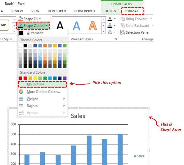
Use the format tab to make any change in colors & outlines for any element of your chart
2. Dealing with Legends
Legends only make sense when there is more than 2 types of data shown in the chart, for example Sales of product A and Product B, Region A Profit and Region B Profit. If you have only one data series on the chart (such as our case) only the heading can suffice describing what the chart is about – So delete the legend (using the delete key)
3. Data Labels – 3 Quick tips and more
Okay I have 3 tips for you here, rather call them thumb rules
- When working with too much data in your chart (sales for 15 years) or have multiple data series (sales, profits & number of customers) in a single chart then adding data labels will make your chart look cluttered. So let the reader use the axis to get an estimate of the value
- Although labels are not preferred when you have more than one data series in the chart, but just in case you need it, make the label text color and the data series (bars) color the same, that will be more legible and easy to read
- In case you want to show the specific values using data labels then the axis becomes redundant and of no use, since the values are already shown by the data labels and you don’t need the axis as a reference point. So avoid having both labels and the axis in a chart
Adding data labels – Simply right click on the data series and choose the option ‘Add Data Labels’
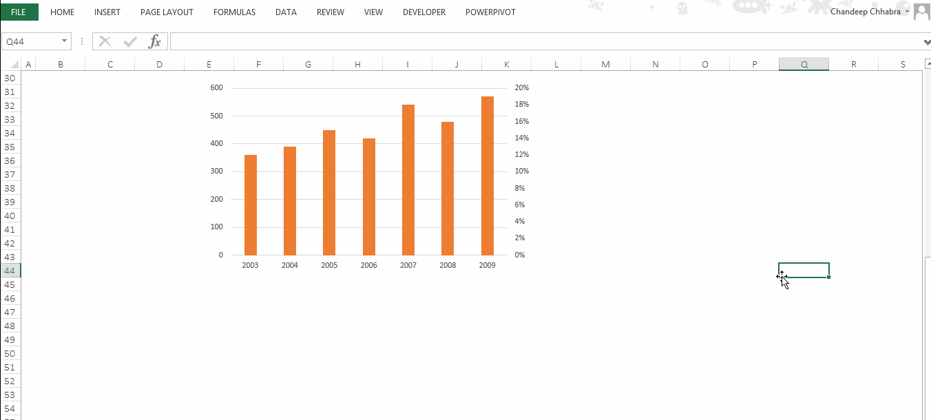
4. Secondary Axis
A secondary axis comes very handy when you want to plot 2 different types of data (Sales Mn and Profit % or Sales Mn and number of customers). Plotting 2 different types of data on the same axis makes it difficult to interpret. Let’s dig deeper into this continuing our earlier case
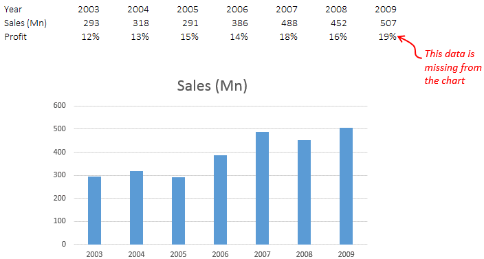
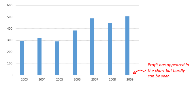
Now we cannot add the profit to the same axis because the profit bar would not have any height against a number like 300, since they are in % terms. So lets add them to the secondary axis. Follow this process
1. Add the profit data series to the chart – Read Charting Arsenal Part 2
2. Now to place the profit on the secondary axis. Follow this
- In case you have difficult selecting the profit series on the chart (since they are hardly visible), go to Format Tab and on the extreme left drop down pick up the ‘Profit Series’
- Then select the profit series and go to format data series options by pressing Ctrl + 1 [Learn this CTRL + 1 trick] or by right clicking and choosing ‘Format Data Series Option’ and place it on the ‘Secondary
- Axis’
5. Changing the Chart Type
Simply right click on the profit series and choose the option ‘Change Chart Type’
Note: Change Chart Type Box is somewhat similar in Excel 2007 and you’ll be able to work your way out!
Also read the earlier 2 posts on Charting Arsenal