Here are my top 7 tips that will make a huge impact on the way your presentations looks! Check’em out!!
1. Align, Align, Align
I have reason to write this trice because it is so important. What do you do when you want to clean up your desk? One of the top things that you do is to ALIGN (align books, align stationery, align papers, align computer accessories together) that’s it and the desk looks much cleaner. Here is a picture by the way 
I am just asking you to do the same to your presentations, just align the objects on the Slide. Alright let’s do it in real! Here is a slide that I randomly found
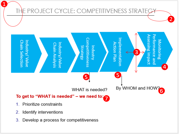
And there are 7 alignment mistakes that I found in this dummy slide
- The header text and the divider the line are not aligned
- The divider line does go till the end of the slide
- The distance between each box is unequal also the boxes are not top or bottom aligned to each other
- The height of all the boxes also not the same
- The arrows are not aligned
- The text (at the end of each arrows) is not aligned
- The text (in red) is almost colliding with the text above
- There is one more mistake, can you find that out before you read on further?? 💡
Here is the product of what can be achieved with systematic alignment and I swear to God that I have just done like less than 2 minute alignment workout with this slide nothing else!! And the 8th mistake was that it the text in the blue boxes was tilted (making it hard to read)
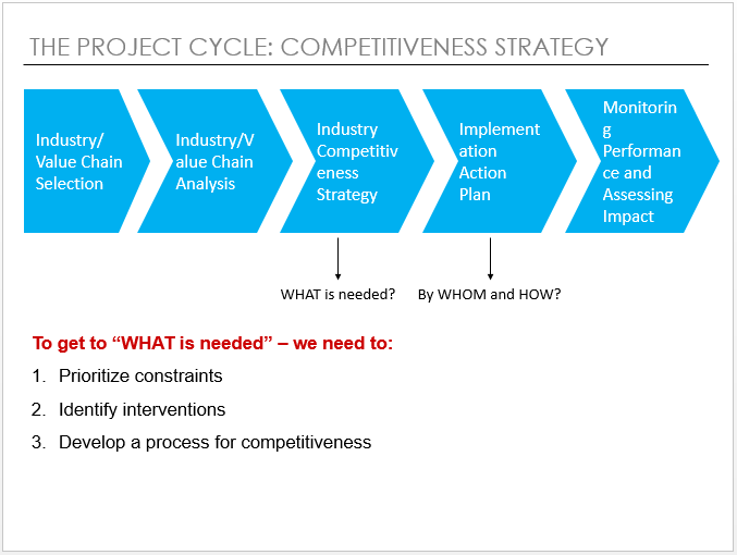
Now you can possibly do all the alignment manually (dragging, dropping, arrow key movement) but there is a smarter way to do it like real quick. Here is the link to 12 Most Important PowerPoint Shortcuts the first one talks about how can you create alignment shortcuts. I made video especially for you!
2. Templatize and use Slide Master
Ok lemme ask you a question! Let’s say that you have this long Monday Morning Presentation that you are preparing on the weekend (sorry dude! I am just trying to help 🙂 ) and you are using a particular format for each slide. Do you copy the previous slide and then delete the contents to retain the format?
If YES then you would kiss me over and over again after you watch this Video [just kidding.. don’t kiss but still watch the video it will save you a ton of time]
About Slide Master – Preparing a Slider Master is the quickest way to create neat and consistent templates for your long presentations! I am also giving away a template in this video
3. Animate but with Purpose
Well, if you animate just to animate then probably your slides would have text and shapes meandering all over. Something like this..

In the above slides the animations have solely been done to beautify (read dirty) the presentation. I have a Golden Rule for animations that I personally follow – I use animations to make the slide message more easier to consume for the audience
In light of the above rule I also have a demo I would like to share with you
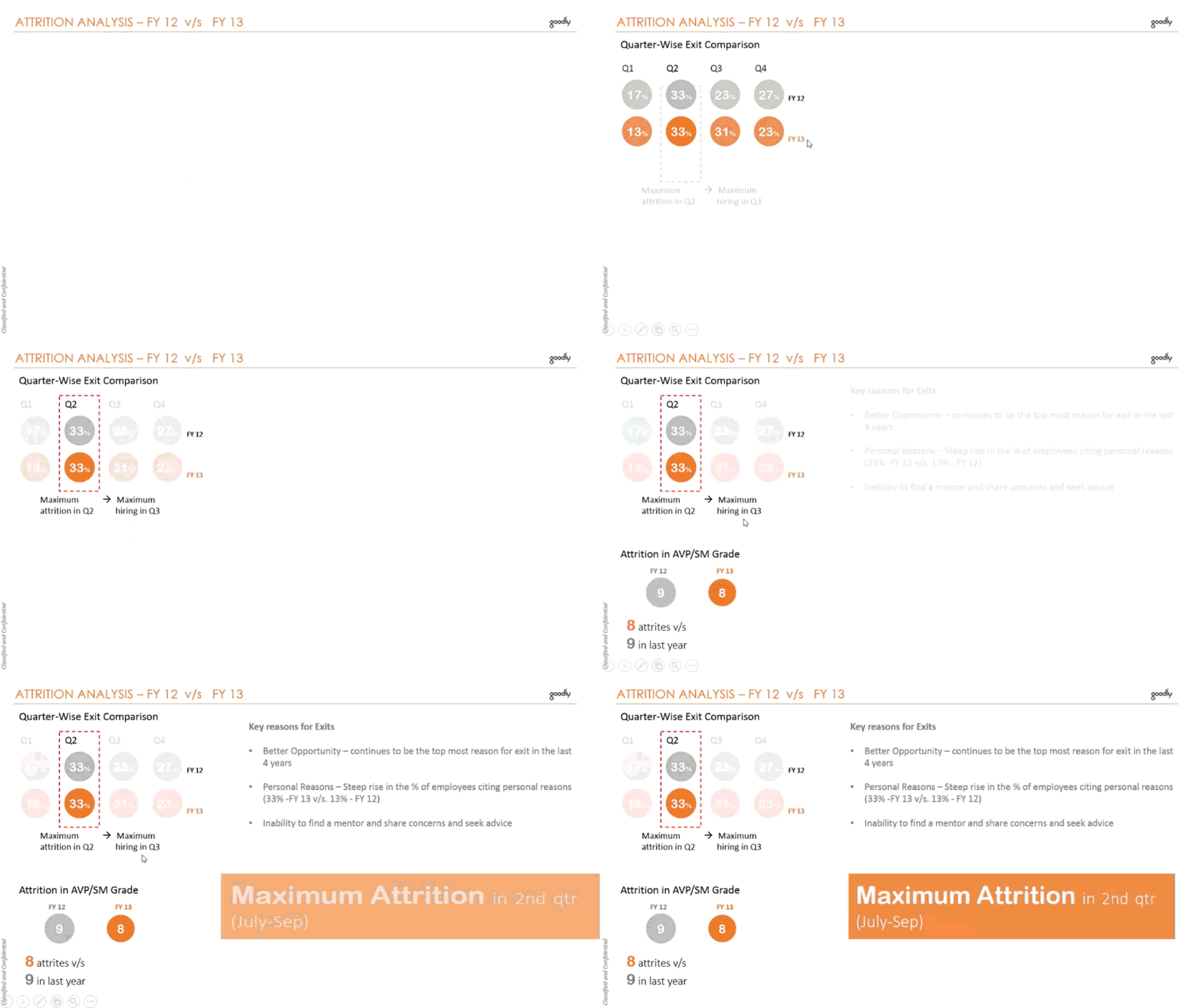
- In the above I use fading animations to draw your attention to the 2nd second quarter numbers
- Then I sequence the appearance of the information one by one to make it easier for you to consume it!
- Also note the sizing of the font. The larger fonts seek more attention!
I also found a kickass video doing a mockery of bad presentations! It is hilarious 😆 as good as a stand up comic but with a strong message !
4. Go White!
Well a lot of people out there fear the white space. They feel like their answer sheet is empty and that they need to fill it up with something. Something could be anything like this … Yikes!!
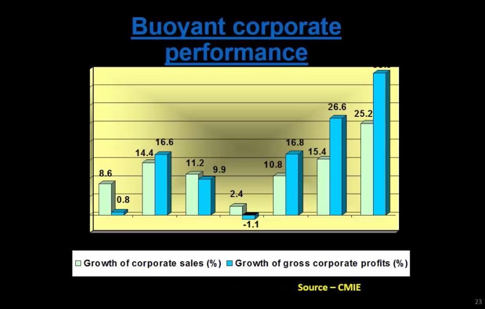
Well the same presentation in White looks much better! Doesn’t it? Strangely I believe you are now looking at the data!! (I added the x-axis years 😎 )
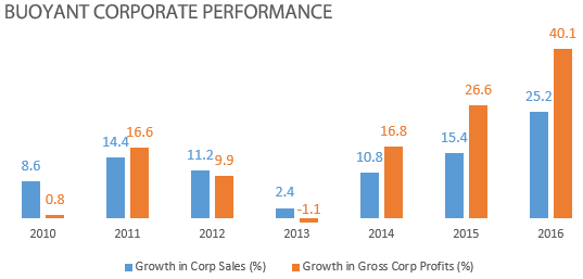
I strongly advocate white background because of the following reasons
- White color is simple and you don’t have to think twice before putting any other color (objects, maps, charts etc..) on it!
- White is so classy! It gives a very neat and tidy feeling. In fact Apple uses white background for most of its product videos
Here is one snapshot from I Pad Air 2 Video

5. Get out of the Box and Borders too!
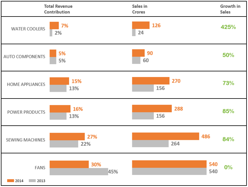
Too many borders, outlines, underlines and boxes just add to the clutter. Alright one simple rule is to use a border or a line only if you want to group or isolate objects from one another. I don’t see any other benefit of having lines or borders
Check this bor(ed)dered slide
V/S
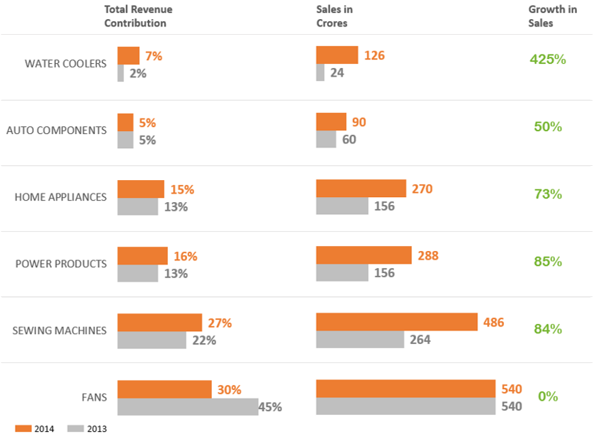
I advocate the second one which looks much cleaner yet having faded off borders, just enough to isolate the product categories
6. Don’t show off your colors!
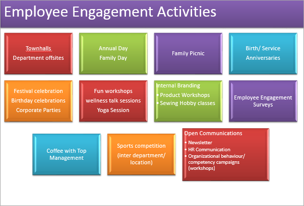
I mean in the literal sense. Don’t show off that how many colors can you add to your presentation. The viewer’s eye have to literally pay a color tax
Here is what too colorful can look like..
V/S
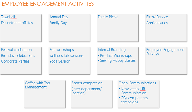
Not only the second slide is better aligned but also saves color tax  Here are a few tips to work around with colors
- Try not have more than 3 colors in your presentations
- Stick to colors used consistently. It gives the presentation a uniformity
- In case of highlighting between two objects (chart bars etc..) choose a bright color for highlighting and light color (light grey) for subduing objects
- Try referring to the color wheel article to pick up an apt combination of colors
7. Go Sans Serif
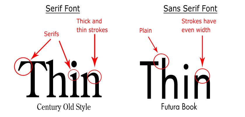
Serifs are these little strokes dangling from the fonts. In my opinion they add to clutter. Go Sans (without) Serif, your text would look much neater and clear. See the difference yourself
![]()
Here are some awesome sans serif fonts that I personally recommend and use
- Calibri / Calibri Light (for body)
- Century Gothic (for headlines)
- Segoe UI Light (for body)
- Helvetica Neue (for body)
- Meiryo UI (for body)
- Lao UI (for body)
Additional Resources
- 5 Steps to Boost Productivity while Making Presentations
- 6 Steps to Make an Awesome Presentation that I always follow
- The 3 Musketeers of PowerPoint
- Adding Action Buttons to your slides [A Must Read]
Closing Note
I personally follow all of what I have written above and also apply in the consulting work for business presentation development that I do for my clients. You may choose to disagree with some (or all) of them but this is what has worked for me. Please let me know your views on how do you format your presentations to make them look better..
Cheers!

