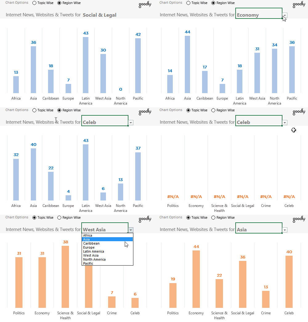
If you missed participating in last week’s question. Here is a quick recap.
- Give your best shot in creating a chart from it
- Paste the snapshot of your chart in the comments
You can read the full story here !
Don’t scroll down to see my solution before you submit yours 😀 !
The key to make a good chart + my solution !
Charts are made so that the data can be understood easily. If the reader is taking too much time to interpret the chart or worse is not able to get any of his questions answered.. then it is not a good chart!
In the video below I have laid down a step by step process to make this chart. Take a look..
Closing thoughts
My chart is certainly not the best chart but I have taken an effort to make it easier for the reader to consume the information. If you have a different chart in mind, please share a hand drawn snapshot your chart in comments and I will try and make that in Excel. Also your feedback on this chart is welcome!
Other Interesting Charting Reworks
- Here is how I reworked a Chart from Economist – a must see!
- Converted a Data Dump into a Visualization
