Interesting is’nt it?
Often I find managers and analysts making standard charts (or sometimes even pie charts) to map the city wise sales. Here is an interesting way to plot the cities on any country’s map..
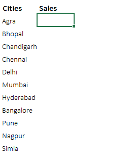
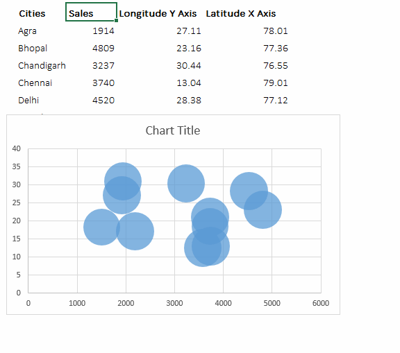
Consider this data
A couple of cities where you have operations and assuming some random sales figures for those cities
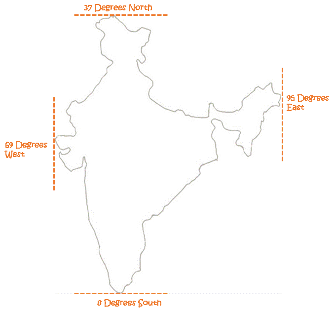
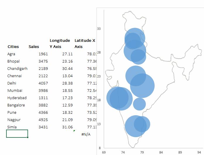
The second thing we will need is the Outline of India Map (outlined because it is neater). Alternatively you can also take a snapshot of the map from Google maps.
The mapping logic
If you are wondering how on earth will Excel know the location of the city, well it is almost the same way that Google Maps knows. Let me explain..,
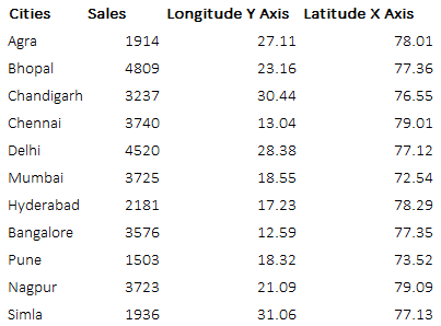
- Cities are mostly plotted with the latitudes and longitudes and these are nothing but the co-ordinates of that city. So I went on to search the co-ordinates of Indian cities and copied the relevant city co-ordinates in excel
- Next, I needed to find the co-ordinates of the edges of India (northern most point, southern most point, eastern most and western most point) and I got this intel here
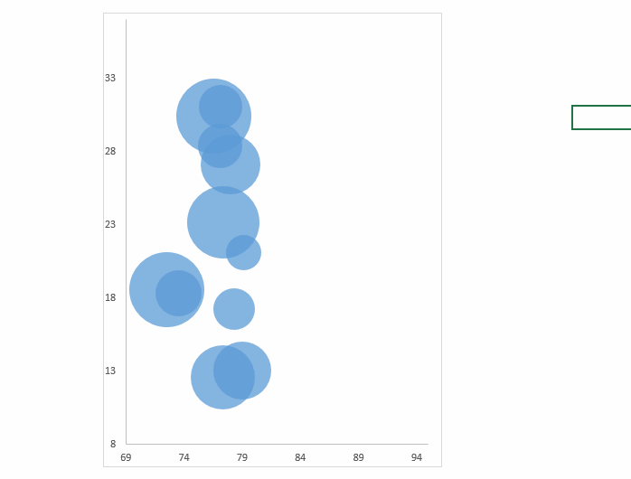
- Now my horizontal axis will start from 69 and end at 95 and vertical axis will start from 8 and end at 37. All my cities will tend to fall between these extreme points
Creating the chart
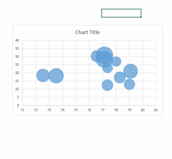
Now with the latitudes and longitudes placed your chart data should look like this
Select the above data (only data and not cities) and make a bubble chart. Set the data to their correct axis. Right click on the chart and use select data option [related article on adding data to charts]
- Latitudes – On the X axis
- Longitudes – On the Y axis
- Sales – Will be the bubble size
Now change the axis values as per the map co-ordinates. Horizontal Axis (Min 8 and Max 37), Vertical Axis (Min 69 and Max 95). Do some bit of formatting and change the chart to a portrait, that is the Indian subcontinent shape
Now add the map to the chart
Select the Plot Area --> Ctrl +1 to format it --> Picture or Text Fill --> File --> Select the path of the Map. [The Ctrl + 1 chart formatting shortcut]
Almost done but the bubble size is too big 😀
To adjust the bubble size lets add a dummy in our chart data. So put in a new city called Dummy and enter a substantially larger value relative to our sales. The trick is that this dummy never will show in our chart
Some formatting changes and you are good to go
Consider doing the following formatting changes to your chart map. [Related article on chart formatting options]
- Remove the axis, chart borders etc
- Add Data Labels
- Format Data Labels --> (Ctrl + 1) and add the sales (bubble size) to your labels
Some good and bad things about this chart
- One of the best things is that this chart looks pretty awesome in presentations and dashboards rather than the archaic pie charts
- This chart lacks analytical rigor – Only shows the position of the city and if the sales (bubbles) larger or smaller compared to other cities. If you looking for a nation wide plotting of your data and just an overview of small and large size bubbles (sales) then this is perfect my friend
- Use a bar or column chart instead if you plan to analyse things like – 2nd or 5th largest city etc..
DOWNLOAD THIS CHART
How to plot cities on a Map – Video
Some unconventional charting tricks