Today we are going to see how to add custom data labels to enrich your Power BI reports. To do this we will be using Tabular Editor and Fields Parameters.
Video – Custom Data Labels in Power BI
There is a 2 part logic to set this up.
- Create a DAX Expression to format the Chart Data Label.
- A slicer to toggle between Measures (using Fields Parameters).
# 1 Create a DAX Expression to format the Data Labels
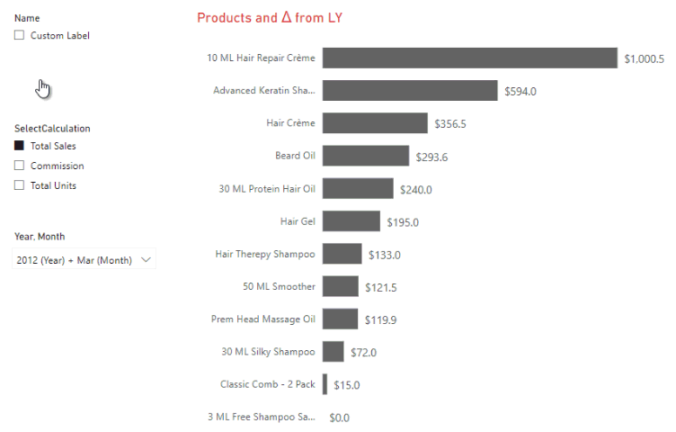
I have a simple horizontal bar graph here that showcases total sales by products.
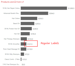
What if I want to add more information on the data labels on this graph?
Something like this.
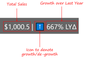
If you look closely, the label is formed in 3 parts
- Part 1 – Total Sales / Total Units / Commission (as per User Selection)
- Part 2 – Icon that denotes growth / de-growth over Last Year
- Part 3 – Percentage increase or decrease over Last Year
To create such a label we’ll use Tabular Editor because it exposes the ability to write custom DAX to format our calculations.
Let's head over to our Tabular Editor and perform these 4 steps.
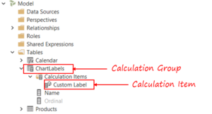
1. Create a Calculation Group – Right click on the Tables and create a new calculation group – 'ChartLabel'
2. Create Calculation Item – Under ChartLabel create a Calculation Item – 'Custom Label'
3. Then write an expression for the Custom Label in the Expression Editor window as
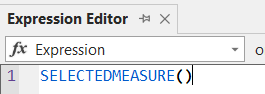
This expression simply returns whatever is calculation the user has selected in the slicer – Total Sales, Total Units or Commission.
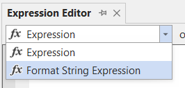
4. Finally switch to format string expression to write some custom DAX.
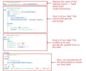
Our formatting calculation is divided into 4 broad parts:
#1 Calculate Metric – The variable CurrentMeasure returns the value of the user selected measure.
-- Calculate Metric --
VAR  CurrentMeasure = SELECTEDMEASURE()
#2 Calculate Growth – Pretty straight forward Growth over LY logic
-- Calculate Growth --
VAR  GrowthCalc =
    VAR  CurrYear = SELECTEDMEASURE()
    VAR  LasYear =
    CALCULATE(
        SELECTEDMEASURE(),
        SAMEPERIODLASTYEAR( 'Calendar'[Date] )
    )
    RETURN
    IF(
        CurrYear && LasYear,
        DIVIDE( CurrYear, lasyear ) - 1
    )
#3 Calculate Icon – Simple Switch Case will do the trick.
-- Calculate Icon --
VAR  Icon =
SWITCH(
    TRUE(),
    GrowthCalc < 0, '🔻',
    GrowthCalc > 0, '⬆️',
    GrowthCalc = BLANK(), ''
)
#4 Combine all 3 – I have simply concatenated all the 3 parts here to display the final Label
-- Combine all 3 --
'''' &
FORMAT(
    CurrentMeasure,
    SELECTEDMEASUREFORMATSTRING()
) & ' | ' &
Icon & ' ' &
FORMAT( IF( GrowthCalc, GrowthCalc, 'NA' ), '0% LYΔ' )
-
- Once Calculation Group is created, save it and refresh your Power BI Model.
- A new ChartLabel table will appear with one Calculation Item.
- Create a slicer on that and enjoy the new Data Label experience.
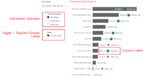
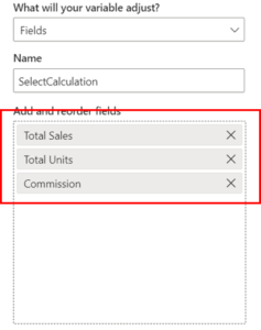
#2 A slicer to toggle between Measures (using Fields Parameters)
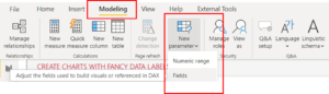
To create a new Fields Parameter, go to Modeling >> New Parameter >> Fields.
Our fields parameter will have Total Sales, Total Units and Commission.
Now that we have our custom label and fields parameter ready, the only thing that remains is to ensure they interact with one another. To do this we simply drop the fields parameter in the X-Axis of our visual and we are done!
More on Power BI
- Getting Started with Calculation Groups in Power BI
- Select a Measure using a Slicer and Calculation Groups
- Custom made Heat Maps using DAX!
- Highlight Missed Targets in a Line Chart