I am dedicating this post to my girlfriend who has taken a “Work From Home” on Monday. We certainly are not going to talk about how much “work” happens from home versus Office. That’s none of my specialization, my specialization is to teach you the following
- How to Add a Direct Legend to the Chart (See the Label of the Line – Work From Home/Office)
- How to work on Excel and still make your girlfriend happy 😉 Just kidding !! I suck at it
Shall we get started? We’ll take less than 5 mins 🙂
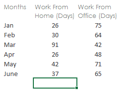
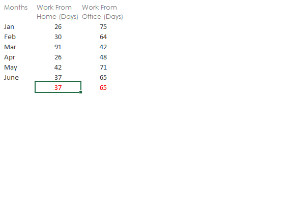
Think of this Data
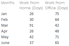
Employees in a particular office either work from home, office or from client’s location and we want to do 2 things
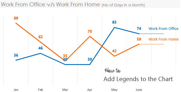
- Plot the number of days worked from Home or Office on a Line Chart. Well that is so simple!
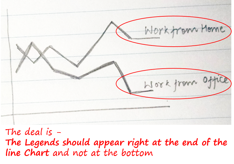
- We also want the Legends to appear in the Chart where the line ends
Step 1 – Add a Dummy
How will this dummy help ?
- Notice that we have a straight line after line chart ends, on top of line the legends appear
- So if have a dummy value that is same as the last number, that will produce a straight line in the Chart
Step 2 – Custom Format the Dummy
Think for a moment..
- Although we want a straight line at the end but we certainly don’t want 35 or 65 to be labeled on top of that
- Instead we want the line to be labeled as Work from Home or Office ! Correct?
Now that is possible with Custom Formatting. [Read an entire post on Custom Formatting in case you are new to it]
Custom Format the Cell which Contains 35
- Press Ctrl + 1 to open the Format Cells Box
- Go to Custom and put “Work from Home” (in double quotes) by replacing General
Custom Format the Cell which Contains 65
- Press Ctrl + 1 to open the Format Cells Box
- Go to Custom and put “Work from Office” (in double quotes) by replacing General
Although the dummy cells still contain the values 35 and 65 but we have custom formatted them to “display” Work from Home / Office … Smart isn’t it ? 😎
Step 3 – Now draw a Line Chart
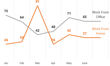
- From the data I have drawn the Line Chart and removed the clutter (Horizontal Grids, Axis, Borders etc..)
- Added Data Labels. Notice the Data Labels are picking up custom formatted values which are appearing as direct legends. Which exactly what we wanted !
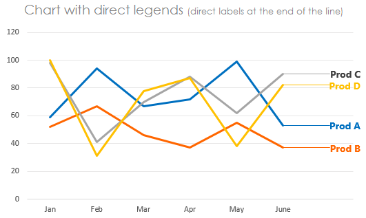
Why should you prefer Direct Legends ?
You can self answer this question
Which Chart is easier to read ?
Versus
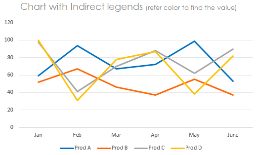
Direct Legends are easier to read and faster to interpret
I would love to hear what you think about direct legends in Charts, share your thoughts in comments below
Download the Workbook from Down Below – How to Add Legends to the Chart
More awesome Charts
- Add a Total Bubble at end of the Line Chart
- Add Total to the Stacked Column Chart
- How to draw a Dynamic Check Button Chart