Mostly people have witness a landscape slide orientation but there is a lot more to it. In this post I am going to talk about how can you change slide orientation (from landscape to portrait) including which ones are the best suited for various purposes!
Let’s get started!
What is a Slide Orientation ?
A slide orientation is basically its structure i.e. Portrait (more height) or Landscape (more width)

PowerPoint allows you to change the orientation of the slide and even the slide size
How can you Change the Orientation ?
The way you can change it in PowerPoint 2007 or 2010 is slightly different from PowerPoint 2013
1. In PowerPoint 2007 or 2010
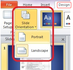
- In the Design Tab
- You’ll find a Slide Orientation drop down
- You can choose either Portrait or Landscape
Go to the Page Setup Option (next to Slide Orientation) to customise the orientation
2. In PowerPoint 2013
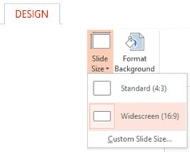
- Again the Design Tab
- Slide Size (drop down on the extreme right)
- Go to Custom Slide Size (I guess no body was choosing the Portrait option so they placed it under Custom Slide Size)
- I’ll talk about the options : Standard( (4:3) and Widescreen (16:9) in a while
Which ones are the best suited orientations ?
When you click on Customize Slide Size in the Slide Size drop down (PowerPoint 2013) you get an option to choose the slide size and its orientation
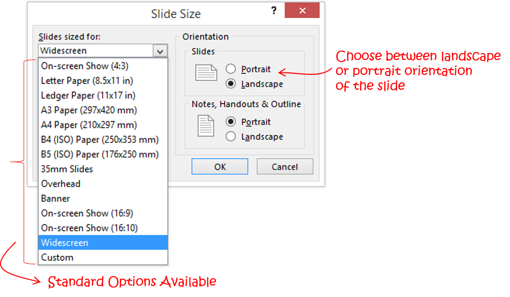
PowerPoint 2010 and PowerPoint 2013 have added new orientation features for landscape slides. Let’s do a quick review and their best suited applications!
(4:3) Standard / On Screen Show
This is the default orientation available in PowerPoint 2007 and 2010 and is typically of the size 25.4 cms (width) by 19.05 cms (height)
This is how it looks in different Modes
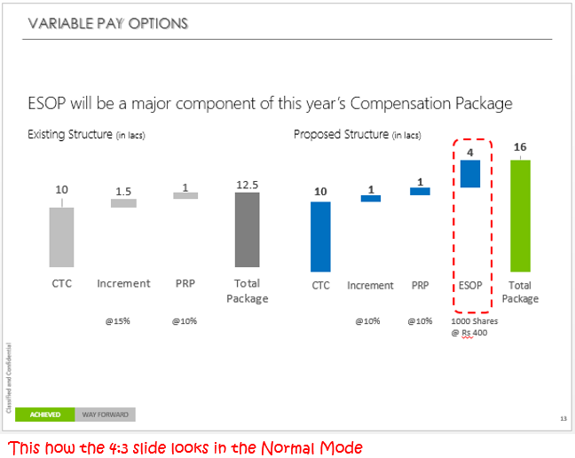
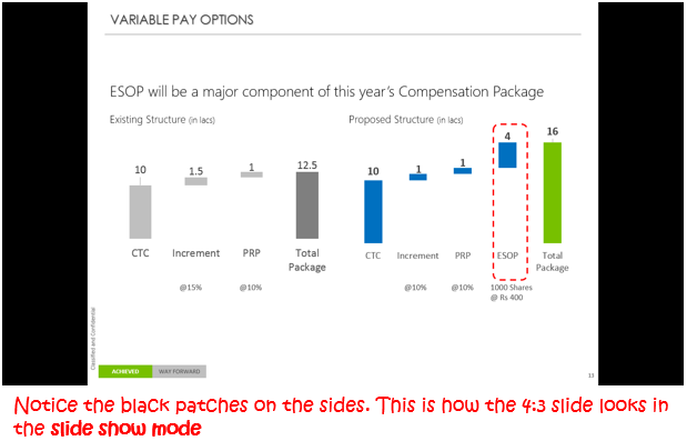
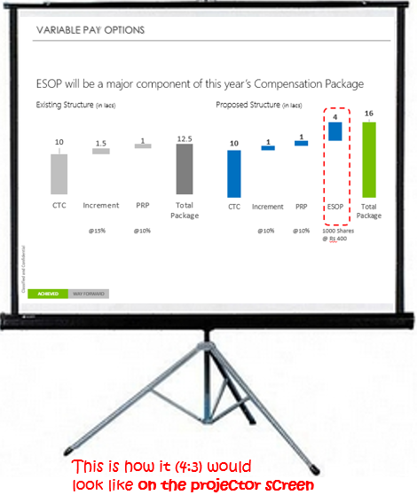
In the current day most projectors available in the market have a 4:3 display (at least in India), so when the slide is put on to the projector the black patches disappear (which you saw in slide show view)
But the truth about 4:3 slide is that a lot of side space is wasted (again recall the black patches) which is why I refrain from using the 4:3 orientation so that I can get more space real estate on the slide
(16:9) Widescreen View
This is the default slide size available in PowerPoint 2013 which is 33.867 cms (width) by 19.05 cms (height). Do not confuse between Widescreen View (I am talking about) and the On-Screen Show 16:9 (in the list). They both product different slide size
The greatest advantage (to me) by using this slide size is that I get more space while working on the wide screen view, so more content without slide congestion!
Here is how it looks in different views
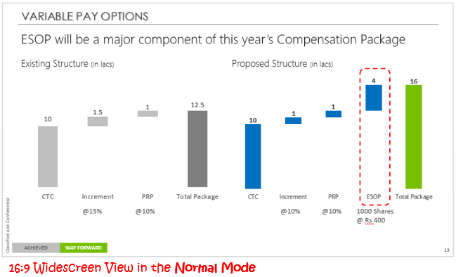
Notice that the slide is more wider, allowing more space to work! Which is awesome and I use this orientation all the time 😎
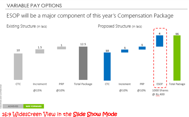
Since the screen is in the ratio of 16:9 in the slide show mode. The slides made in widescreen size fit perfectly in the slide show mode leaving no black patches (like it makes in 4:3 slide show mode)
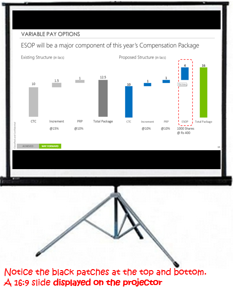
Notice the black patches (at the top and the bottom) and this is because most companies in India do not use the wide screen projector which adjusts to 16:9 slide size
Despite the patches, I still use widescreen format for my slides because it gives me more space and the projectors will sooner or later will adapt to 16:9 projection!
There is one thing that I want you to keep in mind, since the slide resizes between the black patches you might want to reconsider the legibility of the font size and objects in the presentation so that despite the black patches it should look just as good!!
Portrait Orientation (A4, A3, A1 etc)
Whenever I want to do some creative work or even sometimes write a book on Excel or PowerPoint Presentations I use the Portrait A4 format
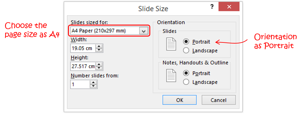
Although I have not seen or projected the slides in A4 portrait format so I will not talk about that, but there is one more (and final) thing that I want to talk about which is maximizing and ensure fit options
Maximize and Ensure Fit options
When you are working in a 16:9 slide size by default and you want to change to let’s say 4:3 slide. PowerPoint gives you a notification about Maximize and Ensure Fit options. Let’s explore this
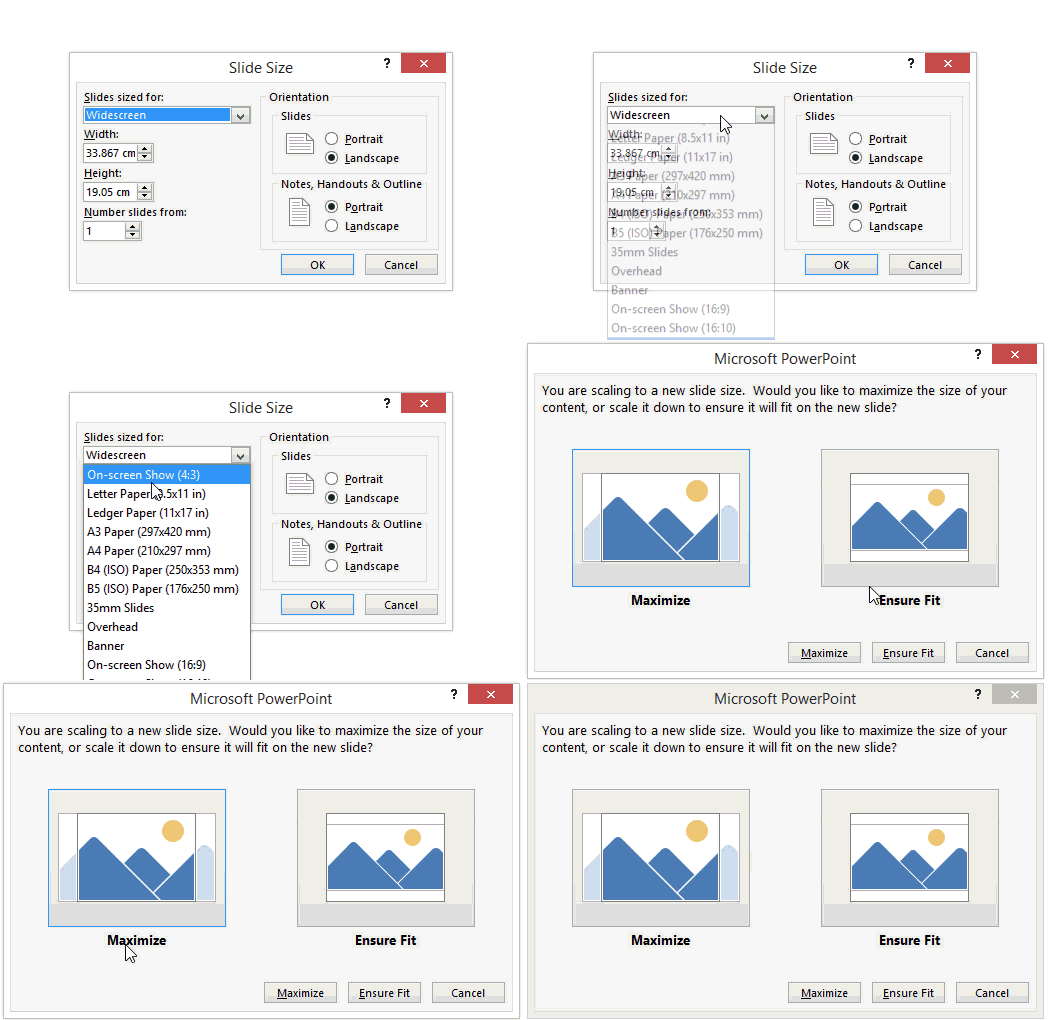
Maximize – If you choose Maximize then your slide will reduce in dimensions (i.e. 4:3) but you content (picutres, logos, object) may spill outslide the slide. In other words the maximize option does not adjust the size of objects according to the resized slide
You may have to do some mannual work to bring the content back into shape in a smaller slide but that is safe because I don’t want powerpoint to abrupty reshape my picture and distort my figure 😛 😆
Ensure Fit – Pretty clear from the words. This options ensures that your content (pictures, text, logos or whatever) automatically fits into the new slide dimensions
Which is good but quite dangerous because you don’t want to resize the logs or pictures without adhereing to their aspect ratio. So I would suggest refrain from using this. Also you can do a Ctrl+Z (undo) if things have gone bad
More on Building Killer Presentations
- How to use action buttons in your slide
- How to make Interactive slides
- Some awesome animation techniques
What slide layout do you use?
Hey do let me know if this info was useful and what slide orientation do you normally use and why? I would love to hear from you
