Okay so what I have for you here is a super awesome time saving technique on creating organisation charts .. but for a change let’s do this the Google way..!
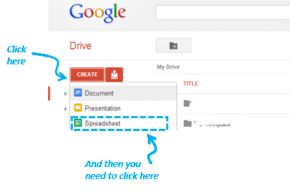
Step 1. Login into your Google account and launch a Google spreadsheet
I am sure you must be having a google account. In case you don’t, you can get it here. Login into google docs and launch a spreadsheet. If you feel lazy to put in the dummy data, you can use mine
Launching a Spreadsheet (a snapshot)

Step 2. Insert the Org Chart
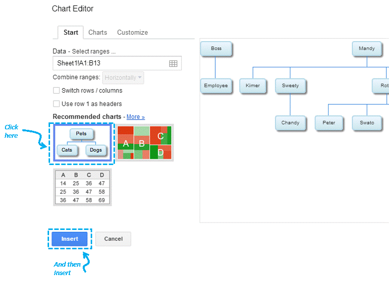
Simply pick the ‘Insert Chart’ Option from the toolbar and create an organisation chart

In the Chart Editor – Insert the Org Chart

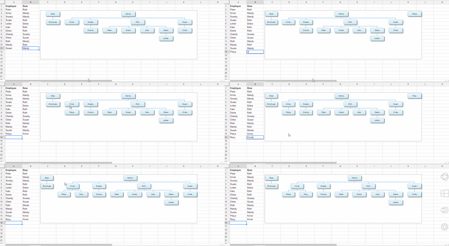
Step 3. Enjoy the Chart (Add/Edit Data)
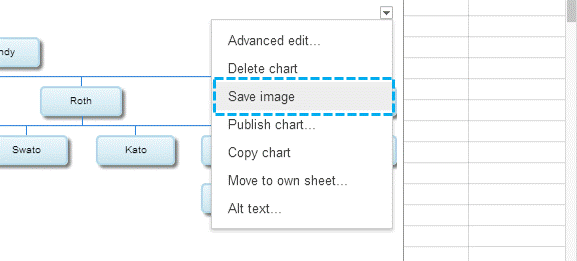
Now you can add more data in the spreadsheet (and the chart self updates), also the little drop down on the right gives the option of
- Copying the chart as a picture (for your presentations)
- Some bit of formatting options
What I really liked & disliked about this chart
The quick display of the org structure with no hassles, but it lacks
- Extra formatting options (may be to completely blend it with your work), but still not too bad for quick work
- It may not be able to handle complex organisation structures.. like cross functional teams, two managers over an employee… etcetera etcetera
Please tell me your favorite work arounds as an alternative to Excel or PowerPoint..
Take Care 😀

