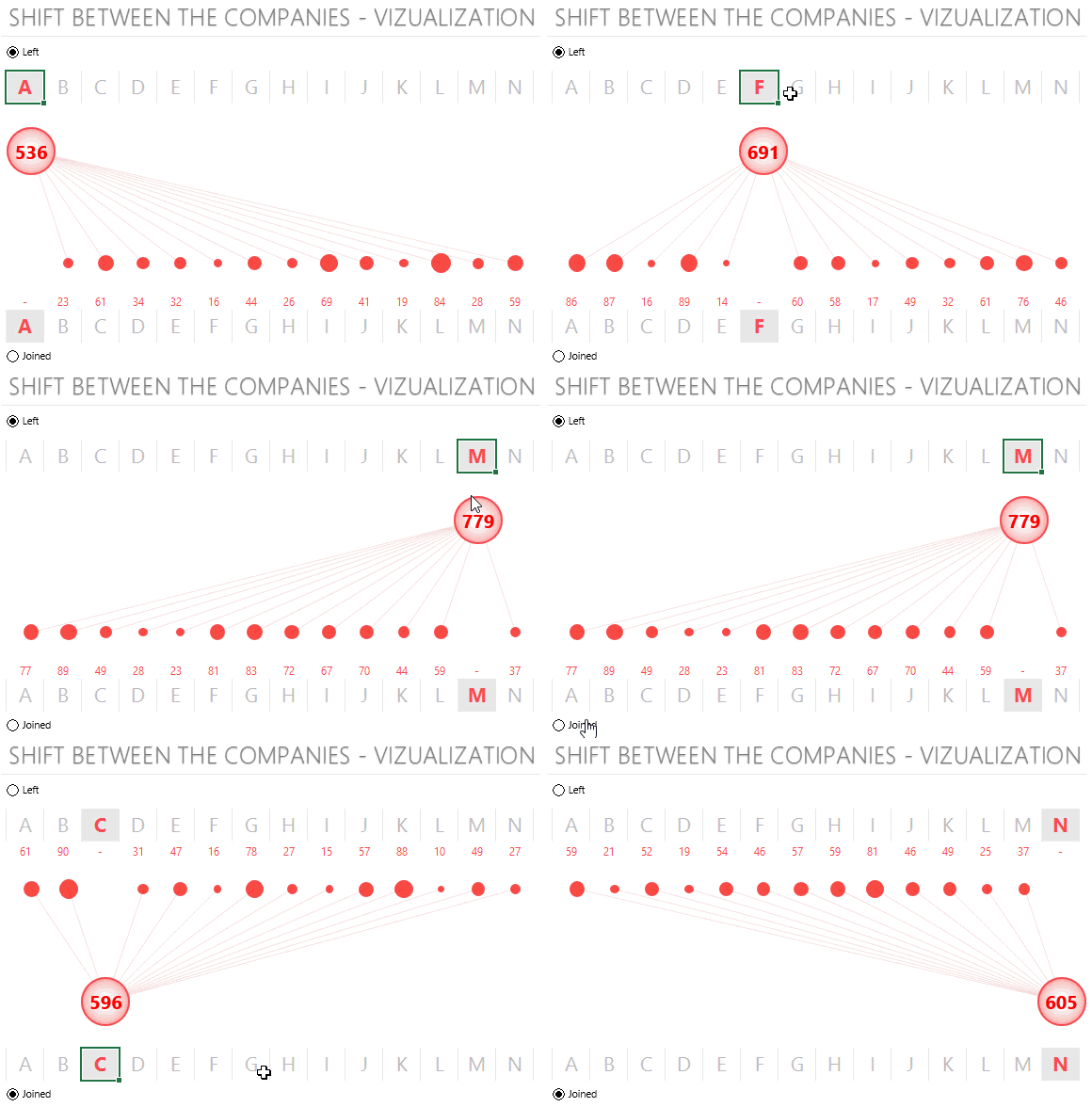
It is amazing how you can you take learning from others and can transform into something unique of your own. Recently I was taking a look at Roberto Mensa’s Dashboard on US State Migration Data, it was so intelligent to see how had he made a beautiful visualization plotting different cities on a Map. The Dashboard also won Chandoo’s recent Dashboard Contest
I came across a similar data where I had to show how people are moving between different companies

DOWNLOAD THIS CHART FROM DOWN BELOW and dissect it to see how have I created it, make sure that you activate macros before you start playing with it
Other out of the Box Vizualizations
- Create a Map Chart – Plot Cities on a Map
- Highlight a Part of a Line Chart
- Bubble Chart with Scrollbars
- DOT Chart in Excel
- Network Relationship Chart from Chandoo
