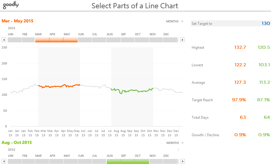
The other day I was gazing at a business metric (a line chart) and I felt the need to just select a part of the line chart and focus on what happened during that time frame.
So I fired up some geeky stuff in Excel and created a chart to do that exact thing! Let’s jump right into it! Interested ?
Let me break down the key elements of this chart and show you how I made it. But that is not the right way to make a chart in real time.
In-fact you should go the opposite..

But for this chart since you already can see the final product, I am going to go reverse and show you how I made it!
Ok, the key elements first!
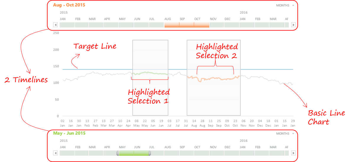
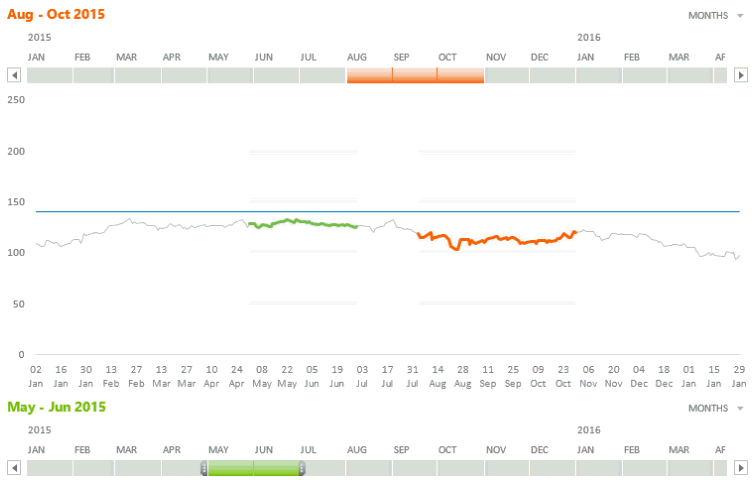
- We need a Line Chart – Standard stuff needs no explanation!
- We need 2 Timelines for time selection
- Two Highlighted Selections : Please note that there are 2 things in the highlighted selection
- The highlighted line
- The bar type structure around the highlighted line
- The Target Line – Not extremely important! Just a fancy thing in case you want to set a target. So just to keep it simple, I am not going to talk about this. You are smart enough to figure this out yourself 😎
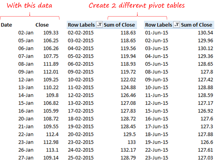
And the of course the Data is right here!
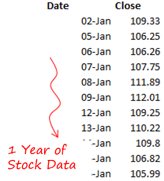
I took 1 year stock data (closing share price) of a random stock. It could be anything for that matter. The key is that we need dates and some number against it!
Make a Simple Line Chart!
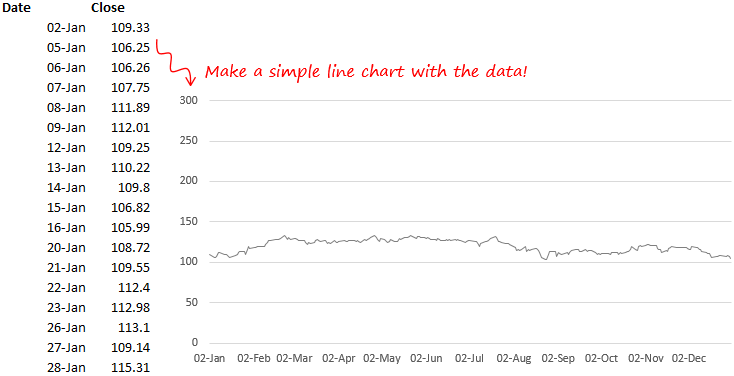
- I used the data and made a line chart
- Also notice that the Y Axis is set to a maximum of 300. This is for a reason and you’ll understand that later!
Let’s Make the Timelines
Step 1 : Create 2 different Pivot Tables with the underlying data
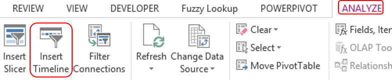
Step 2 : Insert Timelines on each of the Pivot Tables. Go to Analyse Tab and click on Insert Timeline
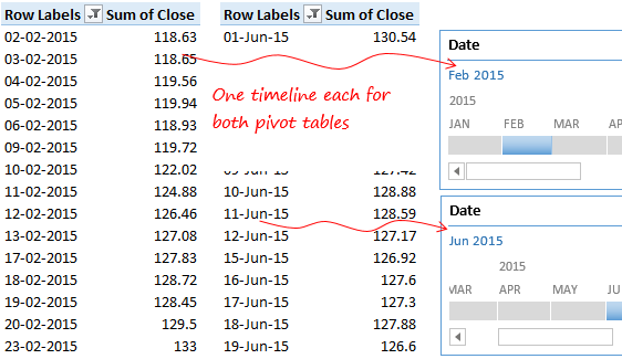
By now dates and closing stock values (in both pivots) are getting filtered as per your selection in the timelines. 2 main items pending as of now!
- We need to highlight the values in the line chart which are filtered by the timelines
- We need a bar type structure around the highlighted line
Here is the Logic (a bit more visually!)

Now that we have the Line Chart ready we need to superimpose our filtered data (from the pivot table) and highlight it! But the question is how will that happen?
Taking the same visualization a bit further
The superimposing happens something like this
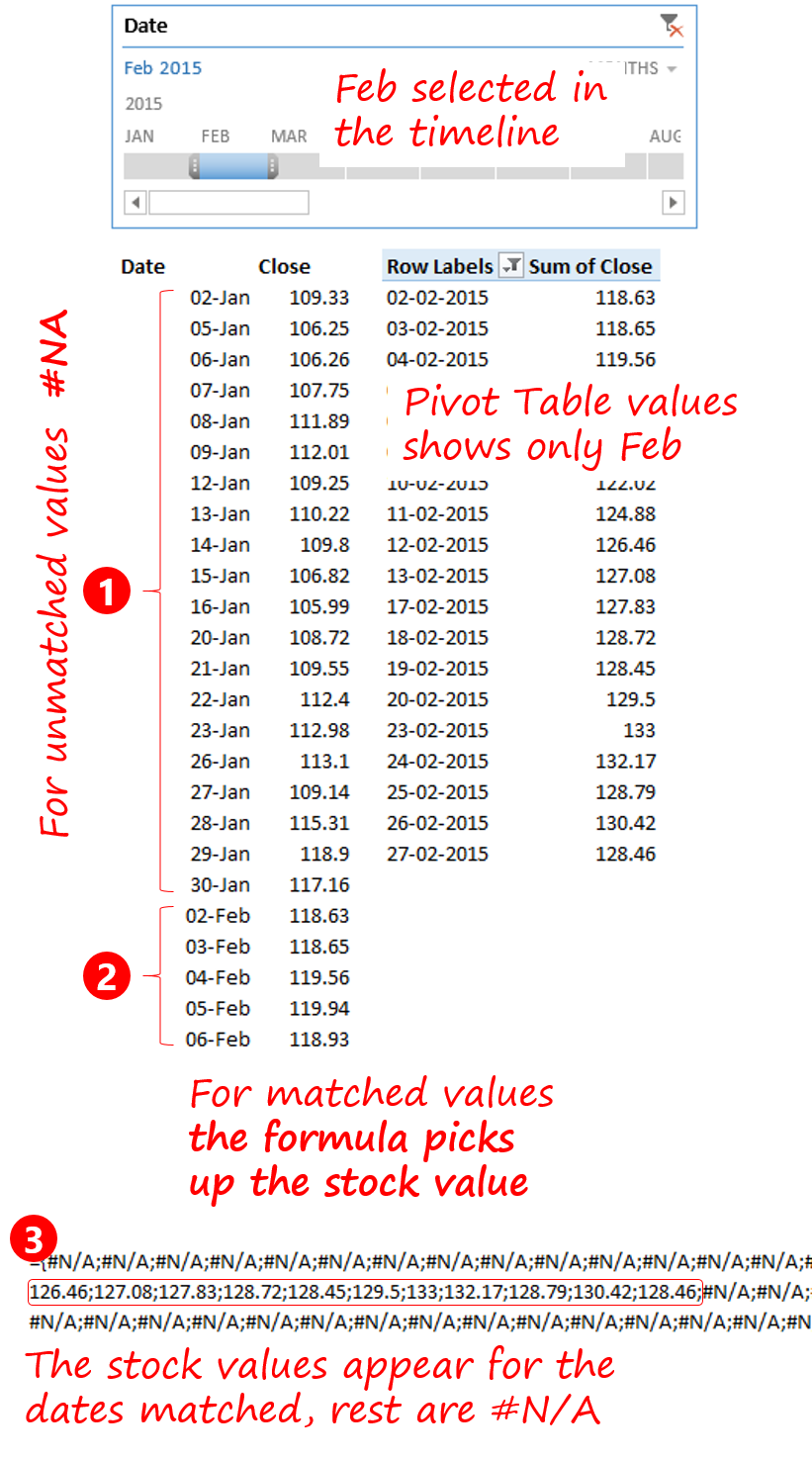
- I take the filtered values from the pivot table and since those values can be anywhere in the middle of the line chart
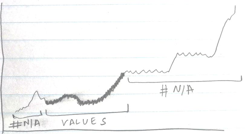
- I need #N/A where the dates don’t match the values filtered in the pivot table and if the values match they need to be highlighted. If you din’t know #NA doesn’t show up in the chart!
Here is the formula for highlighting the filtered data in pivot table
=IF(MATCH(Sheet1!$B$3:$B$254,Sheet1!$F$3:$F$254,0)>0,1,NA())*(Sheet1!$C$3:$C$254)
I am going to take this formula and NAME IT AS “Selection1”. Do not miss this part!
Now let me explain you the text colored in blue in the above formula
- Sheet1!$B$3:$B$254 : Dates Column in Data (1 year dates for stock price)
- Sheet1!$F$3:$F$254 : Column in which Dates are kept in the Pivot Table created
- Sheet1!$C$3:$C$254 : Closing Stock Price Column in Data
What is this formula doing?
I guess it is quite intimidating to look at the formula unless you know what is it doing
- The MATCH function is trying to match all the dates from the pivot table dates. Just to figure out which dates are selected by the timeline
- If the dates match, the IF function will replace the dates with the value 1 and the rest of the dates are converted to #NA
- All 1 values are then multiplied with the stock values to get stock prices for the selected dates
The result of this formula is something like this
Link the Named formula in the Line Chart
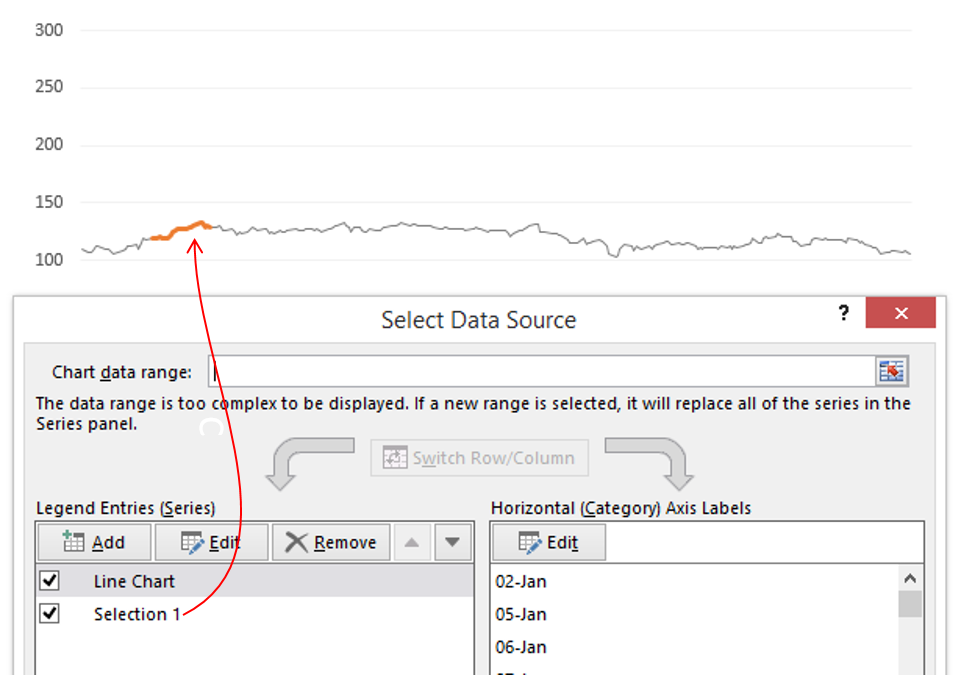
- I have added the named formula (Selection 1) in the Line Chart
- And it starts to highlight only Feb (or whatever is selected in the timeline)
Phew, that was some work! Moving on.. Now we have to make a rectangular (bar shaped) area around the highlighted line
Logic for Highlighted Area
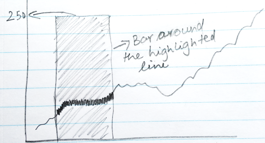
Note a few interesting things
- The width of the bar is the same as the highlighted line. Say Yes!
- The height of the bar is set to 250 (or any reasonable height by which it looks like a bar)
- This is not a bar chart. This is an area chart
Since the highlighted line and the width of bar is the same we can tweak the same formula and set the height to 250
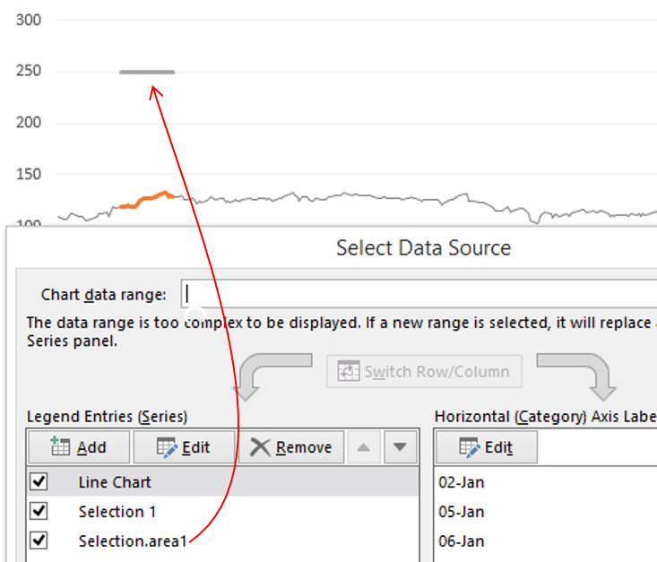
Formula for Bar around the Line Chart
=IF(MATCH(Sheet1!$B$3:$B$273,Sheet1!$F$3:$F$104,0)>0,250,NA())
All we are saying is that
- If the dates match, set the value are 250
- Else #N/A
Name this formula as Selection.area1 Again don’t miss this part
Just like the highlighted line, we will add the named formula (Selection.area1) into the line chart. You’ll see a flat line at 250 level.
Now all you have got to do is to convert this flat line into an area chart and it starts to look something like this
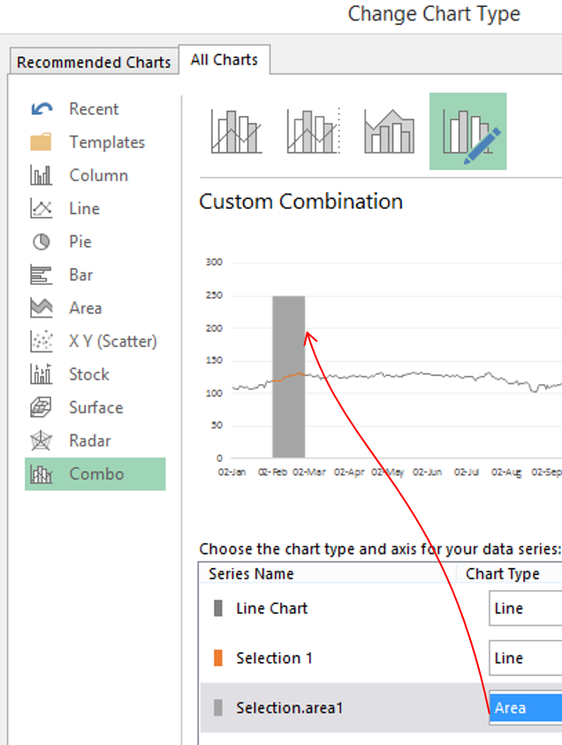
Voila!! We are almost there!
A few things still remain, which I guess if you have gotten so far, you can manage it on your own
- Formatting the pile of stuff that we have created!
- Making the second highlighted line and the bar around it. It is exactly the same, the only difference is that both formulas (for highlighted line and bar) will now be linked to the second pivot table, since our 2nd timeline is linked there!
Now there should definitely be some analytics for the selected portion so on the right side of the chart I have crunched a few numbers
By now if you are wracking your head, I totally get it. This is not a simple chart to make but the result is beautiful!
So if you have got stuck mid way and feel that this chart can add charm to your report. Please put down your questions in the comments. I’ll be happy to take you through, till the end!
Other Interesting Line Charts
- Creating Phases in a Line Chart
- Customizing markers in a Line Chart
- Encircle Data Points in a Line Chart
- Vertical Line Chart in Excel
- Adding Direct Legends to a Line Chart
- Adding a total bubble to the Line Chart
- Stock Ticker Line Chart
- Highlighting Max and Min Points in your Line Chart