The Charts in excel are not just restricted to Chart Objects, we can cleverly use formulas to make Charts.. sounds bizarre and interesting? Lets explore this further with one such function
Introducing the REPT function
- What does a REPT function do? It repeats
- Repeats what? What ever text or number, n number of times
=REPT(text, number_times)
- Text is the text or number you want to repeat
- Number_times is the number of times you want to repeat it
- =REPT(“a”,10) will result in aaaaaaaaaa
- =REPT(“CHANDEEP”,2) will result in CHANDEEPCHANDEEP
- =REPT(1,5) will result in 11111
Note that any text that you want to repeat will obviously be wrapped in inverted commas
But the question is, how are we going to get the Chart ?
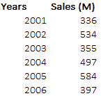
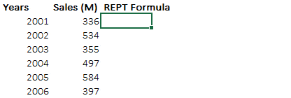
Here is the answer. Let’s say we have some sales data for 5 years for which we want a chart
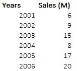
Now here comes the REPT formula
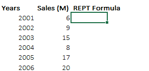 --> Cool isn’t it?
Let’s explore the formula a bit =REPT(“I”,Sales)
- I am repeating the letter “I”
- The number of times of Sales
- Change the font to stick all the “I”s together (Arial Rounded MT Bold)
- And apply bold formatting with blue color. Simple Right?

Adding labels to our Chart
The next but obvious thing is to add labels to the chart, which is as simple as the chart. Check it out
No rocket science
- After the REPT formula, I am just adding a space ” ” with the M letter (Stands for millions)
- And combining all of them with ampersand symbol “&”
What if the sales numbers are larger?
Classic problem! Let’s say we tweak the sales numbers and try to make a chart with REPT function
 --> the sales numbers are much larger
The Problem : If you do =REPT(“I”,Sales) here, the letter “I” will cross the borders of your screen (will be repeated 300+ times) 😆 surely making no sense. We somehow need to contain repetitions to a manageable size
The Solution: Convert the sales into percentages, here is how we do it..
Decoding the formula
- We start with the usual REPT(“I”
- And then we divide the current year sales by the total of all sales. REPT(“I”,Current Year Sales/SUM(Of All Sales) WHY? because that is going to give us the percentage of the current year sales over the total sales
- We then multiply that percentage by 100. REPT(“I”,Current Year Sales/SUM(Of All Sales)*100) WHY because % is a number less than 1 so eventually no “I” letter will be repeated so we multiply it with a manageable number like 100
- Just do the last step of adding labels too, just as the way we did it earlier.. please?
Download the Chart from Down Below and try your hand
The Pros and The Cons
I really like these charts for a bunch of reasons
- Awesome space management. Unlike the regular charts each bar here can easily fit in the bounds of a single cell
- Quick formatting. Since there are less objects to manage here, all you need is to change the font and the color and you are good to go!
Some downsides too
- Not very customizable – Apart from the color and font, there aren’t really a lot of formatting options available
- Formulas can become large at times – Sometimes to fit the need you may have to wrap them around a whole bucket list of formulas, which can be a pain at times
Liked the idea of REPT function charts?
Share your reviews with me..