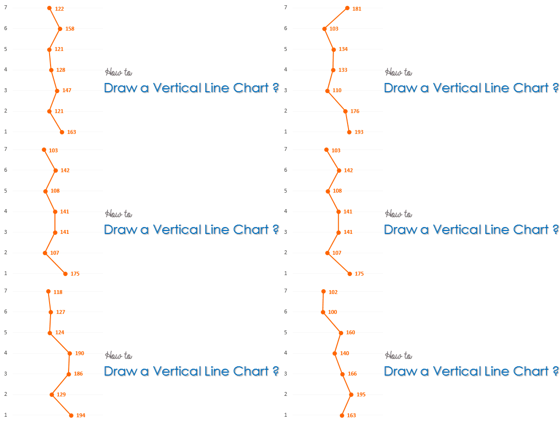
The Horizontal Line Chart is pretty standard stuff! Why don’t we try making a Vertical Line Chart? Well there isn’t a standard vertical line chart in Excel so we’ll tweak some other type of chart to get this done!
Let’s get started..
Assume this Data
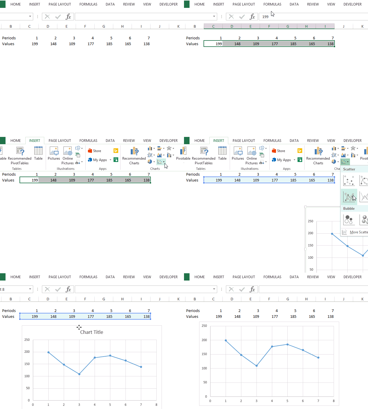
We have 7 periods and some values against them. Instead of a horizontal line chart we want a vertical line chart and to do that we would use a scatter chart with lines and markers
Use Scatter Chart with Lines and Markers
- In the Insert Menu select Scatter Chart
- Then pick up Scatter Chart with Line and Markers
Although this is a line chart but horizontal, let’s make some changes to our chart to make it vertical
Some Changes in our Chart

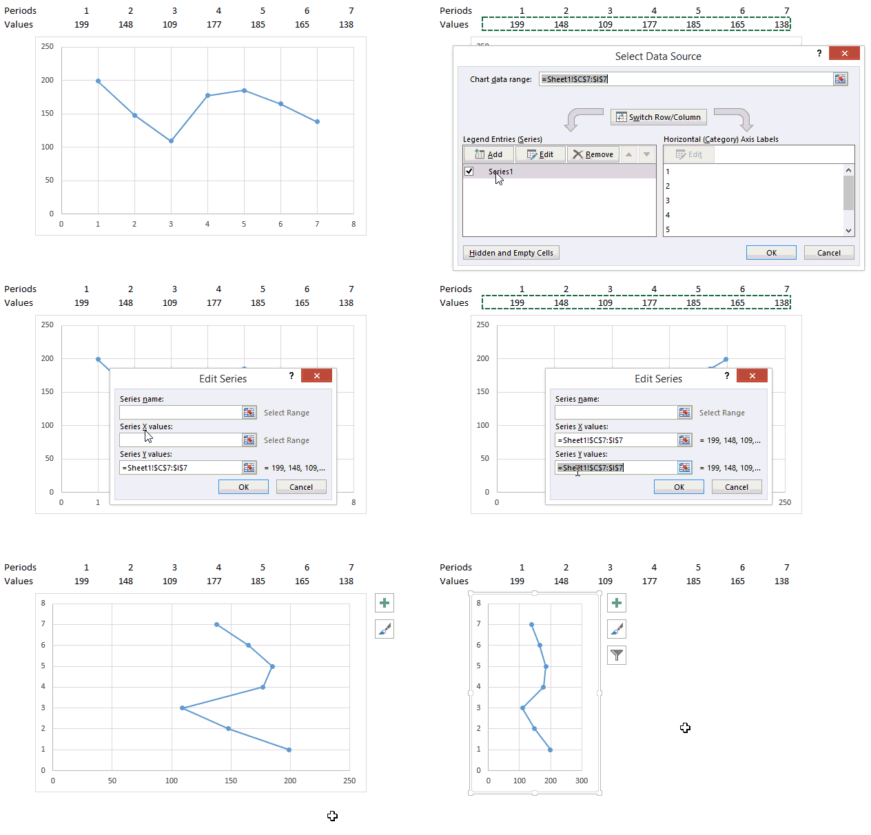
To convert the chart into a vertical line chart, let’s make the following changes
- Click on Select Data (appears in the right click menu)
- Edit the series
- Select the values (from sheet) for the X Axis Values
- Select the periods (from sheet) for the Y Axis Values
- The chart will start to appear as a vertical line chart. Squeeze it a bit
DOWNLOAD THE VERTICAL LINE CHART
With a bit more formatting you are good to go. If you need help regarding basics of charting please refer these 3 charting starters
More Interesting Charts
- Adding Direct Legends to your Chart
- World’s Largest Economies – A revised chart !
- Check button Chart

