If you tired of making obsolete looking Dashboards/Reports then I have 6 awesome (and equally simple) make over tips for you.
We won’t go overboard in decking up our report until it looks horrible and meaning less but just enough to make it classy and beautiful! Let’s get started.. Shall we?
Tip #1 Remove all Clutter
Excel comes with it own User Interface, which is no doubt quite good but is becomes redundant once you are done building your Model, Report or the Dashboard. Let’s take a look at how can we strip the Excel’s Interface to its bare basics
Ribbons
Ribbons eat up a lot of your spreadsheet real estate (how much of space is visible in single screen shot). That could be important when you want to display the chart or dashboard in a single view without giving the user the hassle to scroll down
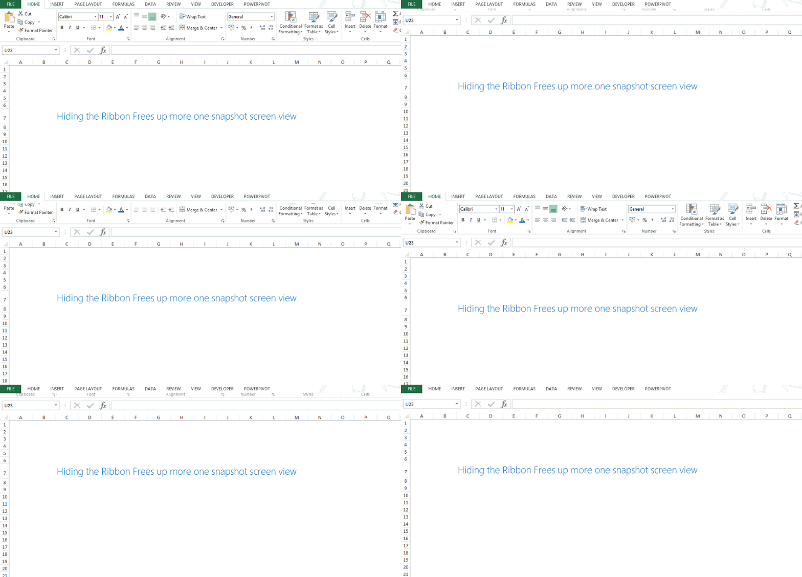
Beauty Tip – Hide it by pressing Ctrl + F1, Don’t worry you can get it back by pressing Ctrl + F1 once again. It works like a toggle and gives you more spreadsheet space
Grids
Gridlines form a criss-cross structure and help to follow along the data in a vertical or horizontal format. There are 3 drawbacks that I can think of straightaway
- Girdlines are by default applied to the entire sheet. So even if you need them on a particular set of data, they are going to be present in the entire sheet, which looks a lot cluttered
- You may require only horizontal or vertical gridlines but excel gives you both so again it adds to the clutter
- Gridlines are not too dark in color but dark enough to clutter your worksheet when data is added
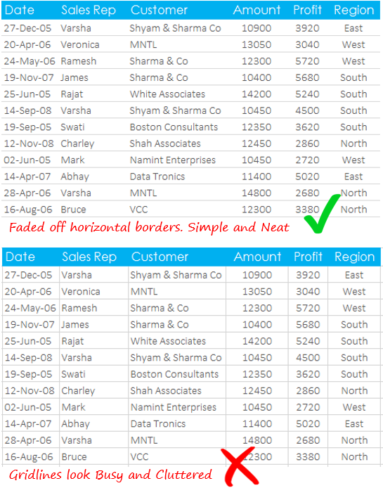
Beauty Tip – Remove the Gridlines from the View Tab
Beauty Tip – Or when you need them draw thin faded off borders only on your data range
Page Tabs, Headings, Scroll bars and Formula Bar
When you really want to squeeze-in the last drop of space available, Excel allows you to even hide elements like Page Tabs, Headings, Scroll Bars and Formula Bar. Head over to hiding tips in Excel to read how to hide these
Beauty Tip – It is advisable to hide these elements when you need more working space. Just make sure that none of these are needed to view/edit or work with your Dashboard or Report. Rest is ok!
Tip #2 Hide extra Rows and Columns
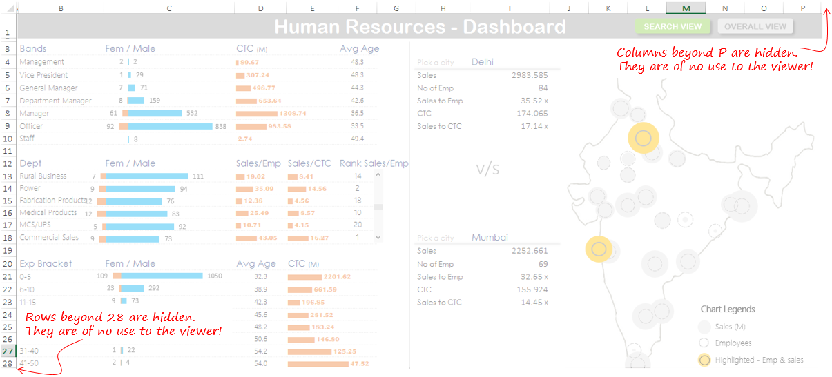
I personally do this all the time. It is a very good habit to hide extra rows and columns that are not needed to be seen by the user. This way your report looks tightly packed and gives a customized User Interface by showing only what is needed.
Think of your favorite car where all the engineering is packed tightly under the hood! You don’t need to see it for a pleasurable driving experience! In a similar way our engineering is in the spreadsheet cells and must be hidden if not relevant for the user
In this HR Dashboard I have hidden most of the clutter including grids, page tabs and also the extra rows and columns
Beauty Tip – Hide the extra Rows and Column. Press Ctrl + 9 to hide Rows an Ctrl + 0 to hide Columns
Tip #3 Customized Scroll bars
By just removing the clutter you can go a long way in making your spreadsheet report look stunning but let go the extra mile. This tip is again a way in which you can optimize space.
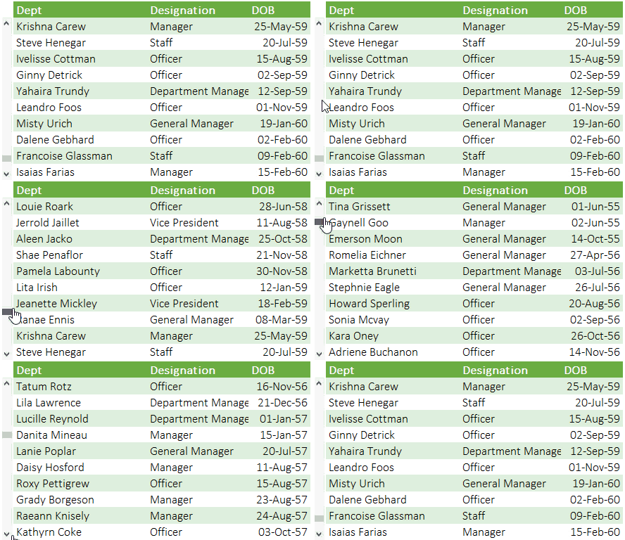
Think for a moment you have 30+ Departments which will take 30 rows but what if you have only 5 or 10 rows to present all this data. Just make a customized scrolling list. This ensures that your data is tightly packed within the given set of Rows
Tip #4 Add Page Tab like Buttons
This is a step further to take your Dashboard User Interface to the next level. You can use simple shapes (like curved rectangles) to draw customized buttons for any particular actions. I have two examples here
1. Page Tab Like Buttons
You can make make page tab like buttons to indicate the user to move to the next sheet (or a different working area). These look more intuitive than the sheet tabs
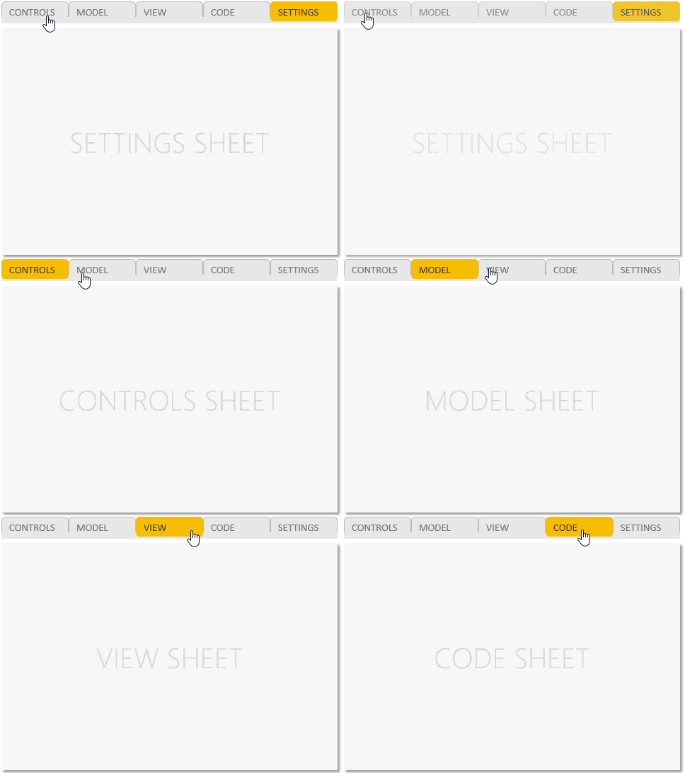
Download Customized Page Tabs file here from down below
2. Buttons to link your Macros
In the same way you can also create single buttons to run Macros, again they are a great way in which you can customize your Dashboards or Models. These buttons also invoke the user to take action. Here is how you do it
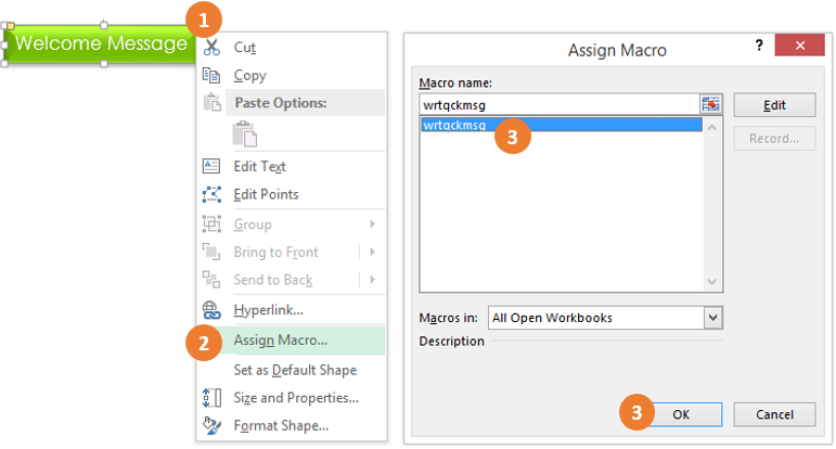
- Right Click on the Shape
- Choose Assign Macro Option / You can also choose Hyperlink to link it to some other Sheet or any other cell
- Select the Macro
- Ok and Done!
Take a look at how I have linked a short macro to a button, when clicked displays a welcome message
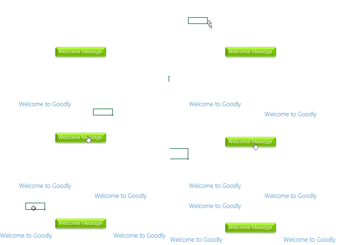
Download this File from down below
Tip #5 Use Form Controls
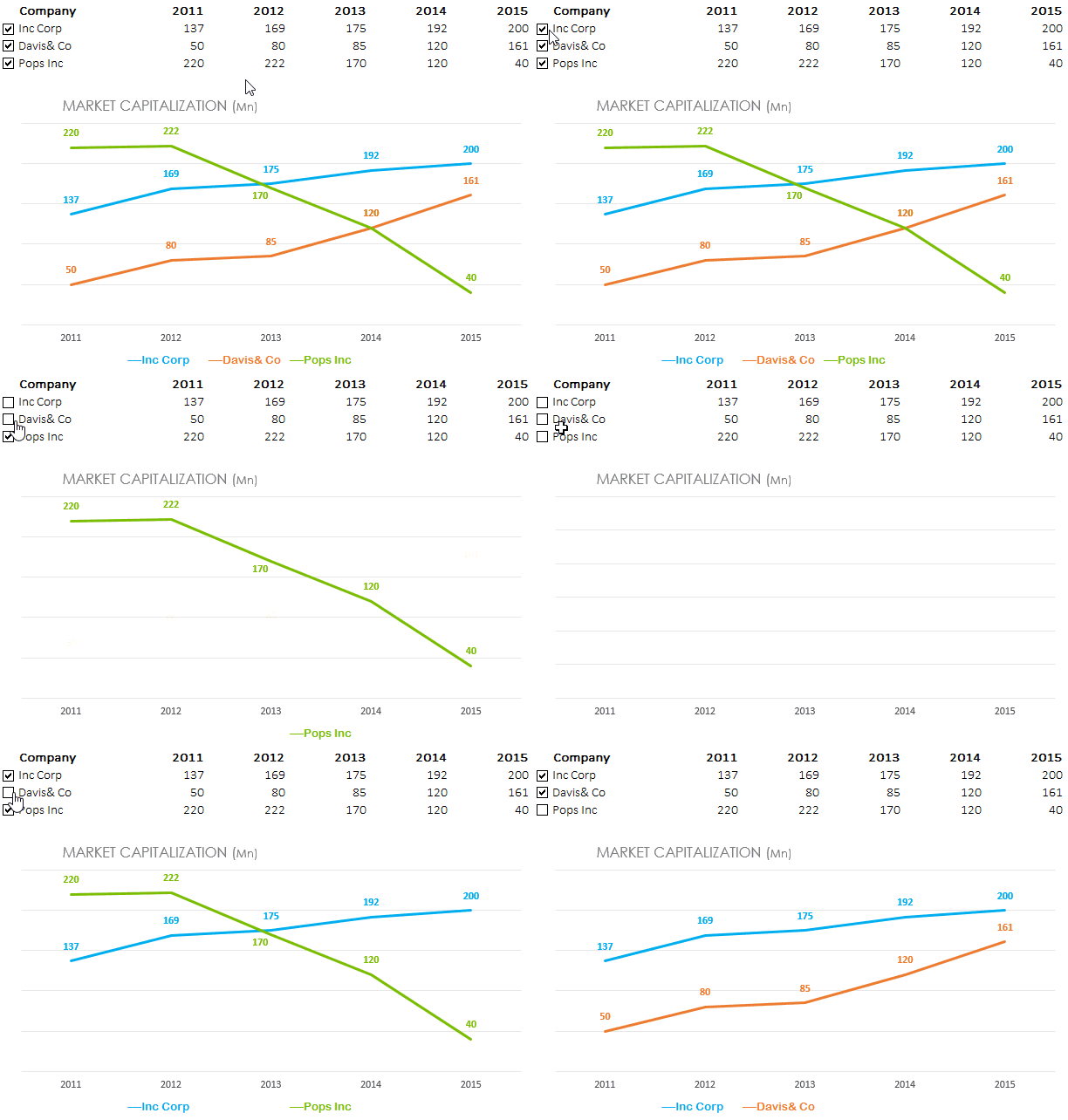
Form Controls allow the user to talk to the Model or the Dashboard. Form Controls are simple to use, they look stunning and allow you to build interactivity in your Dashboard. To access form controls you would have to activate the Developer Tab in Excel
Here is an example of a Check Button From Control used in a Chart to build Interactivity
Tip #6 Smart Legends for Charts
Although Excel has come a long way in improving the look and feed of the chart legends, but there is a lot you can do and customize them your way. Take a look at the customized legends for this chart which also display the average number over 5 years
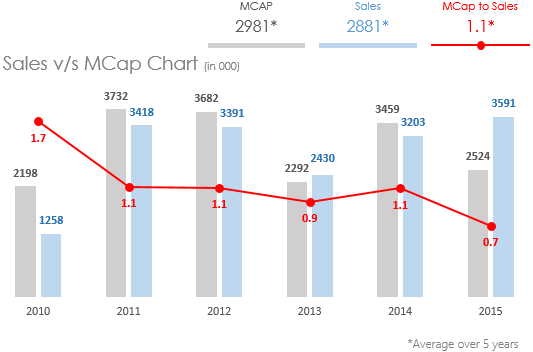
Download Customized Legends Chart from Down Below
What are your Beauty Tips ?
I have been using these techniques to deck up my Reports and Dashboards. What are your favorite tips to add the oomph factor to your Dashboard. Please put down your views in the comments
