Today, I am going to give you some killer formatting tips to make your charts look absolutely stunning (you can literally compare them to the best looking girl your office!!). Let’s get started
1. Remove Gridlines and Axis if not necessary
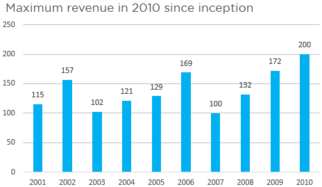
Take a look at this chart and answer the questions?
- What was the revenue in 2003 ?
- Revenue in 2008 ?
- And Revenue in 2010 ?
I guess even the blond can answer these, since the values are straight on top of the bars. So why do you need the axis and gridlines? Remove them if unnecessary
- The purpose of the Axis is to get an approximate value of the bar’s height
- And gridlines help you match the bar height to the axis values
Both these become unnecessary and occupy space when you have data labels
2. Fade off Axis Labels
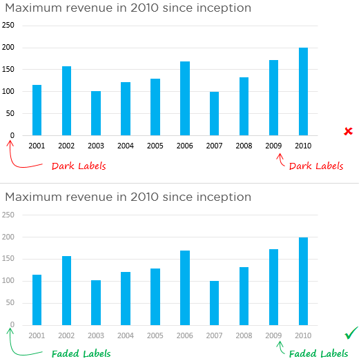
Look at the 2 charts above.
The Faded (lighter colored) label does the job as good as the dark labels. Remember the Axis Labels are just meant to help you understand approximate values for the chart. The darker they are the more attention they will grab, so fade them with grey color
3. Legends are not needed for a single data point
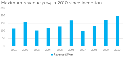
In the Chart above it is pretty evident that the bars show revenue. Why do we need a legend for that when the Chart title is pretty convincing. If your chart has just one data point, remove the legend.
In the newer versions of Excel (13 and above) the legends are taken off automatically in case your charts only have a single data point.
4. Match the color of Data Labels to the Bars/Lines
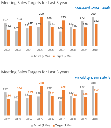
Which of the 2 charts above is easier to read? It becomes incredibly easy to read the chart with matching data labels colors (take a look at the 2nd chart)
5. Align the Axis Labels Properly
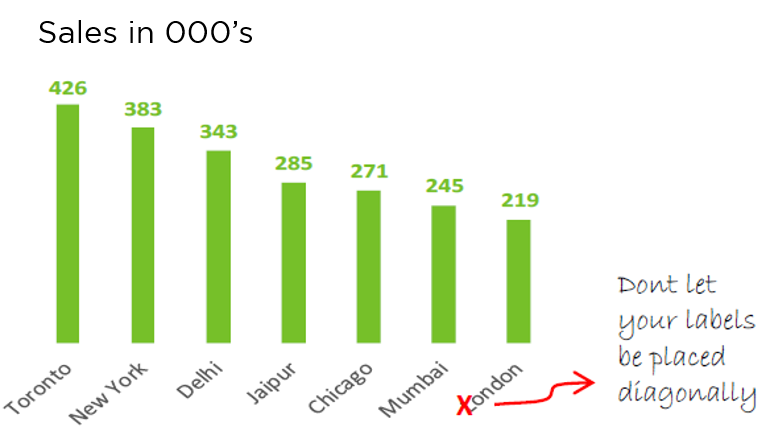
You cannot expect the reader to tilt her neck while reading your chart. That would be awful and too much to expect. So align your Axis Labels to fit Horizontally or Vertically
6. Say NO to unnecessary Borders
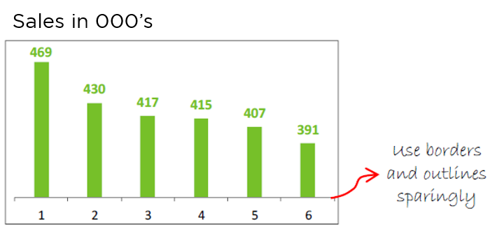
Okay, think about this!
In your living room, do you draw a border outside the edges of the TV on the wall to mark the area for TV? No you don’t.
The reason we use borders and outlines is to group or isolate things from one another. If not needed get rid of unnecessary borders and outlines. It will help you get a cleaner and clutter free chart
7. Write Inference Based Chart Titles
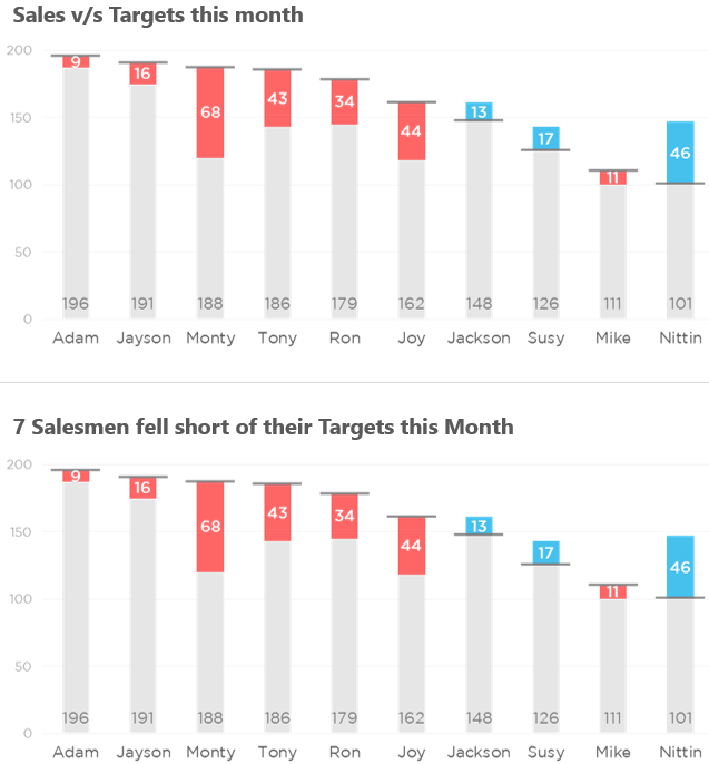
Read the Chart Titles of the both the Charts. The second chart title definitely gives a deeper perspective than the first one. Next time you make a chart make sure that you put a meaningful inference based title to draw deeper meaning out of your chart. It is just 10 seconds of extra work but gets a ton of appreciation, trrrust me!
8. Avoid Indirect Legends
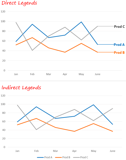
Take a look at the above charts. I guess you would agree with me that Direct Legends are much easier to read and interpret quickly. Here is how you can apply direct legends
While Indirect Legends make it difficult to instantly interpret the data. Try and stick to simple and direct legends as much as possible
Share your best chart formatting practices..
If you have liked any of the above best practice or have your own best practice, please put it down in the comments below. I would love to hear what makes beautiful women envy your charts 😉
Some More Charting Guidelines
- How to Pick up the Right Color for your Chart?
- Quick Tip – Customize Markers in your Chart
- Copy Chart Formats in one Key Stroke
- Create Chart in 1 Key Stroke