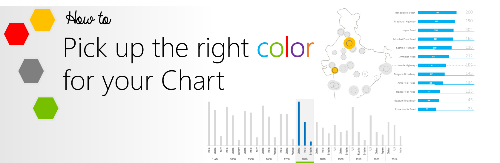
If you have been struggling to get the right mix of colors for your charts and visualizations.. This one is for YOU.
Unfortunately Microsoft’s standard color selection is too lame to get it right the first time.. I am including in here as much as I know about colors to make your charts communicate effectively. Let’s get started!
#1 The Idea is NOT to be too colorful
Yeah you heard me right.. NOT to be too colorful. Colors used for decoration purpose often distract the viewer from the message the chart is suppose to convey
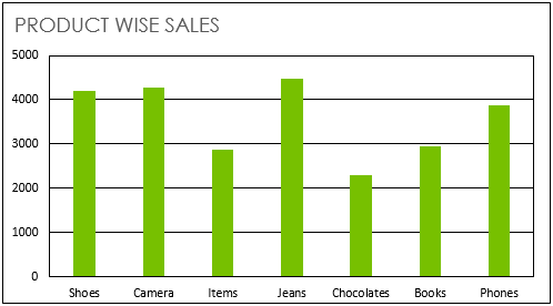
Here is a quick example
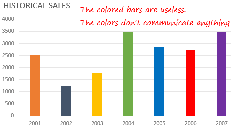
The different bar colors are meant for different years which is absolutely not needed because each bar is labeled with a year (on x axis)
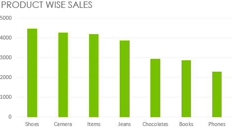
It might look catchy in the beginning but can seriously distract your ability to read the Chart. Take a look a simple bar chart with uniform colors instead
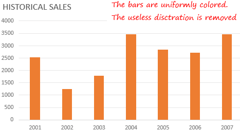
It looks plain and good enough to communicate everything you need!
Learning –
- Use varying colors (3 or less) when absolutely needed to communicate your message and NOT to decorate the Chart
- If you happen to use more than 3 colors, it becomes difficult to pick absolutely contrasting colors to keep them differentiated. A good practice could be to split the chart into 2 or more parts or to make dynamic charts (check here) instead
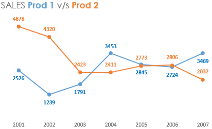
#2 Comparison & Highlighting
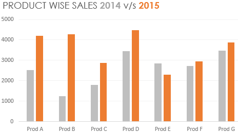
We often use colors to demarcate different data points in a chart. Let’s take an example
Following is a Sales Comparison Chart (Last year v/s Current Year). Assuming that we want to highlight the current year (2015) over the last year (2014)
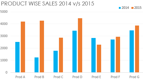
Now this Chart is good enough but there are 2 problems
- For both the years (2015 & 2014) bright colors (Orange & Blue) are used which does not highlight 2015 over 2014. It highlights both of them
- Separate legends have been used which are eating away a bit of space
Here is a good way to fix it using smart colors. Take a look at this chart
- I have used a bright color orange (2015) over light grey (2014) to highlight 2015. It is essential to highlight the focus areas with bright colors and subdue the non focus parts with light color. The human eye focuses over the bright colors more than the light colors
- The legends are also subtly presented in the chart heading with specific color codes
Here is list of colors that you can use in combination for contrasting (highlighting focusing elements over non focusing ones)
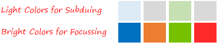
Learning – Use light colors to subdue and bright colors to highlight. This creates focus on the information to be highlighted
#3 Coloring Non Significant (but necessary) Chart Elements
Every chart comes along with its own set of accessories (elements like, Labels, Axis, Grids etc). Those are absolutely necessary to make sense but not important to be focused on
What do you feel about this Chart?
Yeah I know it feels like
- Too Crowded!
- Giving your peace of mind to the one who has made it.. Sorry that is me.. but only to prove my point
Here my point and the revised chart. How do you feel now?
- If you highlight too much the non essential but important elements (axis, axis labels, grid etc) the Chart will look like a crowded market place with nowhere to focus
- Here are a few tips on Non Essential but Important Chart Elements
- Grid-lines – The purpose is to guide you to the axis to map the value, even faded (in light grey) grid-lines would do job as well. So fade them away
- Axis and Axis Labels – The purpose of the axis is to label the bars and provide an estimate of the bar height. Again not too bright but legible (on screen and on print) would do the job just as well. So use medium shade of grey
- Borders and Outlines – The purpose of the border/outlines is to group or separate one thing from another. In most cases they are not needed. If you do feel the need, fade them away
- Data Labels – If you choose to put data labels match them to the color of the bar, it makes them easier to distinguish. (Tip: for lighter colored bars make the labels a bit darker for legibility on screen and on print)
Here is a picture of how data labels should be formatted
Labels are colored according to line color which makes them easier to distinguish
Learning – Use fading (grey color) for non essential chart elements like grids, axis, axis labels etc..
Quick Tip – In the Chart always sort the data in ascending or descending order when dealing with nominal scale
#4 Heat Maps
Heat maps (made with conditional formatting) are a great way to put colors to meaningful use. Lets take a look at two cases
Case 1 – Increasing color Intensity
You can use color intensity to highlight some parts over the rest. Take a look at this Heat Map which depicts Hospitals in 7 countries by 4 Criteria
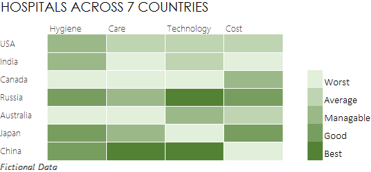
- The dark shade of green instantly catches your eye to focus on the best hospitals in different criteria
- Do not use too many shades otherwise it becomes difficult to differentiate
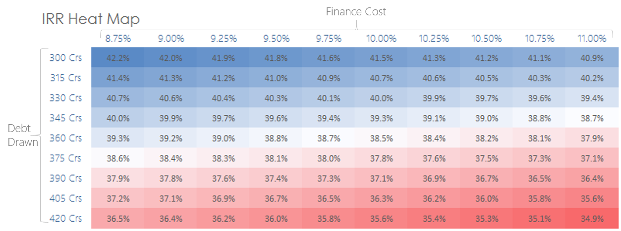
Case 2 – Contrasting Colors over Ranges
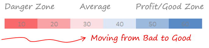
When dealing with ranges (areas) you can use contrasting colors to depict the good area over the bad one. Couple of things to keep in mind
- Use contrasting colors to avoid color confusion (for example Blue and Red are safe)
- Multiple shades (from blue to red) cannot be avoided here and also it is okay to have them, since we are working over ranges (areas) rather than specific data points
- Make sure the meaning of the color is correct (red for danger and blue for safe). It would not be a bad idea to even check for local color interpretation styles for different countries
Here is an IRR Heat Map that shows which are the good areas with high IRRs (in blue) over the bad areas with low IRRs (in red) and the average ones in whiter shade
Learning – Use heat maps (color intensity) to focus on important data points
#5 Match the Chart Color to the Theme
It is often a good practice to match the color of the chart to your Presentation/Document Theme. I have seen this in a lot of documents from Boston Consulting Group (using green) and Bain & Company Reports (using grey and red)
Here is an example
In the above presentation I have used everything as blue and black. There are some benefits of doing it this way
- It shows consistency in the look and feel of your report/presentation. Also it makes it look a hell lot more professional rather than a 4th grader drawing competition
- Keeping consistency also helps consume the information faster and easier
Learning – Matching the Charts/Visualization to the Presentation theme improves readability and consistency
More on Charts
- Turning Raw Data into a Beautiful Visualization
- How I reworked a Chart made by Economist
- Stephen Few’s article on Practical Rules for Using Color in Charts
How do you Color your Charts?
What are your views on choosing colors for charts or do you face any difficulty in picking up the right color for your chart? Don’t hesitate to put down your thoughts or even ask questions