Recently I came across a website that is streaming live Corona Virus data across the Globe. I thought it would interesting to pull it into Power BI and make sense of it.
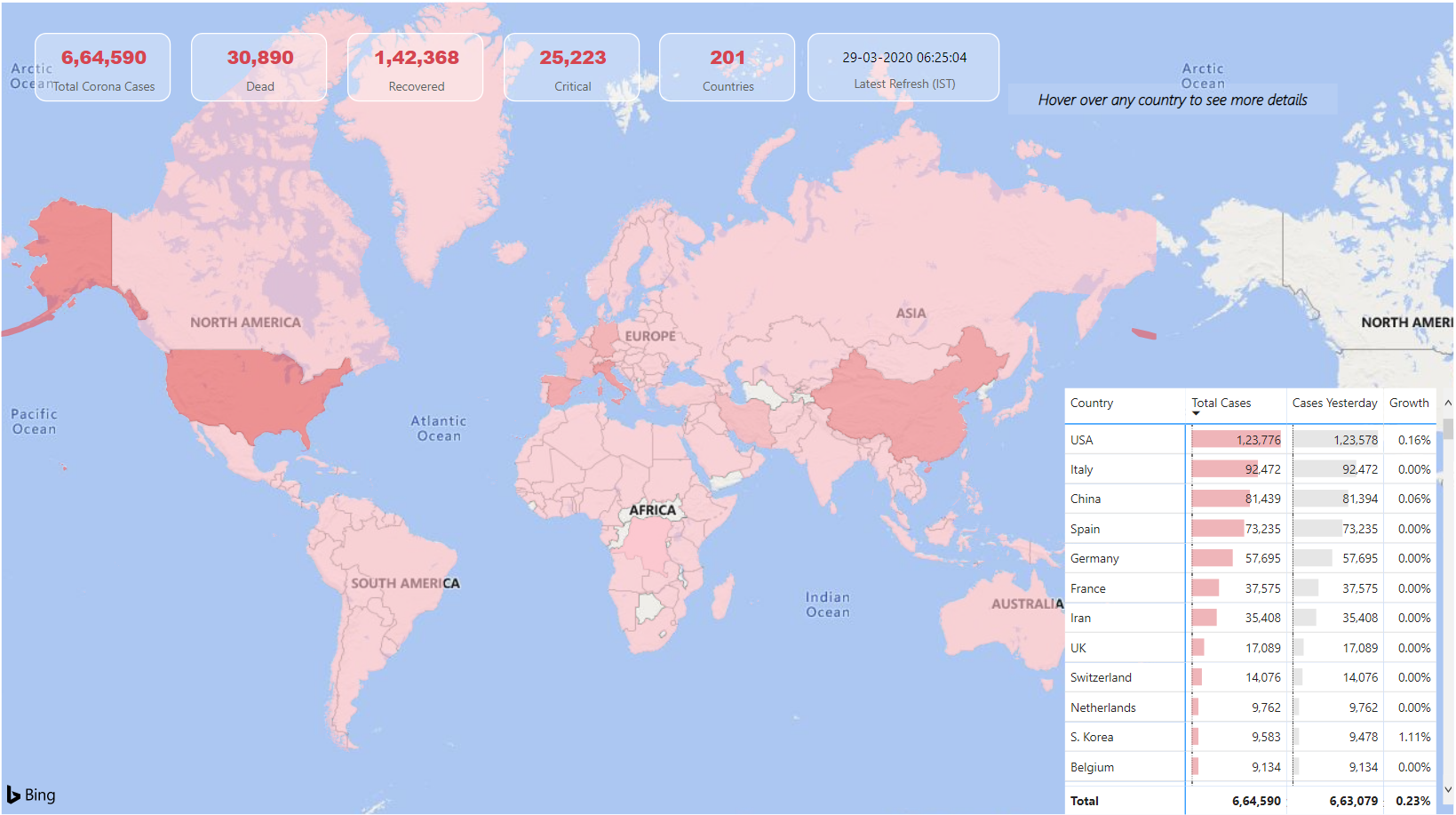
Here is how the Corona Virus Tracker Dashboard looks like..
![]()
- Some Key Stats on the top – Total Cases, Deaths, Last Refresh etc..
- A mouse hover on a country shows more details – Cases, Deaths, Recovered, Key Ranks and Percentages
- Data Source – https://www.worldometers.info/coronavirus/
A Short Video!
If you so wish you can
- Download the Power BI file (Link at the Bottom of the page)- Click Refresh in the Home Tab to see the latest numbers
- Play with the Published Dashboard here
Needless to say that I deem no responsibility for this data and its use. I created this just to educate you about the use of Power BI. Where ever you are.. stay safe!
Updated on 29 March 2020
Since the source data has undergone a few changes I have made quite a few changes in the Dashboard. Here is how it looks now.
More Dashboards on Power BI