A Dynamic Line Chart is very helpful where you’d want the user to have the ability to choose between multiple calculations to display in the visual. In this blog, I will discuss how to create a Dynamic Line Chart in Power BI.
Let’s start.
Video – Dynamic Line Chart in PowerBI
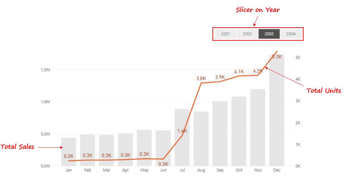
Consider this Line and Clustered Column Chart
The Chart has 2 two data points,
- The Column represents the Total Sales
- The Line represents Total Units Sold.
Now let’s say.. I want the user to select either Commission or Units Sold to display as a Line Value in the above Chart. And based on the selection the line chart should get updated.
In order to make this happen, we need two things.
- A Slicer to select one of the calculations (Commission or Units Sold)
- Connecting the user’s selected calculation to the Line Visual
Let’s see how to tackle each of them..
#1 Creating a Slicer to select between Calculations.
To be able to create a slicer I created a simple Table using the following DAX that contains the list of Calculations / Measures.
Line Chart Measures = { 'Total Units', 'Commission' }
Using the column of this table, I then create a slicer.

#2 Connecting the user’s selected calculation to the Line Visual
I can use a simple SWITCH & SELECTEDVALUE Function to toggle between the user’s selection and perform the calculation selected. Consider this simple DAX Measure
Selected Line =
SWITCH (
    TRUE (),
    SELECTEDVALUE ( 'Line Chart Measures'[Value] ) = 'Total Units', [Total Units],
    SELECTEDVALUE ( 'Line Chart Measures'[Value] ) = 'Commission', [Commission]
)
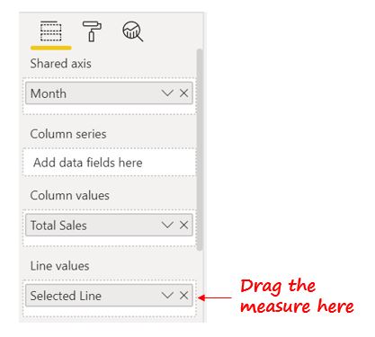
I then drag this measure into Line values of the my Visual.
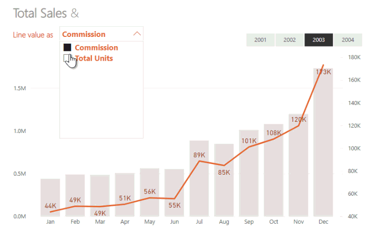
Dynamic Line Chart in Power BI
Now if the user toggles between Commission or Total Units, the relevant calculation is displayed in the Line Chart! Sweet!
A few more Visual Tricks
- Select a Measure using a Slicer
- Switch between Current Year and YTD Calculation
- Show Measures on the Column of a Matrix Visual
- Automatically Set Equal width for a Matrix Visual
- Use Icons in Power BI
- Improve the Look n Feel of your Tables and Matrix Visuals