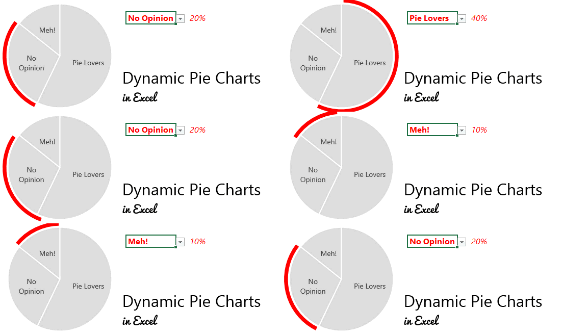
I am sure it has been written over a million times in the excel/charting community that Pie Charts are severely overrated than their actual utility but still people seem to have a heart for them.. at times by their own choice or because of their “pie loving” bosses.
Nonetheless, if you happen to use a pie chart for whatsoever reason, let me teach you how to spice it up i.e. How to Make your Pie Chart Dynamic
Consider this Data..

Nothing great about this data.. but let’s go with this
Here is a quick bite of logic..
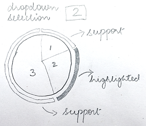
Logic Bite 1 – By now you would have understood that the above chart is the combination of a Pie Chart and Doughnut Chart
Logic Bite 2 –
- Depending on the dropdown the portion of the pie is highlighted using the doughnut chart
- And the other (2 or more) data points in the pie chart are a dummy support to the highlighted value

Doing dummy calculations..
We will need 4 calculations to set up the Chart

Setting up the chart..
- Step 1 – Make a Doughnut Chart using Dummy Calculations
- Step 2 – Add a pie in the same chart using Category and Value data
Formatting the Chart..
- Fill the Pie Chart with the same color and add white borders
- Fill the second (highlighted) series of the doughnut chart with some color, rest of them will be colored as white
- Clean any other clutter in the chart
I would like to credit Roberto’s Site from where I learnt this kick ass technique
Some More Dynamic Charts
- Potting Multiple Projections in a Dynamic Line Chart
- Dynamic Sales Funnel Chart
- Dynamically Add/Remove Labels from a Chart
- Data Validation Drop Down Chart
- Dynamic Dot Chart
