An inappropriate charting anecdote..
I was on a flight to bangalore, gazing people around. The next second, the front row passenger swung his hands behind the head rest!
I felt disgusted – Wondering why? then you probably haven’t clicked on ‘his hands’ link
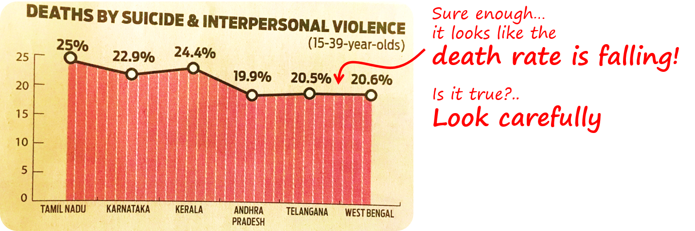
So I grabbed the news paper stuck in front of my seat and I felt even more disgusted. I saw the chart above!
Let’s do some chart talks
Take a good look at this chart..
Could you figure out what is wrong with this chart ?
- At the first glance it feels like a good thing that ‘deaths by suicide rate’ is falling (you’ll feel that way because the line chart establishes a falling trend..)
- But another careful look will tell you that there is no trend because the chart is talking about different Indian States. The horizontal axis has States (nominal axis) and not Time (continuous axis) and time establishes trend
So what could be a Better Chart ?
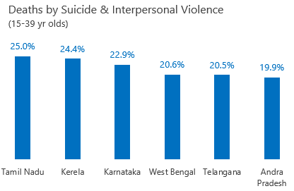
A few changes that I made
- I used a Column Chart because there was no trend across time. Every State was different
- Arranged the data in descending order – which wasn’t done previously
Remember
- Line charts are largely made for Trends (analyzing large time based/continuous data)
- Just because you want to spice up the chart does not mean to pick up an inappropriate chart
More Charting Tips
- Page a Quick Charting Game
- How to Pick up the Right Chart – Guide
- 8 Chart Formatting Fundamentals
- How I revised a Chart from Economist