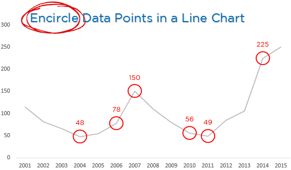
Here is a quick trick to encircle specific data points in your line chart
Let’s start with this data
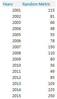
--> 15 years of Random Data
Before we jump on to creating a line chart, lets setup some workings that will help us encircle the data points in the line chart
Creating a Dummy
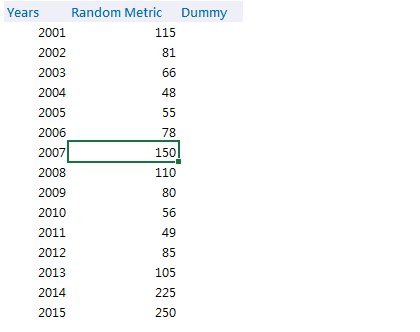
In the column next to Random Data, we are going to create a Dummy
- Select the entire column
- Choose Data Validation from the Data Tab
- Set up a list with 1,0
- This will allow you to create a drop down with 1 and 0 (zero)
The reason : Now think of this dummy as toggle (1,0)
- Selecting 0 would take off the value from the chart
- Selecting 1 would encircle the data point in the chart
Let’s attach the Dummy with the Data
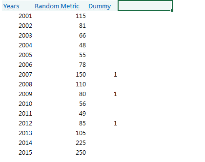
This simple formula will connect the Dummy with the Random Data
=IF(Dummy = 0, NA(), Dummy * Random Data)
The logic is simple : If the Dummy is 0 (or empty) then we want N/A# else we multiply the dummy with the data. Since 1 multiplied by the data point will result in the same number so the dummy works like a toggle
Time for a Line Chart
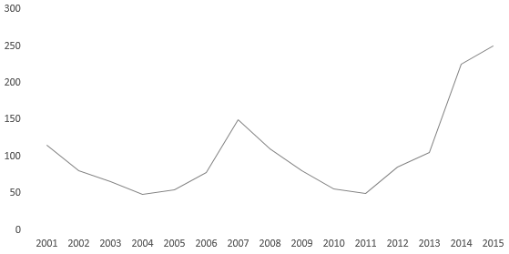
Create a simple line chart with years on the horizontal axis and random metric plotted as a line
Attaching Encircled Points (data) into our Line Chart
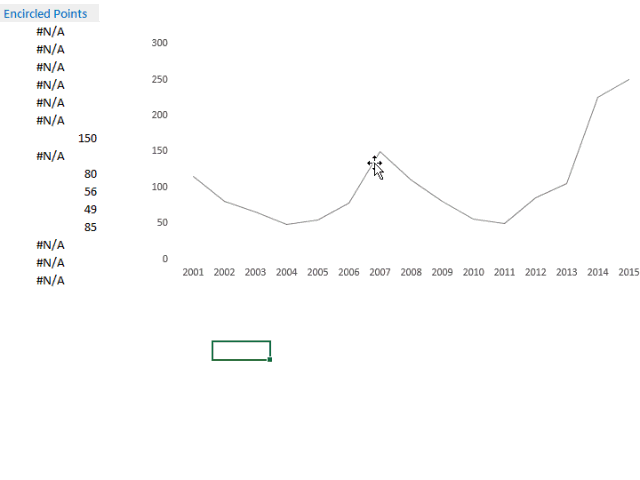
Here are the steps
- Add the Encircled Points Data to the Line Chart
- Change the chart type of Encircled Points Series from a Line Chart to a Line Chart with Markers
- Now remove the line (Show No outline) and retain only the Markers
If you have got till here you know where I am headed! The only thing remaining is customizing the markers to Circles
Customizing the Markers – Dots into Circles
![]() --> Create a circle from Shapes in the Insert Tab. Note a few things
--> Create a circle from Shapes in the Insert Tab. Note a few things
- The size of the circle created will be replicated exactly to the Chart. So create the exact size that you want in your chart. A smaller one!
- The outline color can be any (mine is red), but the inside color has to be none (i.e. No Fill)
Now that we have the circle, all we have to do is to replace the dots with the circles
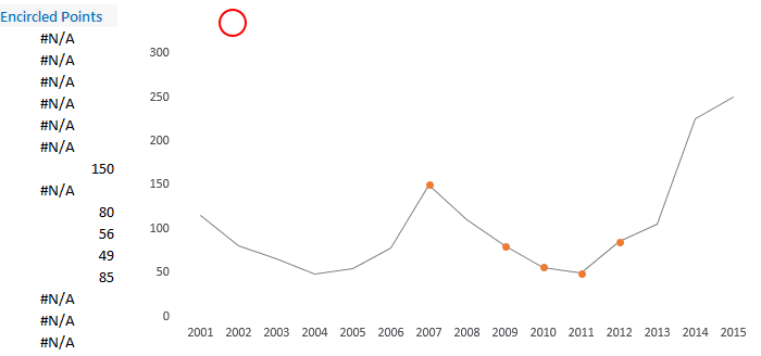
- Copy the circle (that we have created)
- Click on the Encircled Points Data Series and Paste it (use the shortcut Ctrl V)
- The markers will now appear as circles
- You can also add data labels if you want
Now when you change your Dummy toggle, the encircling effect will take place! 😎
More Interesting Charts
- Customize highlighting any data series
- Create a Map Chart to Plot Cities on a Map
- Place legends at the end of the line chart