
The source of inspiration for this chart came when Shuttershock was charging me for downloading a similar infographic chart. I din’t buy, I am thrifty 😉 It helped me save a couple of bucks and also come up with a way to make an infographic chart in Excel
Let’s do this together! Shall we?
Assume this Data
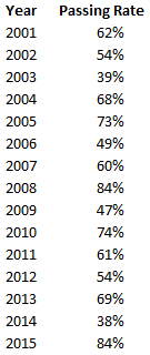 --> 15 Yrs of Passing Rates
Let’s break down the logic
I’ll list down the functionality and things we would need to make this chart
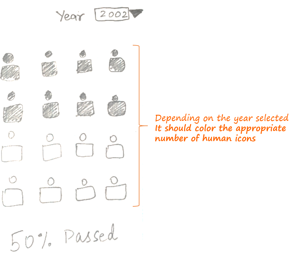
- We would need an year drop down – we can do that with data validation, list feature
- We would to need color human icons in the chart (depending on the year selected) – Making a chart which can dynamically highlight human icons is something that I will show you in this post
Let’s setup the back end
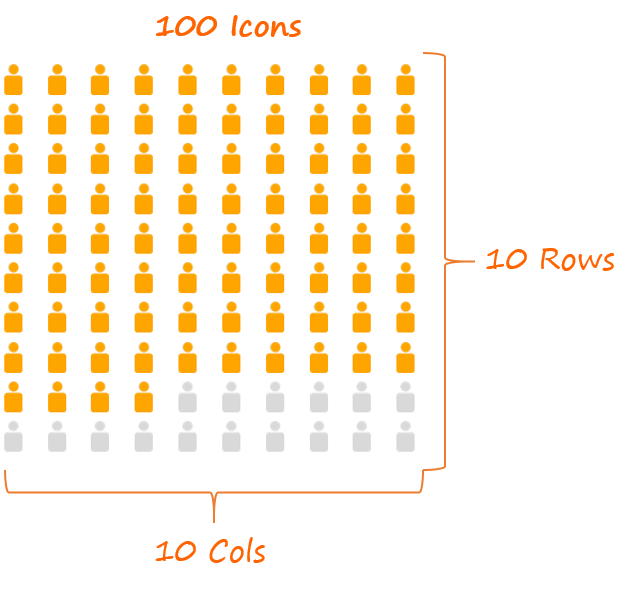
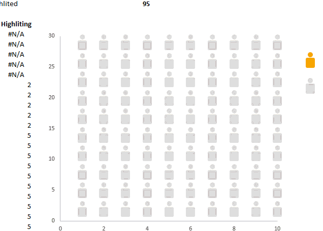
We need hundred icons (just a ball park figure for easier calculations) and from these 100 icons some will be highlighted and the rest will remain in grey
Here are the back end calculations for 2 columns (X Axis and Y Axis)
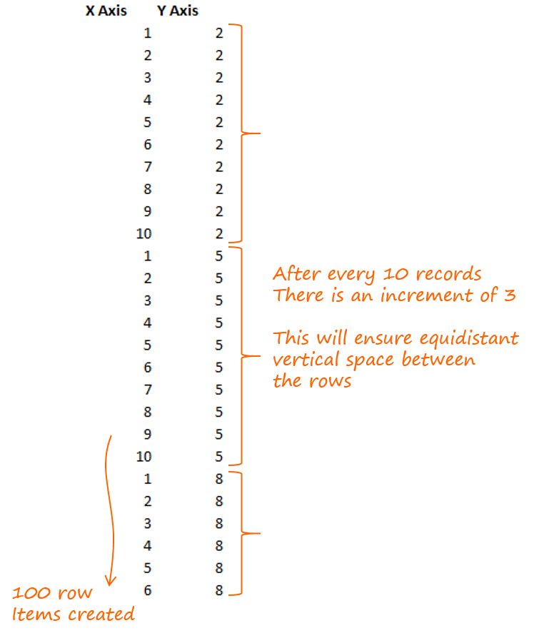
- X Axis (Horizontal) – Since there are 10 Icons in a row, we need numbers from 1-10, repeated 10 times (for 10 rows)
- Y Axis (Vertical) – Since every row should be equidistant from one another, we need some incremental numbers to set the icons apart. In this case we’ll start from 2 and increment by 3 after every 10 records
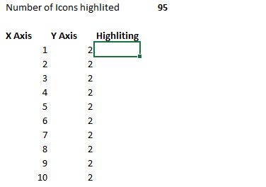
Calculations for the Number of Icons to be Highlighted
Apart from the X & Y Axis we would also need a calculation for counting the number of icons to be highlighted.
Here is a logical explanation of the above formula
- The count formula is calculating when do we hit 95 records. Notice that we have locked $C$103, just to ensure a decreasing count down
- The If Formula is returning #N/A for 5 records (100 minus 95) which are not supposed to be highlighted and values for the rest 95 records
- The number of icons to be highlighted will come from a data validation drop down, which will be linked to the year selected. As of now for simplicity, I have just picked up a random number (i.e. 95)
Now its time to make the Chart
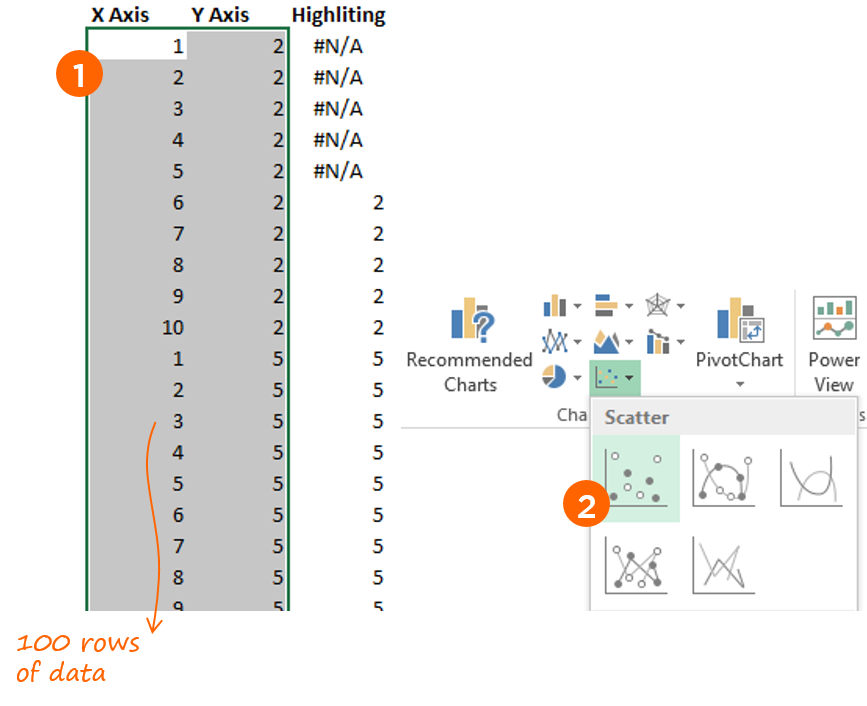
- Select the X & Y axis Data (not headings)
- And Choose Scatter Chart
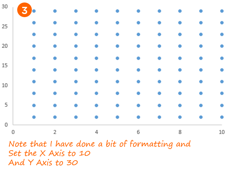
- You’ll get the scatter chart with dots
Let’s Customize the Dots to Human Icons
If you are not aware about this technique, I suggest you to read how to customize markers in a chart
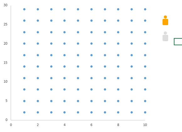
For this chart I already have the human icons made. [Related : Learn to draw a Human Icon : Video] We are just going to copy that to our chart
Finally adding the highlighting dummy to the Chart
- Copy and Paste the highlighted data into the chart
- Customize the dots with the yellow human icon
- Reverse the Horizontal Axis. (Format Axis --> Values in Reverse Order)
All you have got to do now is to format the chart a bit and you are good to go!
Coming up in Part 2
We’ll see that how can we customize a single icon to show percentages. Can you guess how can we make it?

Infographics Charts in Excel – Part 2
More Awesome Charts for You
- Learn to make Target Charts in Excel
- Indian Republic Day Visualization
- Bubble Chart Matrix with Dynamic Quadrants
- A Rework of the Economist Chart on World’s Largest Economies