If you have been longing to find an awesome PowerPoint template that will transform the way how your presentation looks.. let me tell you there are none! Let me not just tell you.. let me give you 2 solid reasons to prove it! Ready ?
Reason #1 Templates work around your content and NOT work on it !
When you apply a template to your presentation, you are essentially working (decorating) around your content but none of that decoration is helping the viewer to consume your content more easily i.e. the template does not help the content to become better
Let’s take an example
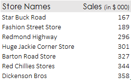 --> We’ve got to present this data graphically
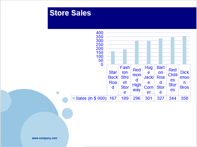
The Template Way! I downloaded a template from here and applied to the chart that I made out of store sales data. This is how it looks
Yucks!! If you happen to like this, you seriously need to improve your sense of design. Again let me not be judgmental. Let me ask you a couple of questions
- Could you tell me the 4th largest store in sales ? (It will take a while (some seconds) to figure out)
- Any other insights other than sales ? (There are none)
Insight driven questions are critical to companies and businesses for taking further decisions, which does not come by applying “beautiful” templates
Make the Data Beautiful way ! (also my way)
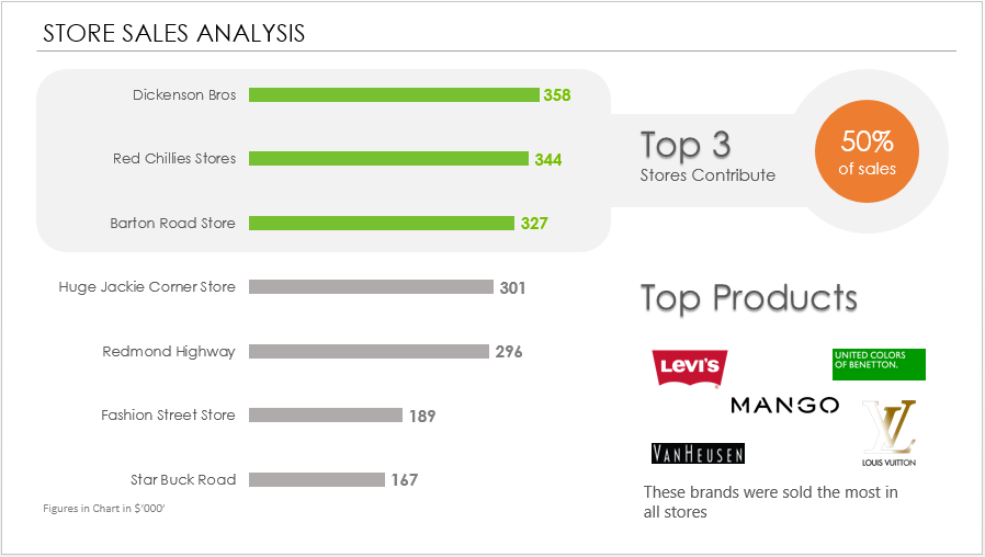
WOW! is what I would say. Note that
- I have not used any “template” (decoration material) here
- Rather I have made my data more insightful. You instantly get to know the following
- Store ranking (because now the chart is sorted)
- You build a relative understanding of how big are our 3 largest stores
- We even have space for putting down the top selling brands. I agree that information is an additional insight
- Important Learning – Do not work around the data but work on the data to look for insights. Then use effective charts and visualizations to present those insights
Reason #2 Templates eat up the Slide Real Estate!
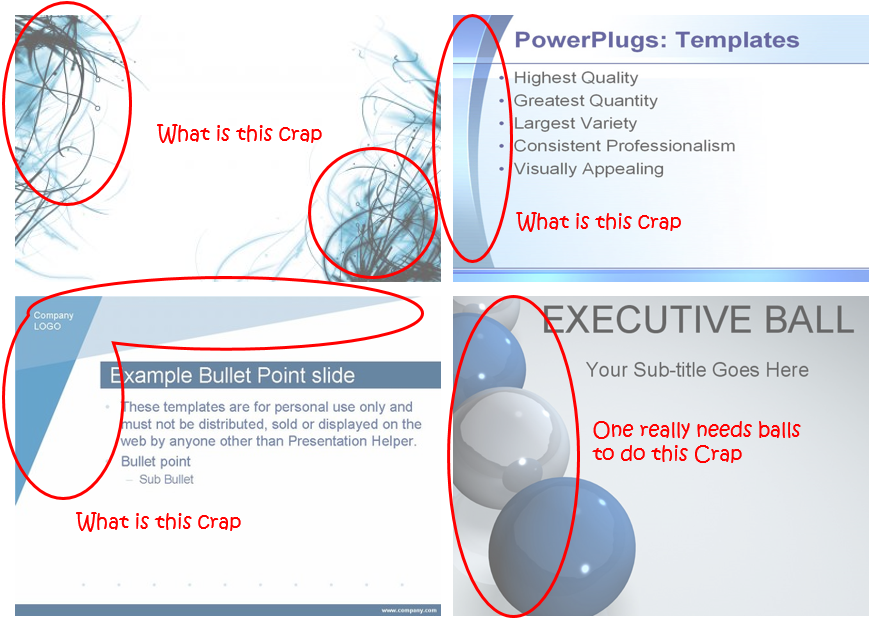
If you google Awesome PowerPoint Templates or Awesome PowerPoint Business Templates most templates that you get are like this
Click the picture to enlarge
When I say Real Estate I mean the space on the barren empty slide. Most templates have crappy fillers which for no reason eat up your slide real estate. Templates give you so less “actual space” to put down your data and analysis
Answer this – What would you do if you had to clean up the living room? Would you add more stuff or get rid of everything unnecessary and stick to essentials. The same works in Presentations, treat them like your living room 😛
Important Learning – Make room for data to come up and breath.. Get it??
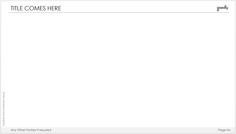
Here is one Template that works beautifully
Click the picture to enlarge
What is awesome about this template
- It has plenty of space for your real meat (I mean data/content)
- It captures the most of important details subtly
- The Headline is important (Large font 24 Pt, Century Gothic in Caps)
- The Headline Divider – The purpose of the divider is just to separate the headline space with the content space, so I drew a light grey line, no too thick (1 pt wide)
- The Company Logo comes on the top right
- Classified and Confidential Stamp on the left at 90 degrees (faded in grey, small font, 10 pt Calibri Light). It just needs to be there not to be focused on
- Any Other Footers & Page Nos (Faded in grey strip, a little larger than the classified stamp, 12 pt Century Gothic)
- The Purpose of this Template – Give all the space to your data/meat/content
Learn how to make this template
Some more Effective Slide creating techniques
- How to work with slide orientation to maximize space
- 7 Tips to Instantly Beautify your Presentations
- 5 Classic Animation Styles (and applications) for your Presentations
Your views on Templates
What are your views on templates? Do you often look for templates to beautify your presentations. What are most common challenges that you face to present your data? Please put down your comments, I would do the best to give my suggestions
