Long ago I was asked by one of my training participants that if his dump of events on specific dates can be plotted on a Calendar? Since then I have had all the setup in my mind but never executed it.
Well, I have executed it now. Presenting to you a Calendar Dashboard in Excel
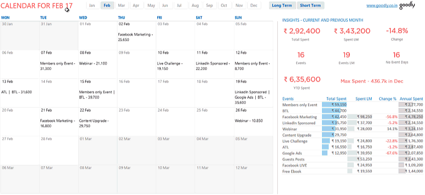
A Quick Overview of the Dashboard
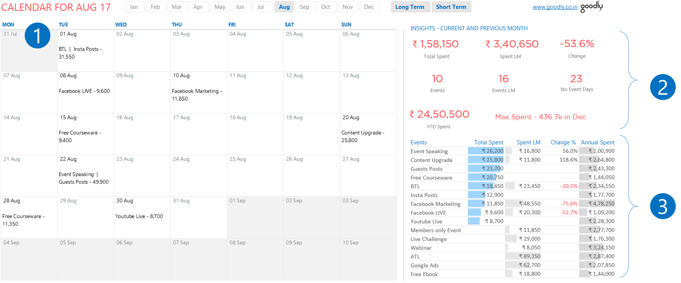
Visually the Dashboard is divided into 3 big parts
- A Single Month’s Calendar – Which shows what activity has been planned and day’s total
- Some Key Metrics – Which provide additional insights into the data
- Summary Table – Which displays more detail about activities
All of this work is done using PowerPivot and Excel’s native capabilities. In this short video I’ll explain 3 things
- How does the back-end data look like
- How does the Dashboard function
- How did I create it ?
Enjoy!
Excel Tactics discussed during the Video
- Download a sample Calendar (made by Microsoft) – to understand it workings
- How to do a Vlookup
- What is PowerPivot and DAX
- Dynamic Textboxes
- Pivot Tables Formatting Tricks
- Slicer Formatting Tricks
- Dashboard Design Guide – PDF
- Conditional Formatting in Pivot Tables
I won’t tease you anymore.. finally DOWNLOAD THE CALENDAR DASHBOARD FROM BELOW
Other Visualizations using Excel and Power Pivot
- Indian Tech Startup Performance Dashboard
- Facebook Dashboard in Excel
- Airline Schedule Dashboard
- Learning and Development Dashboard for HR