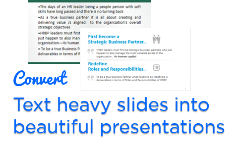
A ton of people face this problem: How to convert text heavy slides into visually beautiful presentations. Often you would hear advice like
- Convert your data into chart / graphs
- Add pictures and bla bla..
This is cool but the problem is
- What if the presentation is purely textual with no numbers to be converted into charts ?
- And most times you’ll start working on the presentation at the 11th hour which has to be presented at 12th
Let me show what I did and share one of my recent presentation project
Quick Story..
A few weeks back a client of mine asked me to create a presentation for their annual HR meeting. Now typically when I create a presentation I also put in a ton of effort in structuring the content besides the aesthetics of the presentation
Only this time I was purely asked to improve the looks of the presentation without editing the content. Reason : We had no time (and may be the content wasn’t cared enough)
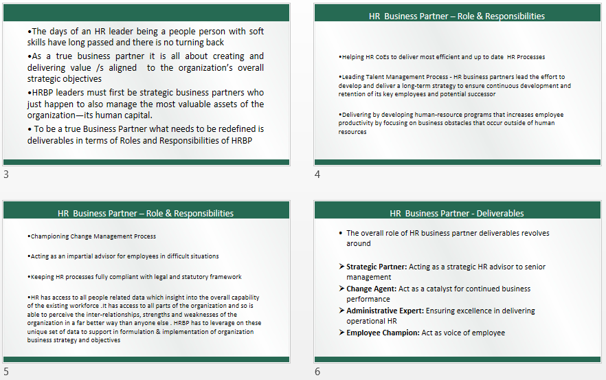
- The Presentation had a problem : The slides were a dump yard of text with paragraphs loaded one after the other
- The good thing was that the presentation was short, about 6-7 slides
Let me show you, how did I do the makeover of a text heavy presentation and share effective strategies for your own presentations
Take a look at the Text Heavy Presentation..

DOWNLOAD THIS PRESENTATION – Just stroll through the slides quickly. This is the actual client’s presentation
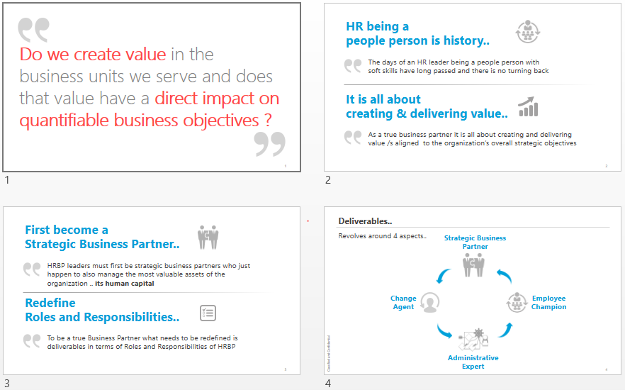
Now take a look at the makeover!

Notes
- This is for sure NOT the best presentation but certainly quite a makeover in 1.5 hours. Agree?
- I wasn’t allowed to edit the content but I strongly felt that the content, its flow, the story boarding and its structuring could have been a lot better
Nevertheless here is the completed presentation – DOWNLOAD THE COMPLETED PRESENTATION FROM BELOW This is the actual presentation that I emailed back to the client
I really want you to read the text heavy presentation.. sounds boring? But it is critical to understand how I did the makeover! Alright read just 2 slides. DO IT
Key principles followed while creating this presentation
- I never first thought about what design to apply to make the presentation look pretty
- I just read the entire presentation twice and noted down important keywords
- And then just highlighted them and made them bigger for assigning more importance
- Used a few contextual vector icons to give it a better visual appeal. That’s about it!
Notice the 2 slides below.. you’ll see the only design strategy applied is highlighting keywords and adding a few vector icons

The Bottom line is : Reading and making the presentation crisper is a very effective strategy and then the design follows. Would love to have your feedback in the comments 🙂
A few PowerPoint Tricks to help you work a lot faster
- How to find vector icons
- How to import / crop images faster in presentations
- Download 60 + PowerPoint Shortcut Guide (and START USING THEM)
- 3 Musketeers in PowerPoint (extremely useful post)
Previous Presentation Reworks
- Presentation Rework Series 01 – Strategy Presentation
- Presentation Rework Series 02 – HR Review Presentation
- Presentation Rework Series 03 – Company Profile Presentation
- Presentation Rework Series 04 – Bitcoin Presentation
