I recently came across an interesting chart idea from Charley Kyd’s website about economic warning. I thought of tweaking it a bit especially to highlight points in a line chart.
This chart can work very well for highlighting upward or downward trends
Let’s start with this weekly Sales Data
Nothing complicated here.. just weeks and their sales.
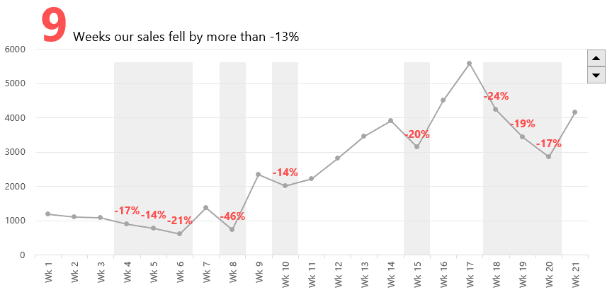
Quick Question – For how many weeks the sales fell by more than 15% as compared to the previous week?
Gotcha!! Yes a simple line chart won’t answer that question easily, therefore I need a mechanism to highlight points where the sales fell by more than 15% in the line chart. I hope now you would get the essence of this chart
The Charting Logic
There are 3 main parts of the chart
- The simple line chart (with markers) of course
- Dummy bars to highlight the points
- Labels for only the highlighted points
- And we also need a spin button (not in this image) to dynamically change the target
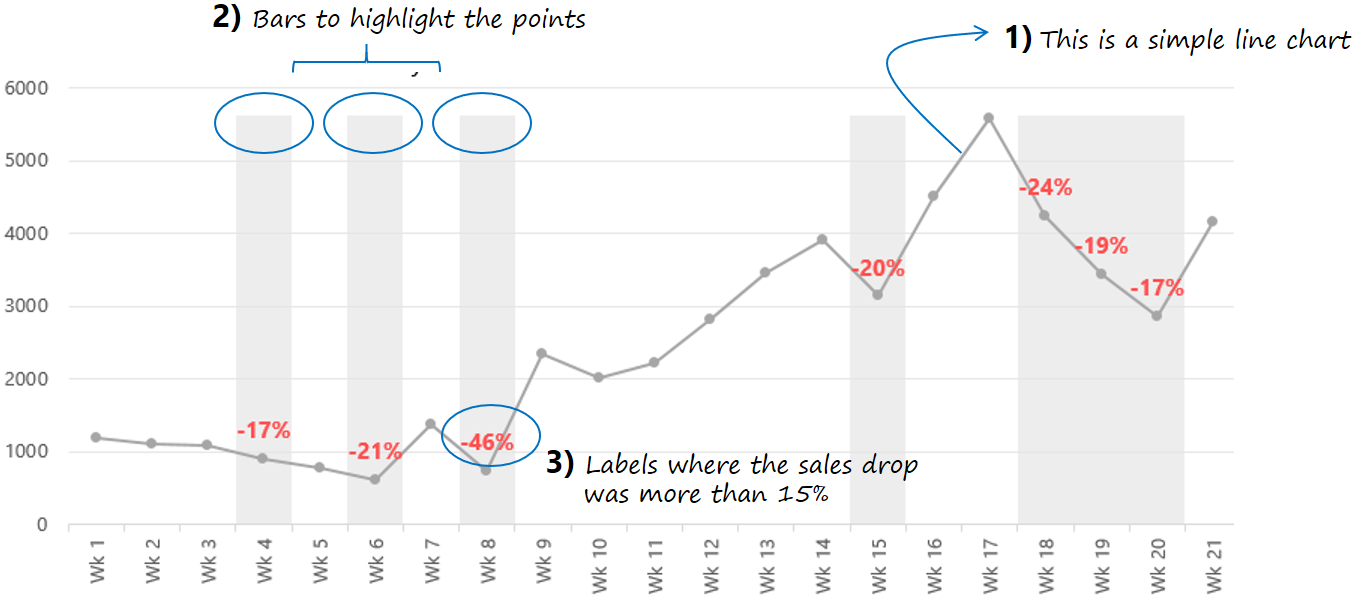
The line chart is pretty straight forward so I’ll assume that you have already made (and formatted) a line chart (with markers) with the weekly sales data
Let’s Start with the Spin Button
Pretty straight forward
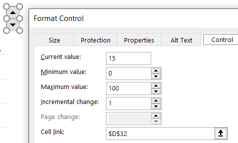
- Insert a Spin Button (Form Controls) from the Developer Tab, Insert Drop Down
- Right Click, choose Format Control and link the spin button to a cell. In my case I have linked it to D32
- The max and min values to be 0 and 100
- Now since the values are not in % and are not negative. I’ll create another dummy (in D33) which will have the following formula =-D32/100 and I’ll keep using this cell (D33 and not D32) in all my formulas
The Dummy Bars
We’ll be needing a dummy calculation (column) for creating the highlighted bars
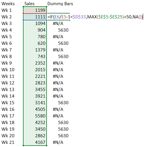
A few things about the formula
- It starts from the second cell (and not the first) because we are comparing a decrease of 15% compared to last year
- If the current week’s value has dropped by more than 15% then I take a MAX value of the range and add 50 to it. Why?? Just want the bar height to be a little taller than the line chart 😉
- Else #N/A
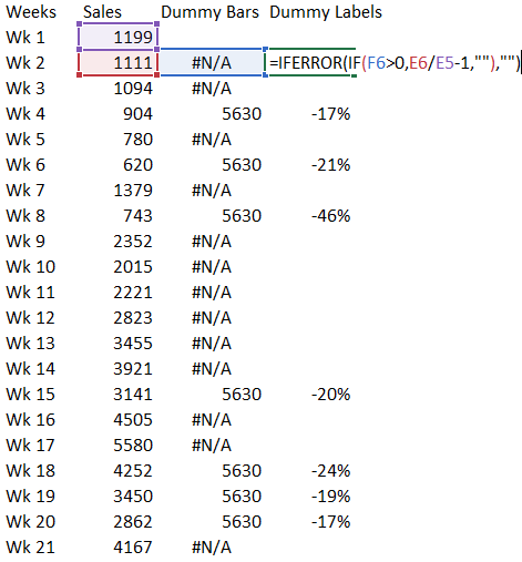
Need another Dummy for Labels
Another column for creating a calculation for adding labels to the line chart (with markers)
Setting up the Chart
Assuming that you already have the weekly sales line chart. Let’s add Dummy Bars as a Column Chart
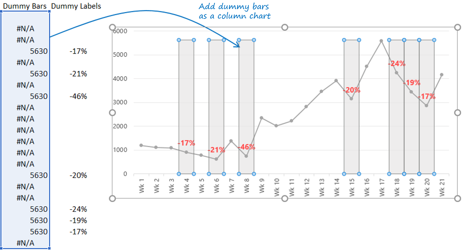
Next add the Label Dummy as a Data Labels
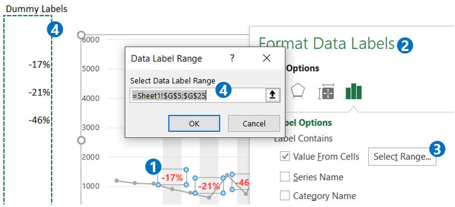
- Add the data labels
- Select the data labels and press Ctrl + 1 to open the Format Data Labels box
- Instead of the actual values, choose value from cells and select the range
- Select the Dummy Labels range from the Spreadsheet. Done!
To add dynamic chart titles I have added dynamic text boxes which are linked back to formulas in the spreadsheets
Yeah I know this was a tricky one.. If you have stuck around till here you definitely need this chart in your work and there is nothing better than a video to explain it
Enjoy the Video
Other Dynamic Line Chart Examples
- Add a Total Bubble at the end of the Line Chart
- Select Parts of the Line Chart
- Encircle Points in a Line Chart
- Plot Multiple Projections in a Line Chart
- Creating Phases in a Line Chart
- Vertical Line Chart in Excel