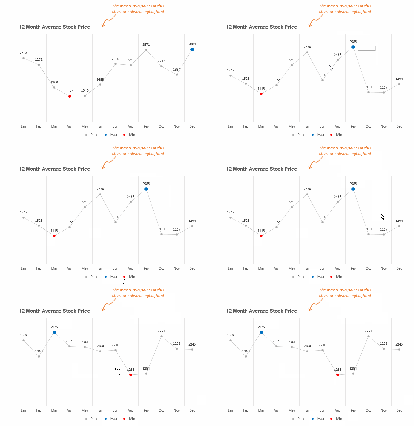
Hello People, I am sure most of us have the need to highlight special points in our charts.. lets say the maximum and minimum values..
Here is how you do it
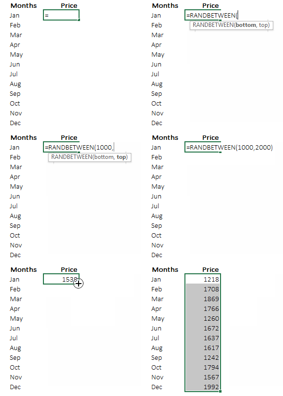
Step 1. Assume the following average stock price data for 12 months
You can generate random stock prices by =RANDBETWEEN(1000,2000) function
Step 2. Calculate max & min points for your data
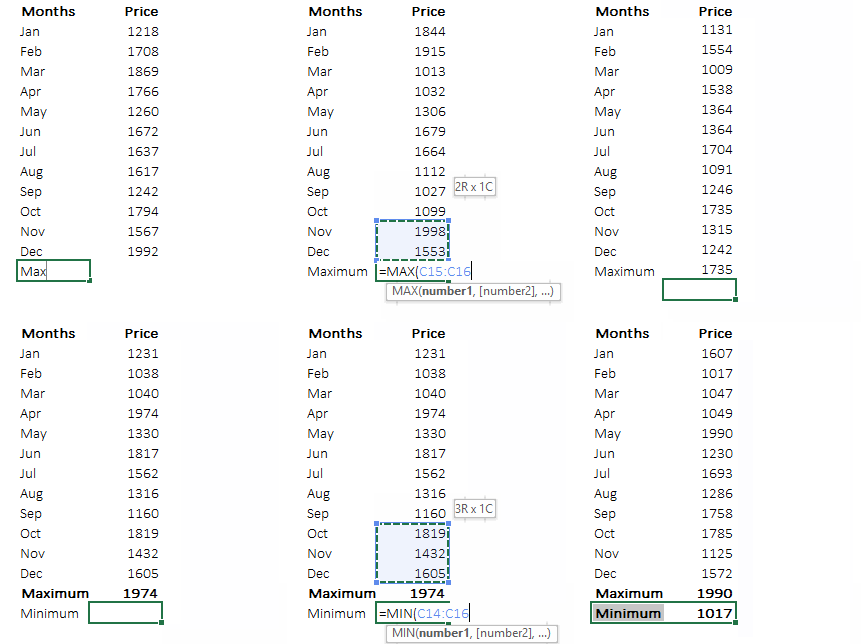
Please note that the data is changing because we have used the =RANDBETWEEN function, which changes the random values every time spreadsheet is refreshed or calculated
Step 3. Create Dummy Data for the Chart
Create 2 dummy series (using IF) for
- Plotting only the maximum value
- Plotting only the minimum value
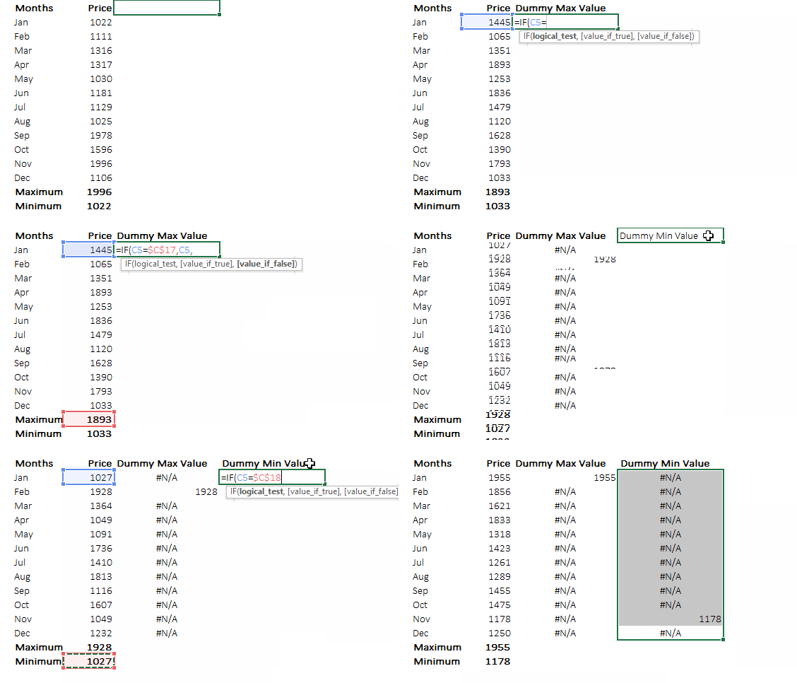
Quick Tip : Use Ctrl + D to drag down the copied formula, that’s much quicker than the mouse dragging or the conventional Ctrl + C shortcut for copying
Step 4. Select the data (including dummies) and plot a line chart with markers
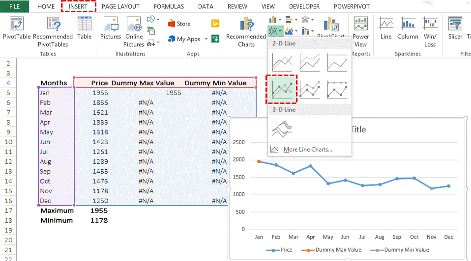
Step 5. Dress up your Chart
Do some formatting to the chart – Remove the outlines, add labels if you want, make the stock price line lighter .. etc. Now every time the sheet refreshes (use the F9 key) --> data changes due to =RANDBETWEEN function --> max and min points are captured by your dummy --> which get updated in your chart 😀
Download the Finished File from Down Below
Additional Stuff
- I learnt this charting technique from Jon Peltier’s Blog
- Also see how can you highlight any specific data point in your chart
- Below is a short video on highlighting max and min points in your data
