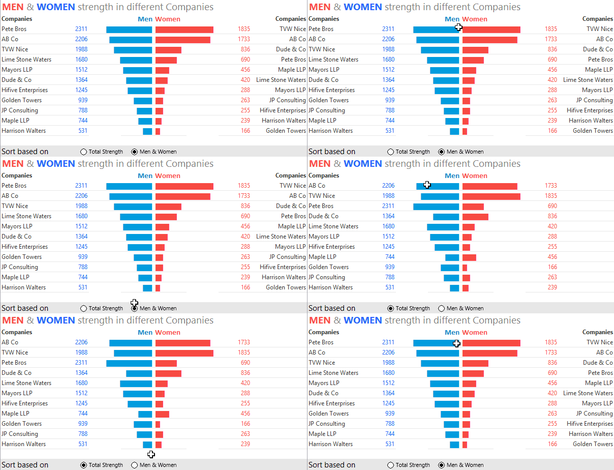
In this tutorial I am going to take you through a funnel chart visualization. Surprisingly this visualization is not any type of a chart rather it is made up of formulas that have been smartly formatted make it look like a chart.
Let’s get into it!
Here is the Data
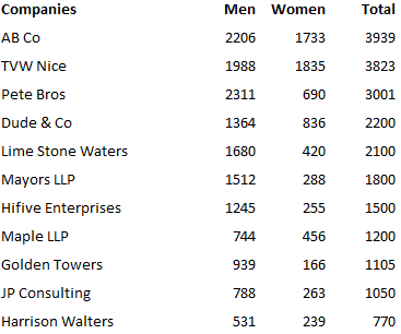
Note that
- In the above data the companies are already sorted (in descending order)
- The chart (in the cover picture) is changing depending on the sorting options
- Sorted by Total Employee Strength – We already have it
- Sorted by Male or Female Strength – We have to create this
Sorting the data by Men or Women Strength
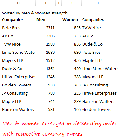
Using the above data I have sorted the men & women in descending order. You can do this in 2 ways
- Use the standard sort feature and manually copy and paste the company names against every value
- Or use the INDEX & MATCH and LARGE function, like I have done it. I recommend this because the formulas will take care of all the changes done in the source data
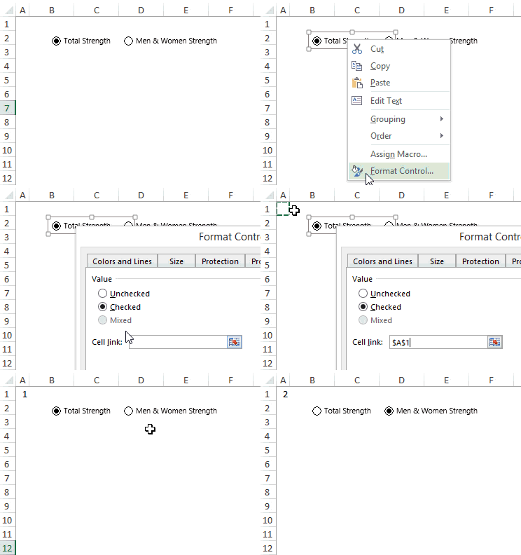
Let’s make the option buttons now
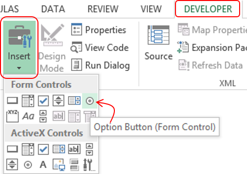
Please note that we are creating the option buttons in a new sheet
- Form the Developer Tab --> Insert Drop Down --> Choose Option Button (Form Control)
- Make 2 Options and name them
- Link the Option Buttons to cell A1
The Charting Logic
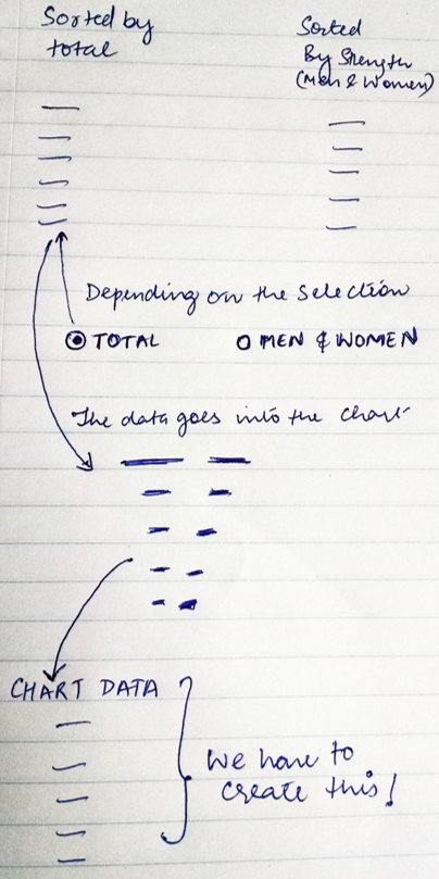
- Now based on the selection (in the option button) the chart should change
- Note that we already have created the 2 types of data.
- Sorted by total,
- Sorted by men & women strength
- We need to create a dummy data for the chart – based on what ever is selected. The dummy data will be used to make the chart
Creating the Dummy Data for the Chart
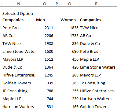
I have created this dummy using the Choose formula.
- If the user selects 1 (in the option button) – It picks up the data sorted by total strength
- If the user selects 2 – It picks up the data sorted by men & women strength
Note that since men and women are individually sorted both will have their respective company names
Finally making the chart
This chart is made using the REPT formula
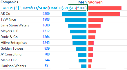
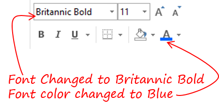
And then I change the font and color to make it look like a thick bar like structure
That was smart.. wasn’t it? 😎
Other Interesting Charts for you
- Learn to make a Customized Scrollbar in Excel
- Make Phases in a Line Chart
- Infographic Charts – Part 1 and Part 2
- Make awesome Target Charts in Excel
