Often a wrong type of a chart for your data won’t communicate the right message. Charts are made for easier & faster interpretation of data and a wrong chart can do the opposite
I wanted to pour my heart out to help gain the skill of picking up the right chart. I suggest you should bookmark this because I am going to make this pretty comprehensive and awesome!
I am going to pick different charts available in Excel and tell you in which scenarios do they serve the best. Once you understand the fundamentals of these charts, you can then combine them to make more sophisticated visualizations
1 COLUMN CHART is a great pick for :
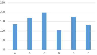
Comparing individual values – Notice that we have six items (from A to F) to compare in the chart below, there is nothing better that comes close to a Column chart for comparing individual values. Without even having the data labels you can figure out that C is almost twice of D
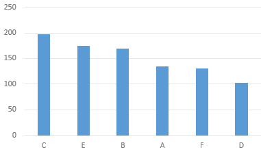
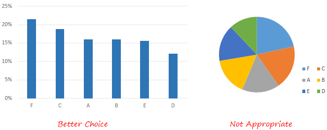
Ranking of data – Whenever you are dealing with nominal scale (for example A to F in the chart below) the column chart can also help you in ranking the data. All you have got to do is to sort the data and then make the column chart. Now it becomes a lot easier to know that A ranks 4th
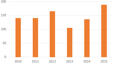
Time based comparison over shorter time – Ranking becomes less relevant when you have time (years) on the horizontal axis. The column chart fits the best for comparing individual years with each other.
Please note : A Column chart is the best for a shorter period of time – Why because
- Having 100 columns (bars) in the chart for 100 years of data would look a lot cluttered and will be difficult to read
- The nature of analysis also changes when you are analyzing 6 years data v/s 50 or 100 years of data. In the former one you tend to focus more on 6 individual values and the latter focuses more on trends over the long time
Deviation & Variation analysis : Columns charts are great for finding deviation or variation. Take a look at Sales V/S Target Chart below where you can easily compare sales and targets of each salesman. Additionally it would also be a great idea to sort this chart as per sales or targets (which I have not done as of now, but hey!)
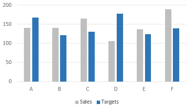
You can always tweak your charts to make them look more awesome, here is one such example of a target chart where I have tweaked the column chart to display sales v/s targets in a better way
Show parts of the whole : Column can also be used to show parts of the whole, for instance how much (in %) did each salesman contribut to form 100% sales. Column chart here is far easy to read and interpret than the pie chart
2 STACKED COLUMN CHART is appropriate for
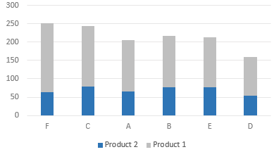
Comparing parts of a whole for multiple values : Notice in the chart below, I have each salesman selling 2 products and both these products are forming the total sales for each salesman.
As of now this chart seems pretty legible to read and interpret, but the problem will occur when you have more products for each salesman. In that case the stacked chart will become difficult to read. Here is how I solved the problem using a dynamic stacked chart
Just as the way we have Salesman on the horizontal axis, we could also have years (time based analysis)
3 BAR CHART is best suited for
Long Axis Labels and more Data Points: The bar chart has the same application as the column chart the only difference : that the bars are horizontal. Which is plus point
- When you are dealing with more values to be presented in a single chart – Let’s say 12 – 15 sales figures from difference salesmen
- When the labels of the horizontal axis is long enough so that it cannot fit in the column chart
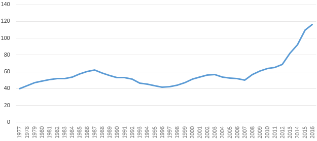
4 LINE CHARTS work best when
When you have large time series (continuous) data – Think about it logically, you would not want to analyze individual years when you have 50 or a 100 years of data. The analysis that people usually make out from large data is trends over a period of time which is best shown by a line chart
Display Routes in a Map – Maps also use line charts to display a route between 2 locations. But I have not figured it out yet that how can I do that in Excel? 😕
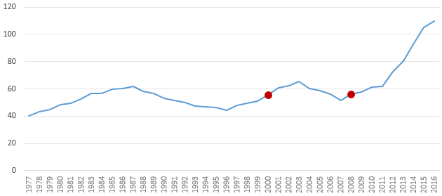
5 LINE CHART AND MARKERS (DOTS) work beautifully when
There is a need to highlight a few data points in a line chart – In the chart below I have highlighted two years 2000 and 2008. Markers work beautifully when you have to bring out a few important data points in your line charts
I have written a few interesting articles on tricks and tips based on line charts
- Customize markers in a line chart
- Encircling data points in the line chart
- How to highlight parts of a line chart
- Creating phases in a line chart
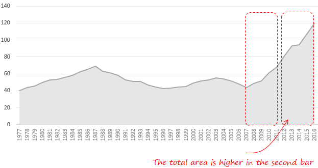
6 AREA CHART provides utility when
You are trying to map the magnitude of change : Take a look at the area chart below, here you can see that the area covered under the second bar is more. Area chart gives a little bit more perspective to understand the trend plus what has been the magnitude of change.
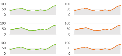
Multiple small area charts in a Dashboard can give a better perspective and look and feel
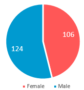
7 PIE CHARTS are not good..
Although pie charts are seriously overrated as compared to their utility but serve little good. But still if you are in love with pie charts and can’t seem to get over it. Here is my key suggestion
Use it for 3 or less variables – Beyond 3 variables it becomes increasingly difficult to read pie charts
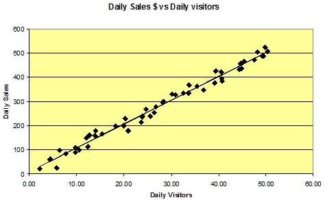
8 SCATTER CHART act good when..
You have to analyse 2 variables and show relationships: In the chart below we have 2 variables Daily Sales and Daily Visitors. Scatter plots are also very common for showing relationships by statistical methods like correlations and regression analysis
9 BUBBLE CHARTS
Just like Pie Charts bubble charts have a limited use. Use bubble charts when
You want to do a 3 Dimensional Analysis: Here on this chart we have 3 variables
- Numbers on the horizontal axis
- % on the vertical axis
- Bubble size is also a variable
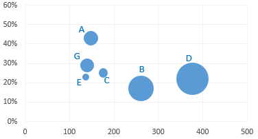
The analysis is limited to which value is smaller or larger (i.e. rough approximation) – Take a look at the chart below, it is easy to say that D > B, but by how much? That would be a difficult call to make. When you want to limit your analysis to rough approximations bubble charts work fine
Here are 2 interesting applications of bubble charts. You’ll love them
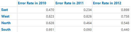
10 TABLES have no alternative when..
You have Textual data
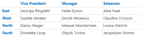
You have to communicate precise values: There is no good alternative to just writing the exact values. Recall your school days, you had a log table not a log chart 😉
Other Helpful Charting Guides
- Pick up the right chart Game, and it solution
- How to pick up the right color for your chart
- 5 Charting hacks to help you work much faster
- 8 Best Chart Formatting Practices