
Today let me share with you some of my favorite techniques to bring more insight and pack more killer information in your Dashboards. Although these tips are in no particular order but you should adhere to them as much as you can
#1 Sorting Chart Data
Take a look at this chart and answer a simple question. Which Product is ranked 4th smallest in terms of sales?
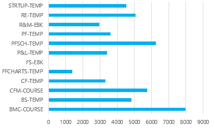
Still thinking..? If it takes any longer than 3 seconds then there is no point of making a chart.
Simple answer – Sort the chart data and see the difference yourself
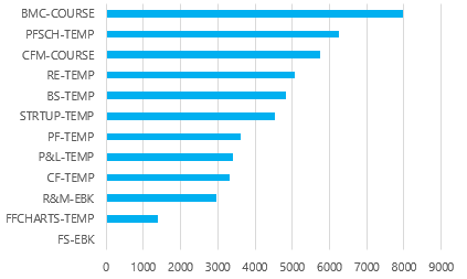
Suddenly the chart becomes a lot more meaningful to look at. Infact you should always sort the data when you have a nominal scale (eg. Products, Customers, Countries… values which don’t relate to each other)
#2 Cross Filter Charts using Slicers
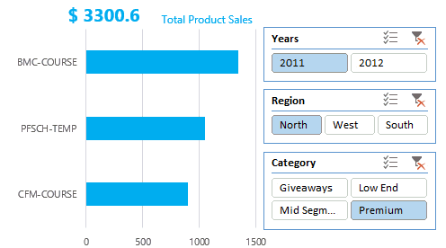
Let’s continue with our previous (Pivot) Chart. The Chart does display the product sales in descending order but nothing more than that…
But what if you have questions (about the same chart). Questions like
- Which year’s Product Sales is this ?
- Can I only get product sales for North Region ?
- Can I only have Premium Products Sales ?
The problem is that this chart is static and does not allow any kind of interactivity. Compare that with a chart with Slicers (filters)
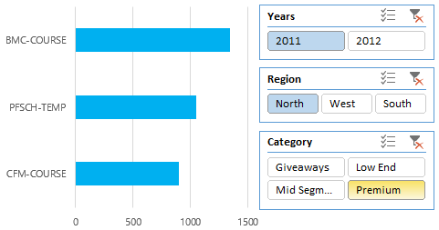
This is quite a transformation. I am only seeing sales of 2011, region of North and 3 Premium Products.
Slicers allow the users to dig deeper and cross filter the information. Slicers are not very recent but certainly one of the most bad ass features of Excel.
If you don’t know about slicers at all
- Read a comprehensive article about slicers
- Learn how to make your Slicers look Sexy (Slicer Formatting)
#3 Adding Summary Text Labels
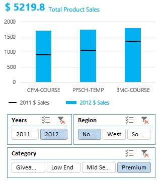
Let’s keep our conversation interesting and continue working with our Pivot Chart.
Given the same chart (with Slicers now), what if I asked you a another quickie.. Dude, what was the total sales for all Premium Products in 2011 and in Northern Region?
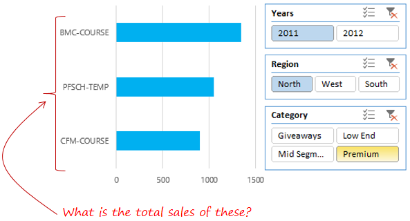
Oops!! You don’t have total sales. Sure enough you can activate the data labels but then you’ll have to run the numbers in your head to get to the total.
But what if there are 10 products displayed in the chart and you have to manually do the total? Doing the math in this tech world would be too much to ask for from the Dashboard user
Save yourself the effort and add dynamic text labels on top of chart to summarize the values. The chart below has a dynamic text box added on top of the chart that summaries the total sales.
This beauty is that the dynamic text boxes changes when you play with slicers
If you don’t know how to work with dynamic text boxes, you might want to look into a recent post on setting up dynamic text boxes
#4 Comparison against relevant Benchmarks
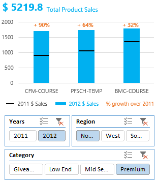
Certainly we have traveled far from where we started but there still a lot of insight that we can bring into our Chart.
Continuing our insight pursuit with the same chart (I have just changed the layout and changed the year to 2012).
Comparing 2012 Sales with last year’s Sales, additionally tells us that the maximum gain has been for the 1st product (which nearly doubled)
Now that is an insight ! Isn’t that?
One of the deep insight points is often comparing values against benchmarks. These benchmarks could be current year v/s past year, actual v/s targeted, us v/s the competition
#5 Work with Ratios and Metrics
Mother Swear – When I planned writing this post I had no intention of progressively continuing with the same example (chart). But I am glad that is happening 😀
In my last example where we compared our 2012 sales with the 2011 Sales, we did get to see that the maximum jump (of about $900) was for the 1st product but that is not very insightful.
What if I say that we grew 90% over last year. Now that information makes even more sense
Ratios and Metrics set a common base for comparison and make numbers easy to compare. Always lookout for comparables like relevant industry ratios, % comparisons, growth rates (cagr) etc.
I can tell you from my experience that your boss will “loove” these
#6 Write Meaningful Titles for Charts
I should have written about this earlier but even this is not a bad timing to talk about meaningful titles.
Take a look at these 2 columns. Which titles would you prefer in your charts?
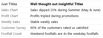
I don’t know for some reason, people are afraid of writing a sentenced out chart title. But that is so wrong. A meaningful chart explicitly communicates the key insight instantly
#7 Give Suggestions rather than just dumping Charts
This one is my favourite!
Let’s say you did all the good work of making your Dashboard very insightful. Your Dashboard has Logical Order, Numbers & Percentages, Ratios & Comparisons and what not..
In the end your Boss can still ask you.. So What??
The answer to that is give suggestions.
Dashboard is just a “spreadsheet dancing” but you got have real time business suggestions for things that are raising an alarm in your Dashboard. If fact I strongly suggest you make suggestions as a part of your Dashboards.
Only then you can truly say that you have built an incredibly insightful Dashboard!
What are your top suggestions ?
Please share with me your top suggestions to make your Dashboards insightful
Take a look a few awesome Dashboards
- Flight Schedule Visualization
- Company Cost Structure Dashboard
- RIO Olympics Dashboard
- Indian Tech Startup Performance Dashboard
- Download a short guide on improving the look and feel your Dashboards