Recently while browsing I found a list of flight information for one of the most popular Indian Airlines Company (Indigo Airlines)
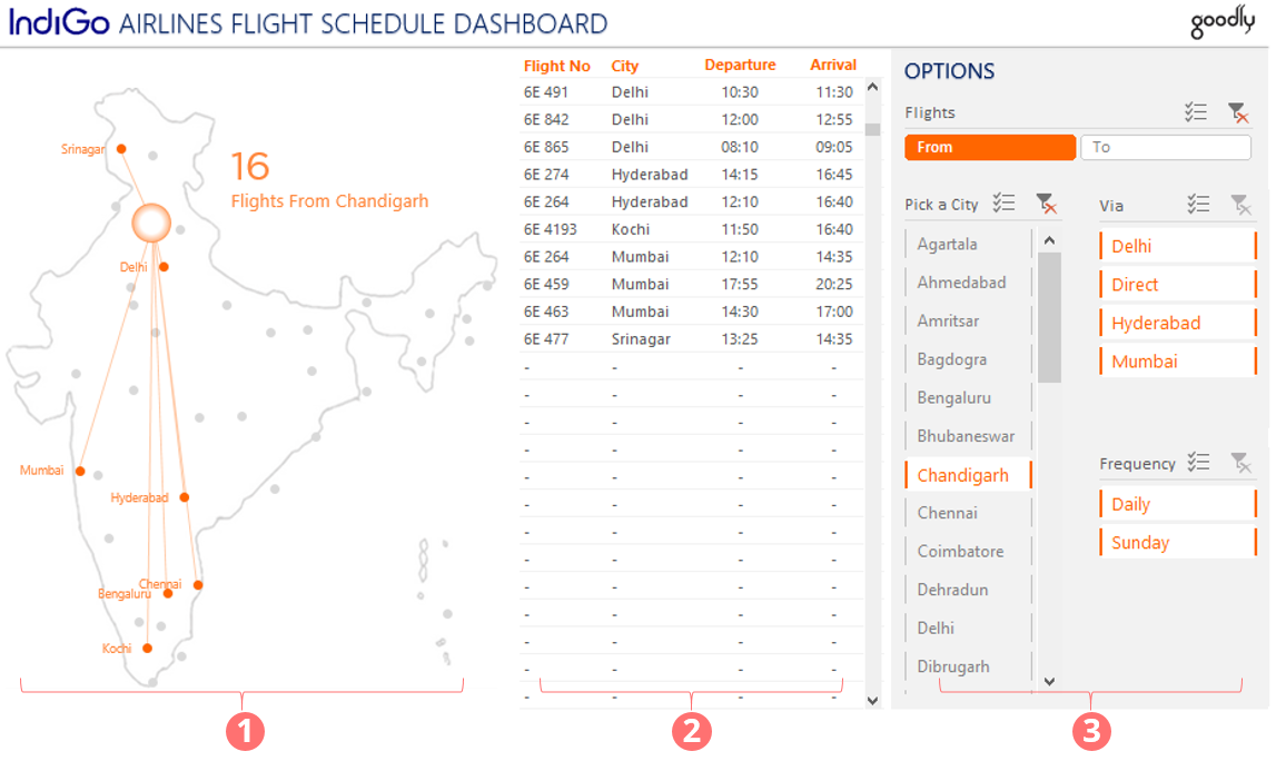
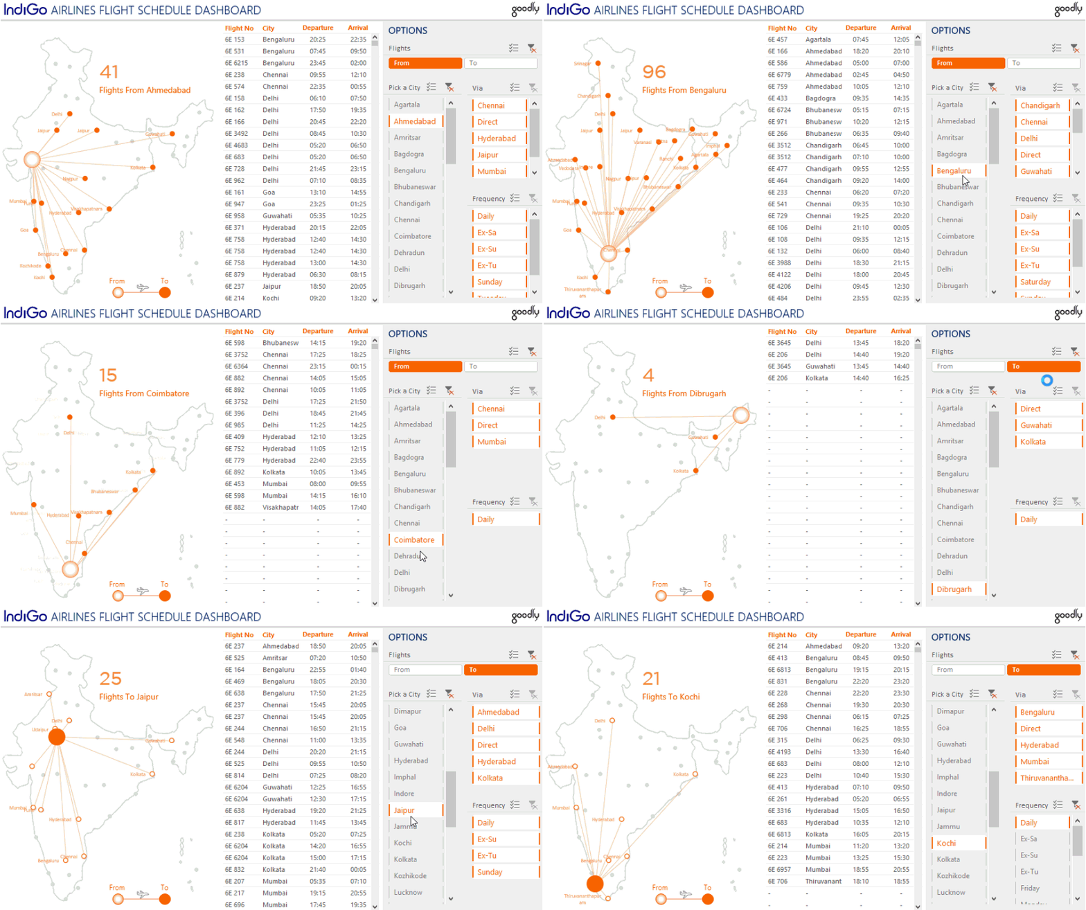
I thought instead of dumping this in Excel, I certainly can do a much better job of visualizing this data and I came up with this Flight Schedule Dashboard
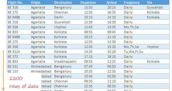
I started with this Raw Data

Which I modified and cleaned a bit to make it fit for analysis using Power Query. Take a look at a quick video and read the rest of the post for all the resources
Techniques used in the Dashboard

There are 3 main parts of the Dashboard
- The Map Chart
- How to Create a Map Chart – A detailed post which also contains an explaier video + downloadable map chart file. Once you learn how to plot the map, you can literally replicate this technique to almost any country
- Location Connectors – I learnt this trick from Roberto Mensa (pretty solid guy!)
- Dynamic Text Boxes – The text box that you see, which shows the number of flights is created using this trick
- The Scrolling List in Excel – You can use this technique to manage space. If you have more information to show (in a form of a table) in less space, this trick is a pure genuis
- Slicer Buttons
- What are slicers and how they work – Start here if you know nothing about slicers
- How to make your slicers look sexy – By default the slicers are pretty raw. This post gives you a lot of tips and tricks to format the slicers
- Manage Multiple Slicers in a Dashboard – for managing multiple slicers in a Dashboard
- Plus how to to hide the Sheet tabs
Excel version needed to play with this Dashboard
- If you want all the features up and running, I suggest you should have excel 2013 or above. Most functionalities should also work with Excel 2010.
- I also recommend you to enable macros before toying around with this Dashboard
DOWNLOAD THIS DASHBOARD
A few other interesting dashboards
- 30 Day Challenge Dashboard
- Indian Tech Startups Performance Dashboard
- Company Cost Structure Dashboard
- RIO Olympics Dashboard
- Indian Republic Day Visualization

